Milan Houzz Tour: A Family Home Where Light Flows Freely
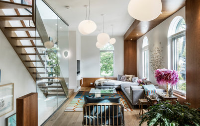
This home's living area flows across the whole house, creating a space with both northern and southern exposure

When renovating their apartment in Milan, Italy, this couple’s main goal was to make more room for themselves and their children to move around. Architect Cecilia Avogadro interpreted this as an exercise in fluidity. She tore down some of the internal walls and arranged the living area diagonally across the apartment. This unusual design draws in the best light at all times of day and gives the home a dynamic feel.
This is why Avogadro went for an unusual, cascading layout. She organised the space to optimise for freedom of movement and allow light to pass from one room to another.
Avogadro started with meticulous layout planning. She eliminated all of the original hallways and connected the sunroom to the living room in the opposite corner. This also allowed for bigger bedrooms and an additional bathroom.
Avogadro started with meticulous layout planning. She eliminated all of the original hallways and connected the sunroom to the living room in the opposite corner. This also allowed for bigger bedrooms and an additional bathroom.
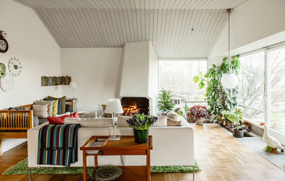
The original sunroom had drawn in a huge amount of light through its large windows. Avogadro spotted its extraordinary potential right away.
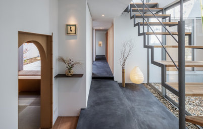
Hence the first important decision, which was the starting point of the entire project. The walls around the sunroom were torn down, while the wall facing the street was replaced with two large glass panels, pictured here. The result is now the hallmark of the home: a true window on Milan, from which the family can see the sky change, watch storms and sunsets and enjoy an open view without obstructions, like at a beach or mountain cabin.
Hence the first important decision, which was the starting point of the entire project. The walls around the sunroom were torn down, while the wall facing the street was replaced with two large glass panels, pictured here. The result is now the hallmark of the home: a true window on Milan, from which the family can see the sky change, watch storms and sunsets and enjoy an open view without obstructions, like at a beach or mountain cabin.
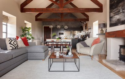
This created an unusual living space arranged along a diagonal axis that cuts through the whole apartment. It therefore has both north- and south-facing views and excellent distribution of natural light throughout the day.
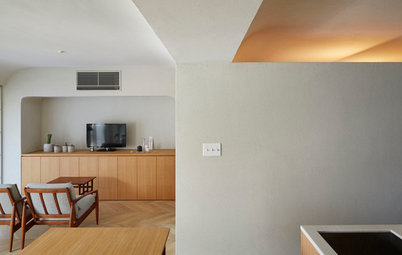
The teal on the wall of the original living room is part of the defining colour palette of the apartment. “The clients said they wanted a warm house, but without using colours like yellow and orange, which are not really the owners’ thing,” says Avogadro. “So, we went for a colour scheme focused on light blue and green shades, livened up with sporadic accents in other colours. For example, we borrowed the hint of petroleum blue for the wall above from the building facade, and used it here as a link to the exterior and to evoke the spirit of the building.”
The daybed was found next to a skip bin and given a new red mattress, handmade by an upholsterer.
The daybed was found next to a skip bin and given a new red mattress, handmade by an upholsterer.
Avogadro personally handled the furniture selection; she started with pieces the owners already possessed and then alternated contemporary furniture and design classics, especially Italian ones.
“Beautiful things stay beautiful forever,” says Avogadro. “Yet … I don’t like putting eight Superleggera [visible behind the table in the photo] chairs together because it would feel like a conference table, like one you might find in an executive’s office. Instead, it is much better to spread the set of chairs over several parts of the house. This approach gives a contemporary touch without any one style being overbearing, in a house that has many historical pieces.”
“Beautiful things stay beautiful forever,” says Avogadro. “Yet … I don’t like putting eight Superleggera [visible behind the table in the photo] chairs together because it would feel like a conference table, like one you might find in an executive’s office. Instead, it is much better to spread the set of chairs over several parts of the house. This approach gives a contemporary touch without any one style being overbearing, in a house that has many historical pieces.”
Wallpaper with ’60s patterns, all from Boråstapeter, also appears throughout the house. It adds a tactile effect to the walls.
A custom-made openwork door maintains fluidity between the original living room and sunroom-kitchen even when closed. Designed by Avogadro and artist Lorenzo Manenti, it was first hand-drawn, then digitised with AutoCAD and finally made out of MDF by a local carpenter.
The door also regulates the amount of light entering the house. As Avogadro says, when the door is open, light from two sources intermingles. “From the kitchen, the light travels throughout the rest of the house. This not only makes the room brighter, but also makes it possible to observe the effect when light from two different sources is mixed, which is a very charming feature.”
The door also regulates the amount of light entering the house. As Avogadro says, when the door is open, light from two sources intermingles. “From the kitchen, the light travels throughout the rest of the house. This not only makes the room brighter, but also makes it possible to observe the effect when light from two different sources is mixed, which is a very charming feature.”
In the kitchen-solarium, a long peninsula separates the cooking area from the dining corner. The dominance of white in the space creates a very light and open environment. The catchy wallpaper under one of the windows adds a touch of animation.
In the master bedroom, wallpaper with a lively dandelion motif is a delicate and dreamy touch. The small pass-through window that opens into the kitchen makes it easy to deliver morning coffee.
Walls are painted several colours, either extending floor-to-ceiling or bordered with white. There are many other unexpected details in this space, like the triangular shelves in the bedroom and the bench in the dressing room.
“I designed them in order to conceal some of the many acute and obtuse angles created within the new layout,” says Avogadro. “Now, the perception of space and the geometric relationships between the furniture and walls are more orthogonal and cleaner.”
“I designed them in order to conceal some of the many acute and obtuse angles created within the new layout,” says Avogadro. “Now, the perception of space and the geometric relationships between the furniture and walls are more orthogonal and cleaner.”
The master bathroom, which can be accessed from the bedroom, features two oil paintings from the 1700s. They are portraits of the owner’s ancestors and are positioned above the bathtub to downplay their rather gloomy, authoritarian look. The blue wallpaper also helps add a little cheer.
The 28-square-metre children’s room is bathed in light from two large windows. In future the space can be divided into two separate rooms to provide the privacy teenagers need.
For now, however, the room is a large, exciting playground with two twin Montessori beds designed by Avogadro. A thick yellow stripe – the only touch of yellow in the apartment – and a rug with a diamond pattern from Anthropologie liven up the space and enhance the graphic feel of its decor.
For now, however, the room is a large, exciting playground with two twin Montessori beds designed by Avogadro. A thick yellow stripe – the only touch of yellow in the apartment – and a rug with a diamond pattern from Anthropologie liven up the space and enhance the graphic feel of its decor.
The children’s bathroom is another example of the home’s mixture of ornate and minimalist. An oak vanity unit designed by Avogadro is matched with polka-dot wallpaper and an antique mirror with a golden frame. This is contrasted by minimalist red tapware and the red cable of the pendant light.
Tell us
What do you love about this home? Tell us in the Comments below. And don’t forget to like the story, save your favourite images and join in the conversation.
More
Love seeing inside other people’s homes? Check out last week’s Stickybeak: Blue Touches and Light Wood Bring Life to a New Home
Tell us
What do you love about this home? Tell us in the Comments below. And don’t forget to like the story, save your favourite images and join in the conversation.
More
Love seeing inside other people’s homes? Check out last week’s Stickybeak: Blue Touches and Light Wood Bring Life to a New Home


Sponsorisé
Rechargez la page pour ne plus voir cette annonce spécifique
Who lives here: A couple with two children
Location: Milan, Italy
Size: 180 square metres spread over a living room, a kitchen with a dining area, two bedrooms, a children’s bedroom, three bathrooms and a laundry room
Year built: 1958
Renovation year: 2013
Architect: Cecilia Avogadro
A non-conformist layout adds a lot of character. Likewise, while square metreage is not a luxury everyone can afford, over-partitioning space with small rooms and hallways is a surefire way to block whatever views are available and stifle the energy in any home.