Idées déco d'entrées avec un mur bleu et un plafond décaissé
Trier par :
Budget
Trier par:Populaires du jour
1 - 20 sur 49 photos
1 sur 3
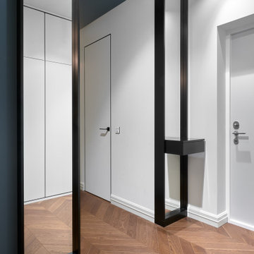
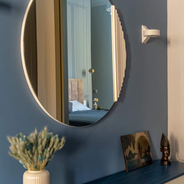
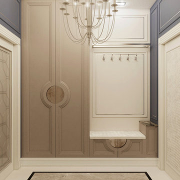
В прихожей глубоким серо-синим цветом выделили стену и потолок. Два зеркала от пола до потолка в черных глубоких рамках, выполненные на заказ, обрамляют вход в интимную зону квартиры.
Поскоольку дверей в этой квартире очень много, все они - невидимки, с отделкой под окраску.
Cette image montre un petit hall d'entrée minimaliste avec un mur bleu, un sol en marbre, une porte double, une porte blanche et un plafond décaissé.
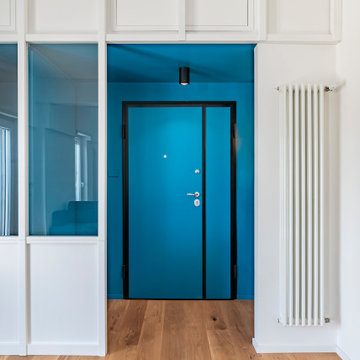
Réalisation d'un petit vestibule design avec un mur bleu, parquet clair, une porte simple, une porte bleue et un plafond décaissé.
Download our free ebook, Creating the Ideal Kitchen. DOWNLOAD NOW
As with most projects, it all started with the kitchen layout. The home owners came to us wanting to upgrade their kitchen and overall aesthetic in their suburban home, with a combination of fresh paint, updated finishes, and improved flow for more ease when doing everyday activities.
A monochromatic, earth-toned palette left the kitchen feeling uninspired. It lacked the brightness they wanted from their space. An eat-in table underutilized the available square footage. The butler’s pantry was out of the way and hard to access, and the dining room felt detached from the kitchen.
Lead Designer, Stephanie Cole, saw an improved layout for the spaces that were no longer working for this family. By eliminating an existing wall between the kitchen and dining room, and relocating the bar area to the dining room, we opened up the kitchen, providing all the space we needed to create a dreamy and functional layout. A new perimeter configuration promoted circulation while also making space for a large and functional island loaded with seating – a must for any family. Because an island that isn’t big enough for everyone (and a few more) is a recipe for disaster. The light white cabinetry is fresh and contrasts with the deeper tones in the wood flooring, creating a modern aesthetic that is elevated, yet approachable for everyday living.
With better flow as the overarching goal, we made some structural changes too. To remove a bottleneck in the entryway, we angled one of the dining room walls to create more natural separation between rooms and facilitate ease of movement throughout the large space.
At The Kitchen Studio, we believe a well-designed kitchen uses every square inch to the fullest. By starting from scratch, it was possible to rethink the entire kitchen layout and design the space according to how it is used, because the kitchen shouldn’t make it harder to feed the family. A new location for the existing range, flanked by a new column refrigerator and freezer on each side, worked to anchor the space. The very large and very spacious island (a dream island if we do say so ourselves) now houses the primary sink and provides ample space for food prep and family gathering.
The new kitchen table and coordinating banquette seating provide a cozy nook for quick breakfasts before school or work, and evening homework sessions. Elegant gold details catch the natural light, elevating the aesthetic.
The dining room was transformed into one of this client’s favorite spaces and we couldn’t agree more. We saw an opportunity to give the dining room a more distinguished identity by closing off the entrance from the foyer. The relocated wet bar enhances the sophisticated vibe of this gathering space, complete with beautiful antique mirror tiles and open shelving encased by moody built-in cabinets.
Updated furnishings add warmth. A rich walnut table is paired with custom chairs in a muted coral fabric. The large, transitional chandelier grounds the room, pairing beautifully with the gold finishes prevalent in the faucet and cabinet hardware. Linen-inspired wallpaper and cream-toned window treatments add to the glamorous feel of this entertainment space.
There is no way around it. The laundry room was cramped. The large washer and dryer blocked access to the sink and left little room for the space to serve its other essential function – as a mudroom. Because we reworked the kitchen layout to create more space overall, we could rethink the mudroom too – an essential for any busy family. The first step was moving the washer and dryer to an existing area on the second floor, where most of the family’s laundry lives (no one wants to carry laundry up and down the stairs if they don’t have to anyway). This is a more functional solution and opened up the space for all the mudroom necessities – including the existing kitchen refrigerator, loads of built-in cubbies, and a bench.
It’s hard to not fall in love with every detail of a new space, especially when it serves your day-to-day life. But that doesn’t mean the clients didn’t have their favorite features they use on the daily. This remodel was focused largely on function with a new kitchen layout. And it’s the functional features that have the biggest impact. The large island provides much needed workspace in the kitchen and is a spot where everyone gathers together – it grounds the space and the family. And the custom counter stools are the icing on the cake. The nearby mudroom has everything their previous space was lacking – ample storage, space for everyone’s essentials, and the beloved cement floor tiles that are both durable and artistic.
Главной особенностью этого проекта был синий цвет стен.
Cette photo montre un petit vestibule scandinave avec un mur bleu, sol en stratifié, une porte hollandaise, une porte grise, un sol marron, un plafond décaissé et du papier peint.
Cette photo montre un petit vestibule scandinave avec un mur bleu, sol en stratifié, une porte hollandaise, une porte grise, un sol marron, un plafond décaissé et du papier peint.
Un ufficio, moderno, lineare e neutro viene riconvertito in abitazione e reso accogliente attraverso un gioco di colori, rivestimenti e decor. La sua particolare conformazione, costituita da uno stretto corridoio, è stata lo stimolo alla progettazione che si è trasformato da limite in opportunità.
Lo spazio si presenta trasformato e ripartito, illuminato da grandi finestre a nastro che riempiono l’ambiente di luce naturale. L’intervento è consistito quindi nella valorizzazione degli ambienti esistenti, monocromatici e lineari che, grazie ai giochi volumetrici già presenti, si prestavano adeguatamente ad un gioco cromatico e decorativo.
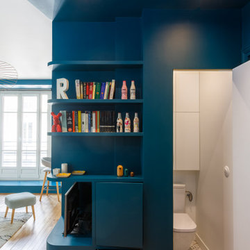
I colori scelti hanno delineato gli ambienti e ne hanno aumentato lo spazio . Il verde del living, nelle due tonalità, esprime rigenerazione e rinascita, portandoci a respirare più profondamente e trasmettendo fiducia e sicurezza. Favorisce l’abbassamento della pressione sanguigna stimolando l’ipofisi: l’ideale per la zona giorno! La palette cromatica comprende anche bianco che fa da tela neutra, aiutando ad alleggerire l’ambiente conferendo equilibrio e serenità.
La cucina è il cuore della casa, racchiusa in un “cubo” cromatico che infonde apertura e socialità, generando un ambiente dinamico e multifunzionale. Diventa il luogo per accogliere e condividere, accompagnati dal rosso mattone, colore che aumenta l’energia e stimola l’appetito
Réalisation d'une très grande porte d'entrée marine avec un mur bleu, une porte simple, une porte blanche, un sol marron, un plafond décaissé et du papier peint.
Inspiration pour un grand hall d'entrée design avec un mur bleu, parquet clair, une porte simple, une porte en bois foncé, un sol jaune, un plafond décaissé et du papier peint.
L'ingresso di casa c70 è la quinta scenica che filtra la zona giorno open space. Si caratterizza dal contrasto cromatico tra la vernice blu di pareti e soffitto e il bianco della vetrina in falegnameria realizzata su disegno. La parete in legno bianca nasconde una piccola cabina armadio e un soppalco.
Idée de décoration pour une entrée tradition de taille moyenne avec un mur bleu, un sol en carrelage de porcelaine, un sol beige et un plafond décaissé.
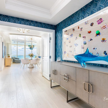
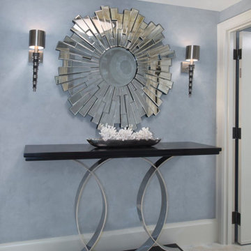
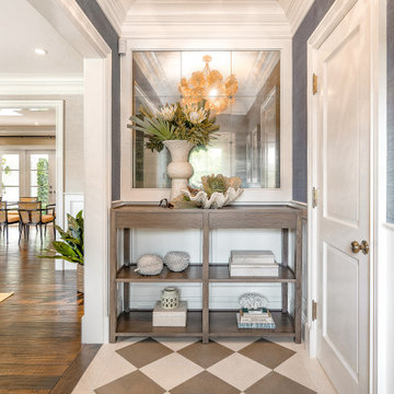
The foyer entryway view is a Fantastic First Impression.
Wallcoverings by Phillip Jeffries.4294 Batten Blue.
handcrafted.
Aménagement d'un hall d'entrée bord de mer de taille moyenne avec un mur bleu, parquet clair, une porte double, une porte blanche, un sol beige, un plafond décaissé et du papier peint.
Aménagement d'un hall d'entrée bord de mer de taille moyenne avec un mur bleu, parquet clair, une porte double, une porte blanche, un sol beige, un plafond décaissé et du papier peint.
Adding Architectural details to this Builder Grade House turned it into a spectacular HOME with personality. The inspiration started when the homeowners added a great wood feature to the entry way wall. We designed wood ceiling beams, posts, mud room entry and vent hood over the range. We stained wood in the sunroom to match. Then we added new lighting and fans. The new backsplash ties everything together. The Pot Filler added the crowning touch! NO Longer Builder Boring!
The historical Pemberton Heights home of Texas Governors Ma (Miriam) and Pa (James) Ferguson, built in 1910, is carefully restored to its original state.
Aménagement d'une entrée classique de taille moyenne avec un mur bleu, un sol en carrelage de porcelaine, un sol beige et un plafond décaissé.
L'ingresso di casa c70 è la quinta scenica che filtra la zona giorno open space. Si caratterizza dal contrasto cromatico tra la vernice blu di pareti e soffitto e il bianco della vetrina in falegnameria realizzata su disegno. La parete in legno bianca nasconde una piccola cabina armadio e un soppalco.
Idées déco pour un petit vestibule contemporain avec un mur bleu, parquet clair, une porte simple, une porte bleue et un plafond décaissé.
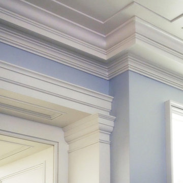
Traditional millwork and classical moldings done by our in-house team
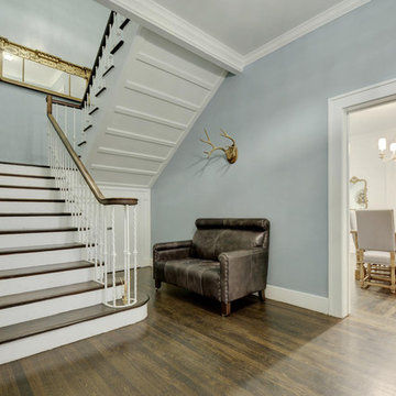
Cette photo montre un grand hall d'entrée tendance avec un mur bleu, parquet peint, une porte simple, une porte en bois brun, un sol marron, un plafond décaissé et du lambris.
Cette photo montre un grand hall d'entrée tendance avec un mur bleu, parquet peint, une porte simple, une porte en bois brun, un sol marron, un plafond décaissé et du lambris.
Idée de décoration pour une très grande entrée marine avec un couloir, un mur bleu, un sol marron, un plafond décaissé, du papier peint, une porte simple et une porte blanche.
Exemple d'un grand hall d'entrée tendance avec un mur bleu, parquet clair, une porte simple, un sol jaune, un plafond décaissé et du papier peint.
Beautiful white oak floored entry with private elevator
Inspiration pour un hall d'entrée traditionnel de taille moyenne avec un mur bleu, parquet clair, une porte simple, un sol blanc et un plafond décaissé.
Inspiration pour un hall d'entrée traditionnel de taille moyenne avec un mur bleu, parquet clair, une porte simple, un sol blanc et un plafond décaissé.
Idées déco d'entrées avec un mur bleu et un plafond décaissé
1