Idées déco d'entrées avec parquet clair et un sol en bois brun
Trier par :
Budget
Trier par:Populaires du jour
1 - 20 sur 38 172 photos
1 sur 3
Vue sur l'entrée
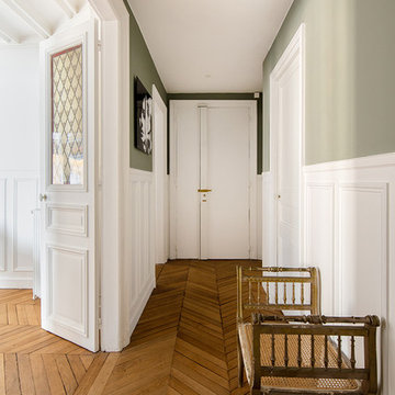
Inspiration pour une entrée traditionnelle avec un couloir, un mur vert, un sol en bois brun, une porte simple, une porte blanche et un sol marron.
Inspiration pour une entrée traditionnelle avec un couloir, un mur vert, un sol en bois brun, une porte simple, une porte blanche et un sol marron.
Dans cet appartement haussmannien un peu sombre, les clients souhaitaient une décoration épurée, conviviale et lumineuse aux accents de maison de vacances. Nous avons donc choisi des matériaux bruts, naturels et des couleurs pastels pour créer un cocoon connecté à la Nature... Un îlot de sérénité au sein de la capitale!
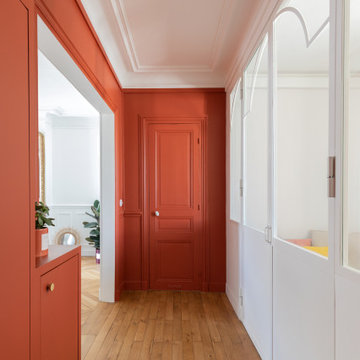
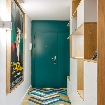
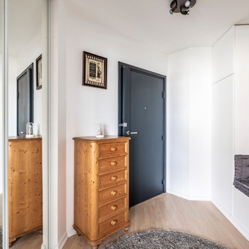
Aménagement d'un hall d'entrée contemporain de taille moyenne avec un mur rouge, un sol en bois brun, une porte simple, une porte rouge et un sol marron.
Shoootin
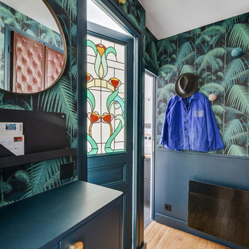
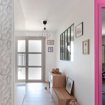
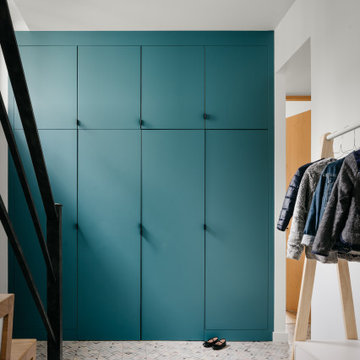
Réalisation d'une entrée design avec un mur multicolore, un sol en bois brun, une porte simple, une porte bleue et un sol beige.
Réalisation d'une entrée design avec un mur multicolore, un sol en bois brun, une porte simple, une porte bleue et un sol beige.
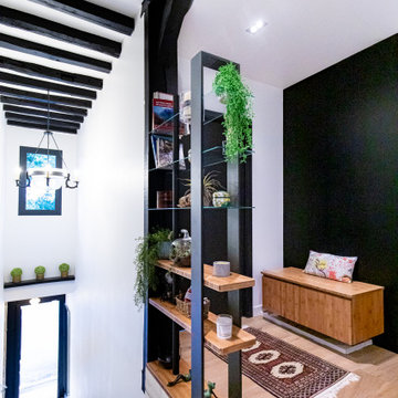
Nos équipes ont utilisé quelques bons tuyaux pour apporter ergonomie, rangements, et caractère à cet appartement situé à Neuilly-sur-Seine. L’utilisation ponctuelle de couleurs intenses crée une nouvelle profondeur à l’espace tandis que le choix de matières naturelles et douces apporte du style. Effet déco garanti!
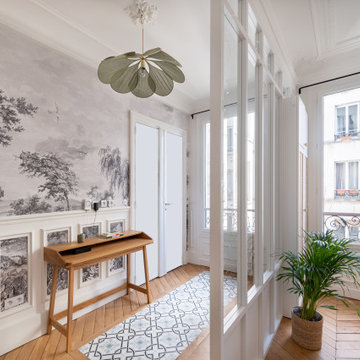
Aménagement d'une entrée bord de mer avec un couloir, un mur blanc, parquet clair, une porte simple, une porte blanche et un sol gris.
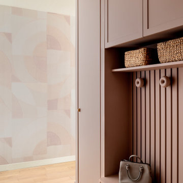
Cette photo montre une petite entrée scandinave avec un mur rose, parquet clair et du papier peint.
Réalisation d'une entrée tradition avec un mur blanc, parquet clair, une porte simple, une porte noire et un sol beige.
Résolument Déco
Exemple d'une entrée tendance de taille moyenne avec un mur blanc, parquet clair, un couloir, une porte simple, une porte blanche et un sol beige.
Exemple d'une entrée tendance de taille moyenne avec un mur blanc, parquet clair, un couloir, une porte simple, une porte blanche et un sol beige.
Rénovation appartement Neuilly sur Seine
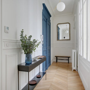
Idées déco pour un hall d'entrée classique de taille moyenne avec un mur blanc, parquet clair, une porte double et une porte bleue.
Idées déco pour un hall d'entrée classique de taille moyenne avec un mur blanc, parquet clair, une porte double et une porte bleue.
Nathan Brami
Idée de décoration pour un grand hall d'entrée design avec un mur blanc, parquet clair et un sol beige.
Idée de décoration pour un grand hall d'entrée design avec un mur blanc, parquet clair et un sol beige.
Cette image montre un hall d'entrée nordique avec un mur bleu, parquet clair et un sol beige.
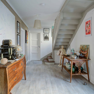
Exemple d'une entrée éclectique avec un mur blanc, un sol en bois brun, une porte simple, une porte noire et un sol marron.
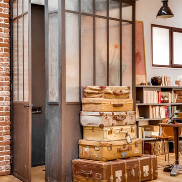
Photo de l'entrée fermée par une verrière type atelier. Le verre est structuré afin de ne pas être parfaitement transparent.
Un empilement de valises d'époques incitent au voyage.
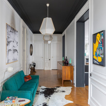
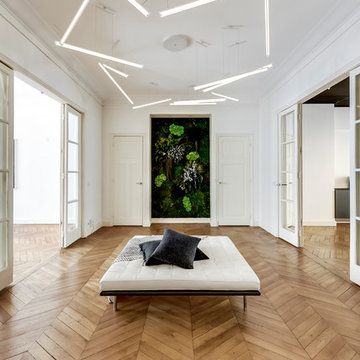
Cette image montre un grand hall d'entrée design avec un mur blanc, un sol en bois brun, une porte double, une porte blanche et un sol marron.
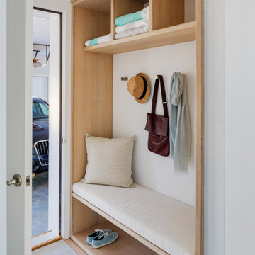
Réalisation d'une petite entrée design avec un vestiaire, un mur blanc, parquet clair et un sol beige.
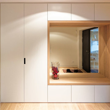
Foto: Jens Bergmann / KSB Architekten
Cette photo montre une très grande entrée tendance avec un mur blanc, parquet clair, un vestiaire et une porte simple.
Cette photo montre une très grande entrée tendance avec un mur blanc, parquet clair, un vestiaire et une porte simple.
Download our free ebook, Creating the Ideal Kitchen. DOWNLOAD NOW
For many, extra time at home during COVID left them wanting more from their homes. Whether you realized the shortcomings of your space or simply wanted to combat boredom, a well-designed and functional home was no longer a want, it became a need. Tina found herself wanting more from her Old Irving Park home and reached out to The Kitchen Studio about adding function to her kitchen to make the most of the available real estate.
At the end of the day, there is nothing better than returning home to a bright and happy space you love. And this kitchen wasn’t that for Tina. Dark and dated, with a palette from the past and features that didn’t make the most of the available square footage, this remodel required vision and a fresh approach to the space. Lead designer, Stephanie Cole’s main design goal was better flow, while adding greater functionality with organized storage, accessible open shelving, and an overall sense of cohesion with the adjoining family room.
The original kitchen featured a large pizza oven, which was rarely used, yet its footprint limited storage space. The nearby pantry had become a catch-all, lacking the organization needed in the home. The initial plan was to keep the pizza oven, but eventually Tina realized she preferred the design possibilities that came from removing this cumbersome feature, with the goal of adding function throughout the upgraded and elevated space. Eliminating the pantry added square footage and length to the kitchen for greater function and more storage. This redesigned space reflects how she lives and uses her home, as well as her love for entertaining.
The kitchen features a classic, clean, and timeless palette. White cabinetry, with brass and bronze finishes, contrasts with rich wood flooring, and lets the large, deep blue island in Woodland’s custom color Harbor – a neutral, yet statement color – draw your eye.
The kitchen was the main priority. In addition to updating and elevating this space, Tina wanted to maximize what her home had to offer. From moving the location of the patio door and eliminating a window to removing an existing closet in the mudroom and the cluttered pantry, the kitchen footprint grew. Once the floorplan was set, it was time to bring cohesion to her home, creating connection between the kitchen and surrounding spaces.
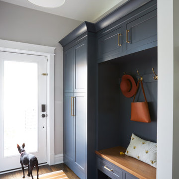
The color palette carries into the mudroom, where we added beautiful new cabinetry, practical bench seating, and accessible hooks, perfect for guests and everyday living. The nearby bar continues the aesthetic, with stunning Carrara marble subway tile, hints of brass and bronze, and a design that further captures the vibe of the kitchen.
Every home has its unique design challenges. But with a fresh perspective and a bit of creativity, there is always a way to give the client exactly what they want [and need]. In this particular kitchen, the existing soffits and high slanted ceilings added a layer of complexity to the lighting layout and upper perimeter cabinets.
While a space needs to look good, it also needs to function well. This meant making the most of the height of the room and accounting for the varied ceiling features, while also giving Tina everything she wanted and more. Pendants and task lighting paired with an abundance of natural light amplify the bright aesthetic. The cabinetry layout and design compliments the soffits with subtle profile details that bring everything together. The tile selections add visual interest, drawing the eye to the focal area above the range. Glass-doored cabinets further customize the space and give the illusion of even more height within the room.
While her family may be grown and out of the house, Tina was focused on adding function without sacrificing a stunning aesthetic and dreamy finishes that make the kitchen the gathering place of any home. It was time to love her kitchen again, and if you’re wondering what she loves most, it’s the niche with glass door cabinetry and open shelving for display paired with the marble mosaic backsplash over the range and complimenting hood. Each of these features is a stunning point of interest within the kitchen – both brag-worthy additions to a perimeter layout that previously felt limited and lacking.
Whether your remodel is the result of special needs in your home or simply the excitement of focusing your energy on creating a fun new aesthetic, we are here for it. We love a good challenge because there is always a way to make a space better – adding function and beauty simultaneously.
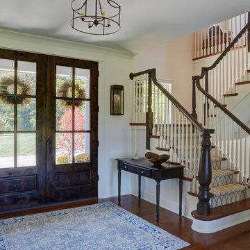
Front door is a pair of 36" x 96" x 2 1/4" DSA Master Crafted Door with 3-point locking mechanism, (6) divided lites, and (1) raised panel at lower part of the doors in knotty alder. Photo by Mike Kaskel
Idées déco d'entrées avec parquet clair et un sol en bois brun
1