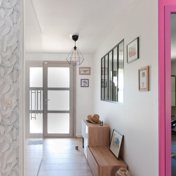
Idées déco d'entrées avec une porte violette et une porte blanche
Trier par :
Budget
Trier par:Populaires du jour
1 - 20 sur 21 164 photos
1 sur 3
Vue sur l'entrée
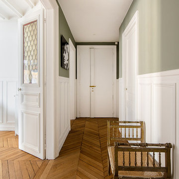
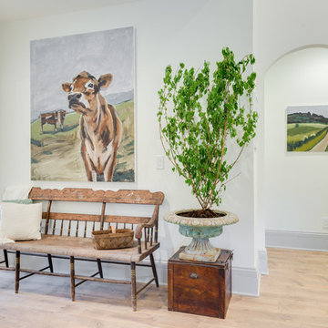
Inspiration pour une entrée traditionnelle avec un couloir, un mur vert, un sol en bois brun, une porte simple, une porte blanche et un sol marron.
Inspiration pour une entrée traditionnelle avec un couloir, un mur vert, un sol en bois brun, une porte simple, une porte blanche et un sol marron.
Dans cet appartement haussmannien un peu sombre, les clients souhaitaient une décoration épurée, conviviale et lumineuse aux accents de maison de vacances. Nous avons donc choisi des matériaux bruts, naturels et des couleurs pastels pour créer un cocoon connecté à la Nature... Un îlot de sérénité au sein de la capitale!
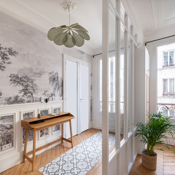
Aménagement d'une entrée bord de mer avec un couloir, un mur blanc, parquet clair, une porte simple, une porte blanche et un sol gris.
Stéphane Vasco
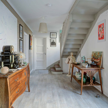
Réalisation d'un hall d'entrée bohème avec un mur gris, une porte simple, une porte blanche et un sol beige.
Réalisation d'un hall d'entrée bohème avec un mur gris, une porte simple, une porte blanche et un sol beige.
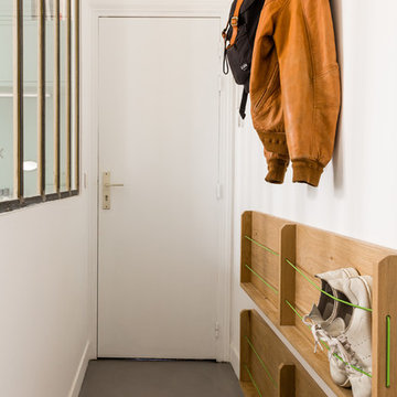
Entrée optimisée avec rangements chaussures sur-mesure
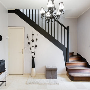
Réalisation d'une petite entrée design avec un couloir, un mur blanc, sol en béton ciré, une porte simple, une porte blanche et un sol gris.
Réalisation d'une petite entrée design avec un couloir, un mur blanc, sol en béton ciré, une porte simple, une porte blanche et un sol gris.
Résolument Déco
Exemple d'une entrée tendance de taille moyenne avec un mur blanc, parquet clair, un couloir, une porte simple, une porte blanche et un sol beige.
Exemple d'une entrée tendance de taille moyenne avec un mur blanc, parquet clair, un couloir, une porte simple, une porte blanche et un sol beige.
Cette image montre un grand hall d'entrée design avec un mur blanc, un sol en bois brun, une porte double, une porte blanche et un sol marron.
Download our free ebook, Creating the Ideal Kitchen. DOWNLOAD NOW
For many, extra time at home during COVID left them wanting more from their homes. Whether you realized the shortcomings of your space or simply wanted to combat boredom, a well-designed and functional home was no longer a want, it became a need. Tina found herself wanting more from her Old Irving Park home and reached out to The Kitchen Studio about adding function to her kitchen to make the most of the available real estate.
At the end of the day, there is nothing better than returning home to a bright and happy space you love. And this kitchen wasn’t that for Tina. Dark and dated, with a palette from the past and features that didn’t make the most of the available square footage, this remodel required vision and a fresh approach to the space. Lead designer, Stephanie Cole’s main design goal was better flow, while adding greater functionality with organized storage, accessible open shelving, and an overall sense of cohesion with the adjoining family room.
The original kitchen featured a large pizza oven, which was rarely used, yet its footprint limited storage space. The nearby pantry had become a catch-all, lacking the organization needed in the home. The initial plan was to keep the pizza oven, but eventually Tina realized she preferred the design possibilities that came from removing this cumbersome feature, with the goal of adding function throughout the upgraded and elevated space. Eliminating the pantry added square footage and length to the kitchen for greater function and more storage. This redesigned space reflects how she lives and uses her home, as well as her love for entertaining.
The kitchen features a classic, clean, and timeless palette. White cabinetry, with brass and bronze finishes, contrasts with rich wood flooring, and lets the large, deep blue island in Woodland’s custom color Harbor – a neutral, yet statement color – draw your eye.
The kitchen was the main priority. In addition to updating and elevating this space, Tina wanted to maximize what her home had to offer. From moving the location of the patio door and eliminating a window to removing an existing closet in the mudroom and the cluttered pantry, the kitchen footprint grew. Once the floorplan was set, it was time to bring cohesion to her home, creating connection between the kitchen and surrounding spaces.
The color palette carries into the mudroom, where we added beautiful new cabinetry, practical bench seating, and accessible hooks, perfect for guests and everyday living. The nearby bar continues the aesthetic, with stunning Carrara marble subway tile, hints of brass and bronze, and a design that further captures the vibe of the kitchen.
Every home has its unique design challenges. But with a fresh perspective and a bit of creativity, there is always a way to give the client exactly what they want [and need]. In this particular kitchen, the existing soffits and high slanted ceilings added a layer of complexity to the lighting layout and upper perimeter cabinets.
While a space needs to look good, it also needs to function well. This meant making the most of the height of the room and accounting for the varied ceiling features, while also giving Tina everything she wanted and more. Pendants and task lighting paired with an abundance of natural light amplify the bright aesthetic. The cabinetry layout and design compliments the soffits with subtle profile details that bring everything together. The tile selections add visual interest, drawing the eye to the focal area above the range. Glass-doored cabinets further customize the space and give the illusion of even more height within the room.
While her family may be grown and out of the house, Tina was focused on adding function without sacrificing a stunning aesthetic and dreamy finishes that make the kitchen the gathering place of any home. It was time to love her kitchen again, and if you’re wondering what she loves most, it’s the niche with glass door cabinetry and open shelving for display paired with the marble mosaic backsplash over the range and complimenting hood. Each of these features is a stunning point of interest within the kitchen – both brag-worthy additions to a perimeter layout that previously felt limited and lacking.
Whether your remodel is the result of special needs in your home or simply the excitement of focusing your energy on creating a fun new aesthetic, we are here for it. We love a good challenge because there is always a way to make a space better – adding function and beauty simultaneously.
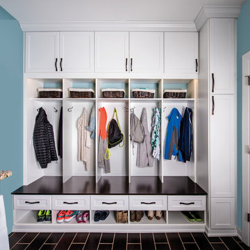
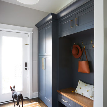
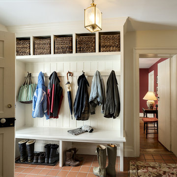
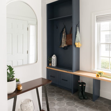
Keeping track of all the coats, shoes, backpacks and specialty gear for several small children can be an organizational challenge all by itself. Combine that with busy schedules and various activities like ballet lessons, little league, art classes, swim team, soccer and music, and the benefits of a great mud room organization system like this one becomes invaluable. Rather than an enclosed closet, separate cubbies for each family member ensures that everyone has a place to store their coats and backpacks. The look is neat and tidy, but easier than a traditional closet with doors, making it more likely to be used by everyone — including children. Hooks rather than hangers are easier for children and help prevent jackets from being to left on the floor. A shoe shelf beneath each cubby keeps all the footwear in order so that no one ever ends up searching for a missing shoe when they're in a hurry. a drawer above the shoe shelf keeps mittens, gloves and small items handy. A shelf with basket above each coat cubby is great for keys, wallets and small items that might otherwise become lost. The cabinets above hold gear that is out-of-season or infrequently used. An additional shoe cupboard that spans from floor to ceiling offers a place to keep boots and extra shoes.
White shaker style cabinet doors with oil rubbed bronze hardware presents a simple, clean appearance to organize the clutter, while bead board panels at the back of the coat cubbies adds a casual, country charm.
Designer - Gerry Ayala
Photo - Cathy Rabeler
Tom Crane
Réalisation d'une entrée de taille moyenne avec un vestiaire, un mur blanc, sol en béton ciré, une porte simple, une porte blanche et un sol gris.
Réalisation d'une entrée de taille moyenne avec un vestiaire, un mur blanc, sol en béton ciré, une porte simple, une porte blanche et un sol gris.
Nat Rea Photography
Inspiration pour un hall d'entrée traditionnel avec un mur blanc, parquet foncé, une porte simple et une porte blanche.
Inspiration pour un hall d'entrée traditionnel avec un mur blanc, parquet foncé, une porte simple et une porte blanche.
Angle Eye Photography
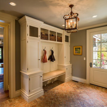
Cette photo montre une grande entrée chic avec un sol en brique, un vestiaire, un mur gris, une porte simple et une porte blanche.
Cette photo montre une grande entrée chic avec un sol en brique, un vestiaire, un mur gris, une porte simple et une porte blanche.
Exemple d'une entrée nature de taille moyenne avec un couloir, un mur blanc, une porte simple, une porte blanche, un sol marron et parquet clair.
Rob Karosis
Cette image montre une entrée rustique avec un vestiaire, un mur beige, une porte simple et une porte blanche.
Cette image montre une entrée rustique avec un vestiaire, un mur beige, une porte simple et une porte blanche.
Cette image montre une grande entrée traditionnelle avec un vestiaire, une porte simple, une porte blanche et un sol gris.
Architectural advisement, Interior Design, Custom Furniture Design & Art Curation by Chango & Co
Photography by Sarah Elliott
See the feature in Rue Magazine
After receiving a referral by a family friend, these clients knew that Rebel Builders was the Design + Build company that could transform their space for a new lifestyle: as grandparents!
As young grandparents, our clients wanted a better flow to their first floor so that they could spend more quality time with their growing family.
The challenge, of creating a fun-filled space that the grandkids could enjoy while being a relaxing oasis when the clients are alone, was one that the designers accepted eagerly. Additionally, designers also wanted to give the clients a more cohesive flow between the kitchen and dining area.
To do this, the team moved the existing fireplace to a central location to open up an area for a larger dining table and create a designated living room space. On the opposite end, we placed the "kids area" with a large window seat and custom storage. The built-ins and archway leading to the mudroom brought an elegant, inviting and utilitarian atmosphere to the house.
The careful selection of the color palette connected all of the spaces and infused the client's personal touch into their home.
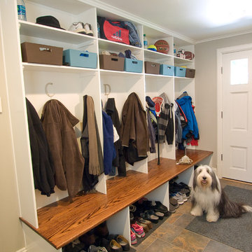
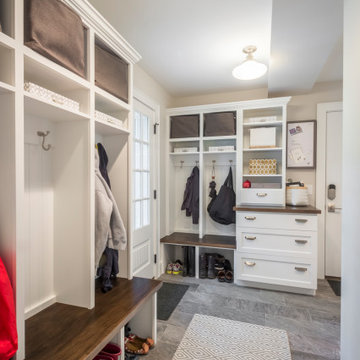
The room that gets talked about the most is the mudroom. With two active teenagers and a busy lifestyle, organization is key. Every member of the family has his or her own spot and can easily find his or her outerwear, shoes, or athletic equipment. Having the custom made oak bench makes changing foot gear easier. The porcelain tile is easy to maintain.
Photo by Bill Cartledge
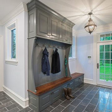
This stately Georgian home in West Newton Hill, Massachusetts was originally built in 1917 for John W. Weeks, a Boston financier who went on to become a U.S. Senator and U.S. Secretary of War. The home’s original architectural details include an elaborate 15-inch deep dentil soffit at the eaves, decorative leaded glass windows, custom marble windowsills, and a beautiful Monson slate roof. Although the owners loved the character of the original home, its formal layout did not suit the family’s lifestyle. The owners charged Meyer & Meyer with complete renovation of the home’s interior, including the design of two sympathetic additions. The first includes an office on the first floor with master bath above. The second and larger addition houses a family room, playroom, mudroom, and a three-car garage off of a new side entry.
Front exterior by Sam Gray. All others by Richard Mandelkorn.
Bohemian-style foyer in Craftsman home
Réalisation d'un hall d'entrée bohème de taille moyenne avec un mur jaune, un sol en calcaire, une porte simple, une porte blanche, un sol jaune et boiseries.
Réalisation d'un hall d'entrée bohème de taille moyenne avec un mur jaune, un sol en calcaire, une porte simple, une porte blanche, un sol jaune et boiseries.
Idées déco d'entrées avec une porte violette et une porte blanche
1