


Activité récente


I would not lower the blinds.
paint the wall the same color as the blinds and all the mechanics so it blends into the wall.

My only commennt, pretty view!
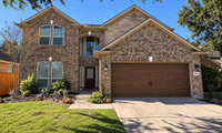
Wood tone, as in “faux”. In my experience real wood garage doors & gates weather very quickly, even in my mild climate. I had beautiful custom wood gates at my previous home, they were beautiful but I had to have them refinished, maintained on a yearly schedule,. &, as I stated, I live in a mild climate ( beach, So Cal ). Not cheap.

Love a wood door on the garage. I would try to get something with a darker stain to complement your lovely brick.

Yes, but I guess how big the fence will be & how visible from your house? That would affect my answer but I think , generally, white will be fine.

The trash cans are directly across from the door in the picture. Maybe 20 feet or so.
Yes, vinyl. We just demoed the previous wood fence and shed. We live in a brutal climate. Wind, cold, heat, salt air. The fence will be 18 feet long on a patio that is maybe 30 feet across. There is a hedge. I will take a picture in the morning. It is too darl now.
White should work well here since it picks up your white trim and will contrast nicely with the grey pavers and chairs. A couple of planters in front will soften that bright look a lot. With the wind and cold you mentioned, it's also worth asking the installer how deep the posts are going. A common guide is about a third to a half of the post below ground and below the frost line, with some gravel at the base for drainage, so the fence stays straight through winter heave. Hope that helps.
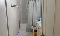
Have you thought about ordering a Samplize of Pale oak? . That would be helpful because you can then move it around different walls & fixtures in the room.
Have you considered ditching the shower curtain and instead installing a glass shower door? The kind that sits on top of the bathtub edge and has two panels that slide past each other. You can get one that has either clear glass or a subtle patterned glass. I think that would look better than a curtain. And, if you want, the outer sliding panel can have a bar for hanging a towel or bath mat. It's a much "cleaner" look than a drape-y shower curtain. Then you have lots of possibilities for a runner and towels.
I like a ple watery colored wall in bathrooms much more than a beige tone and a nice shower screen with hinged door is my go to insted of a shower curtain This is my fave .I would aslo match all the metal and ditch that rug and get a nice plain rug with that floor.

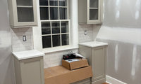
What color are your cabinets?

With golden oak floors, undertone is the whole game. Beiges and greiges with pink or violet bases will fight the floor, while warm whites, soft sages and muted blue-greens sit comfortably next to golden oak because blue-green complements those orange tones. Whatever you shortlist, paint large sample boards and lean them against the floor, not just the cabinets, and check them at night under your actual kitchen lighting before deciding.

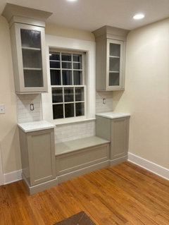
Off beige toupe.

Muted sage green.
Many colours that can work such a personal choice
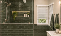
Since you plan on selling within 3 years I would just fix what needs fixing & call it a day. So many odd comments …. I hang my towels on hooks, no problem re them drying & I’ve had skylights in all of my homes ( except in my current ”glass box” ) & never had a leak , including the five in my previous 50 year old home.

Hi Norwood architects, this is my shower just different tile. And no, very little water comes out of the shower. I can see why you think that because I did not provide the measurements. I don’t have any problem with wet towels either. I know people don’t like hooks either.

Nice direction. One thing worth checking before you price it out: AI images often invent finishes and proportions that don't exist as real products, so the tile, vanity and lighting may look quite different once you specify the actual items. Pick the real tile and fixtures first and compare them against the image. For resale in 3 years, the white version is the safer bet; the green is lovely but more personal.
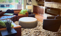

The two you are choosing do not look better than your current rug. I would just keep your original rug or look for a new one.
The pattern on the 2 options are fighting with the fireplace and decor.

I would consider a rug with less contrast in the pattern. I don't think you require a custom size. A 9x12 would likely work for your setting.


These are from RugsDirect.com
We had plantation shutters throughout my previous home at the beach here in So Cal. I really don’t understand the comments re ”blocking the view”. Ours had no center wand, wide vanes, & certainly didn’t block the ocean views ( which are very expensive here ).
That’s what we had ( 4.5 ”) with no center verticle wand ( or whatever its called ).

^^^
An attractive install is a marriage of inside window casing depth, blade depth. Outside mounts are less desirable....
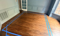
Rectangular

I do not like the pattern of the rug in room with all the other applied trim under the chair rail. Plus the style is more Ralph Lauren library and does not compliment the other rugs.
Suggest the desk goes between the sconces with art between the lights. Love seat in the bay window.
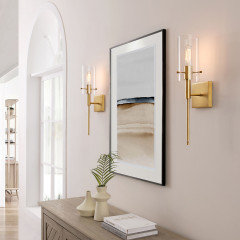
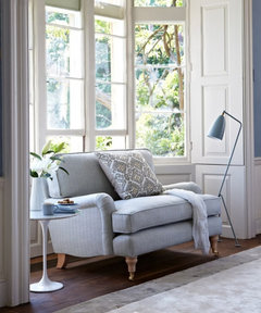
Choose the size of the rug to accommodate the bay window and sofa. The 8 x 10 is too big for the room. Measure out a 5 x9 and a 6x8, centering on the window. Show more of the lovely floors.

I agree that you should figure out the furniture layout first, and then the rug size.
You have such beautiful floors so you don't want more coverage than you need. The desk and chair don't seem to work with the 8 x 10 rug, since the chair will be on and off the rug when it's moved. As long as the front legs of the settee and chair are on the rug you could probably get away with a 6 x 8 or 5 x 9. But "take the magic out" and do the furniture plan to scale before buying anything.
Your recommendations ( so many questions & considerations ) are best answered onsite by a professional. What do you consider ” not long term”? That answer alone would impact my recommendation for starters.
Your shower sounds very small & a sauna is a real “niche” feature ( I wouldn’t want one, but ymmv ).
Thanks. This is pretty helpful. I was leaning towards the custom option, but my husband said who cares what it looks like if the prefab works for our current needs, and we can always install a freestanding tub when we go to sell. These are good options to consider. I will block the window over the weekend and see how it feels. There is a lot of light that already comes from the bedroom so we will see. The only other true options are using half of my master closet for a prefab unit or the patio which would definitely block light from coming in and also impact the usage if that space. The tub is truly the only option that feels viable.

I'd strongly caution against a prefab. They are not a very good experience and a many people stop using them after a brief time. There's a reason why you don't see them in Europe - they know better.
Your money though.
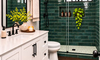
lovely. although I can tell you from experience, black fixtures do not maintain their color over time

Do you have a locally owned tile store in your area? the folks who work there are often super knowledgable and can help you select the best tiles
it’s personal preference but I’d be looking at warm whites and grays with chrome fixtures for sparkle (chrome also wears very well)

Pea gravel driveways are beautiful. Those castles in England, wineries in Italy. You know how they stay looking like that? Staff. When we were in Italy we watched the manager rake the drive every morning. Weeds love pea gravel. So do sneakers. String trimmers will throw them into your windows (weeeee!!!)


I'd go with a very warm cream, like SW Creme or a very pale color like SW Glimmer. A very light tan like River's Edge would work with your windows, too. You don't want to look too much like your neighbor. Then, pick a bright color for your door. A dark green or blue with Glimmer, a red or brown, like Jalapeno for River's edge.
I'm an avid gardener and I never recommend window boxes. They are very hard to keep looking good and a straggly or empty window box detracts, rather than enhances.
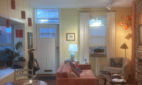
I would do white to blend with the ceiling.
I have fans on my covered lanai and used bronze/brown because it blends in with the medium stained wood ceiling. For me, fans are utilitarian and not design items that need to be highlighted.
Since you already have the smaller version & like it I would. It will save you the hassle of shopping for another ( since I hate shopping that would be a win for me ).

I would try the smaller BR rug in the LR first to make sure it looks good, before buying a larger one.

totally fine, nobody's doing a rug audit. the only thing i'd watch is scale. a rug that works in a bedroom under the foot of the bed usually needs to be bigger in a living room so the front legs of the sofa and chairs sit on it. if the pattern is calm, using it twice just reads as a consistent look across the house.
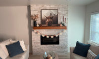

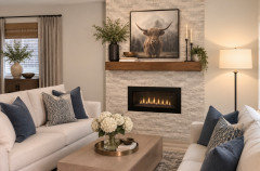
I wouldn’t add, as the distance to couches looks tight and may feel too cramped/cluttered. To create interest and balance, hope below helps. Room will benefit by additional lighting and drapery will help fill in the other side.
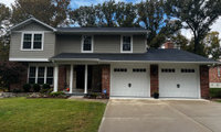
I think your house looks better without them. i like your new trim very much.
No shutters on your lovely home. Shutters are not decoration. Shutters are architectural and belong on a traditional style home. Shutters should not be vinyl, attached to the siding, and should have appropriate, authentic hardware. Your home, a raised ranch, was not meant to have shutters.
My one thought is the white of the garage doors:

No shutters it is perfect
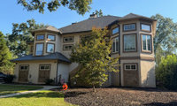
Lyn Nielson’s suggestion is best. All those dark frames around all those windows are jarring, gives a ”chopped up” look. Simplify.
i'm with the folks saying tie the trim and windows together first. with urbane bronze on the roof, i'd keep stucco in a warm greige, one or two shades off the stone so it reads like one palette. trim a touch lighter than the stucco, not stark white. then do the front door in a deep color like oxblood or dark green to pop. get big samples on the actual wall and check them morning and evening before you commit.

I agree with Lyn and Boss Design Center — the biggest win here isn't picking a stucco color in isolation, it's getting rid of that rectangle-within-a-rectangle effect. Right now those dark frames are the first thing you see, and they make the house look busier than it is. Painting the trim and stucco the same warm greige, or within a shade or two of each other, will let the stone and the shape of the house do the talking.
Virtual Taupe and Intellectual Gray are both sensible places to start, since they sit well with Urbane Bronze, but don't judge them on a chip. Paint big test patches on the actual wall — one in full sun, one in shade — and check them morning and evening, because stucco shifts a lot in changing light. I'd stay warm rather than cool, so the color works with the tan windows and the stone instead of fighting them, and keep the trim just a touch lighter than the body rather than stark white. A deep front door — Urbane Bronze itself, or a dark green — would give you the contrast in one focused spot, and from a curb-appeal standpoint that kind of calm, unified exterior tends to photograph and show much better than a high-contrast one.
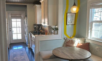
Is your ceiling tin? Haven’t you posted this dilemma before? For some reason I remember your kitchen.
I have a tin ceiling and changing my walls to white instead of blue really helped the room feel less cold. I also added lights on top of my cabinets to illuminate the dark shadowed areas above the cabinets. I still contemplate painting them white to look more like plaster which was why they were originally added to mimic but my family loves them tin.
It might not be warmer but I could see how playing up a french bistro theme subtly might improve the room. It looks like a newer room so I might play with decorating before a reno.
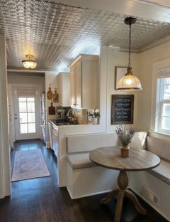
Here is no changes other than painting the tin ceiling white which was often how it would have been in the 20s.
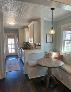
Lots of good advice already
if it were me, I’d start with painting the ceiling (matte) and replacing the mini blind with a bamboo shade to warm it up (i’d want the door and window treatments to match, but that’s a me thing)
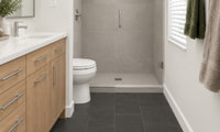
I like shower niches. My primary home doesn’t have any in all 3 baths, drives me crazy. Since I wash & condition my hair daily I’ve resorted to placing the bottles on a high window ledge, my second home has shower niches in all the baths, I much prefer that.
cgs, a niche on the control wall may stay drier if it’s outside the direct spray, but I wouldn’t assume that wall will stay dry; hand-shower angle and splash matter. Mock the niche and ledge with tape and your actual bottles before settling on a height. With just 29 inches at the entry, check how a 4-inch ledge affects the clear opening. Have the installer follow Wedi’s waterproofing details, and ask Wedi or a licensed tile pro before changing the assembly.
Is this an actual photo of exactly what your bathroom will look like? Assume those are 12 x 24” floor tiles? When our tiling contractor did a very similar floor in our kitchen, he said tiles should be layed in a pattern that is 1/3rd offset vs. 1/2 offset as shown here - for proper stability.


"our builder has been helping us with the design process"

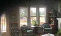
Since I dislike drapes take my comment with a grain ….. I prefer ( & have flat Roman shades on all my windows with the exception of a large, 18’ + wide, expanse of glass where I have solar shades) . FYI, I’ve never had a problem with the shades hanging level, it’s not difficult, lol. There are many styles & endless fabric choices for them….. I’ve had them in every home I’ve owned, but you should get what you like & are comfortable with.
This is what chat gpt designed https://chatgpt.com/s/m_6af06f8022888191ad416591bacf96d1
The pic is quite fuzzy so hard to help with the color or fabric . It is even hard to see the crown molding so maybe post a much clearer picture.ChatGPT shows IMO a lot of window covering for a small space
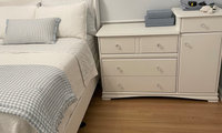
Thank you Maureen; yes after posting, i did read a lamp between 24-27 inches would be suitable. one lamp is 24 and other is 27 😬 not sure which way to go; I guess I may get both and see which looks best in person. Thank you for the lamp/ art suggestions. All very pretty! I had thought about a blue lamp , but paused as in the event she / we want to change wall/ decor colors down the line - its one less thing to have to change. Havent written it off, but seeing how glass lamps may work first. Will keep looking for some blue lamps to consider.
Yes, I will be adding art above the dresser. Love that piece you suggested . May look into that suggestion for an accent piece for a different wall , as I think a vertical piece may work better over the dresser (?) Haven’t gotten there yet- LOL
Patricia Colwell Consulting… are you questioning why I am asking this question and not my daughter? i dont understand what you’re comment has to offer
Thanks la_la Girl ! I love how the paint looks. Its BM Lily White- a soft, muted light blue- gray. Dreamy color and so serene! i love it . The dresser is 21 deep .
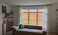

Are curtains necessary? This is such a gorgeous view I'm not sure about covering any of it up.
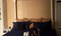
I like the wall covering, the bedding not so much.
Thank you everyone. i have decided to keep bed for now and change paper to lighter more neutral sand color. and change beddinng. will post pics when done
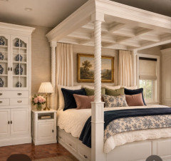

I’d actually keep the wallpaper. To me, the alternative looks similar enough that changing it wouldn’t make much difference. What feels unfinished is the decorating around it. Some colour and wall decor could balance the yellow tone, and your blue pillows already make a lovely combination with it.
I’d consider painting the recessed squares in the ceiling above the bed a shade of blue, perhaps a lighter blue that ties in with the pillows and bedding, while keeping the beams white. Then I’d hang a painting above the bed. There doesn’t seem to be room on the right, but a narrow decorative wall piece on the left could help finish the space.
For more bedroom ideas, here’s our video showing one bedroom redesigned in three different styles, with different combinations of colour, lighting and decor: https://youtu.be/nEcPGozCbFY
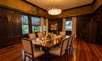
Having a birdcage or not having a birdcage is not going to sell the house. It looks like a beautiful home, so if it's priced right it will sell.
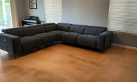
I went through the same thing with our sectional and ended up with a rectangular rug and a round coffee table. The round table was the best part, honestly, because nobody bangs a shin on a corner when they walk around it, and it softens all those straight lines. I did the same sheet test on our floor before ordering, and it is what kept me from buying one that was too small.
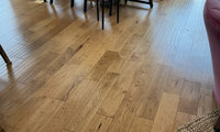
They look like the floors in my previous home. Mine changed color too,it didn’t bother me. Since my current home is at least 75% glass I had the west, south & east facing glass treated with a clear UV protectant, also have solar shades which I rarely close. Mine were tinted to protect art.
Start with Bona NaturalSeal or NordicSeal which has a very minimum amount of white pigment. Sand to remove water raised grain. 2-3 coats water based two part clear poly in matte or ultra matte finish. Bona Traffic HD has UV stabilizers to resist future finish yellowing. Loba 2K is another made to maintain a raw just sanded look. Avoid oil modified water based products. Go 100% acrylic/urethane. Ciranova Woodlook Plus as the sealer has a minimum white tinge. Fortico 2C topcoats in ultra matte provide commercial grade scratch resistance and UV stabilizers.

@dan1888 Thank you so much for your suggestions!
Am just not sure that any backsplash is going to lessen the impact of those cabinets. The cabinet color is strong and the scrolling in the doors is pronounced. Even if you painted the cabinetry you would still have the scrolling to deal with. If the boxes of the cabinets are in good shape you could have the doors replaced.