Houzz Tour: A Trip to Japan Inspires a Texas Bungalow Makeover
Newlyweds’ love of beautiful materials, minimalism and midcentury modern style informs their first home

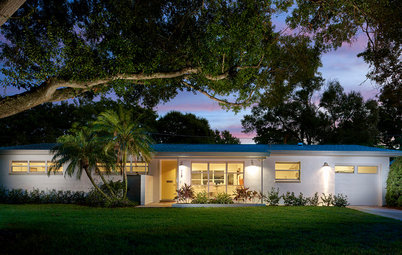
Before: “We wanted the house to feel the same from the exterior,” Hughey says. The bungalow was built in 1930 and saw two additions by the time Hughey and Jayne bought it. One of the additions created the carport at left and a small utility room. If you compare this photo with the previous one, you can see the office that Hughey and Jayne added where the carport once stood.
Aesthetically, they kept the original house intact. They painted the existing siding a black with a hint of green in it and replaced the windows and doors, which were in poor condition. “We found out that the house originally had two windows where the picture window was, so we restored that original detail,” Hughey says. They also replaced the metal posts with simple wooden ones.
Find a local architect on Houzz
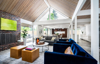
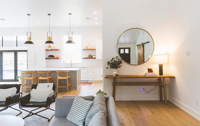
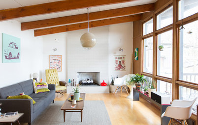
Opening Up the Floor Plan
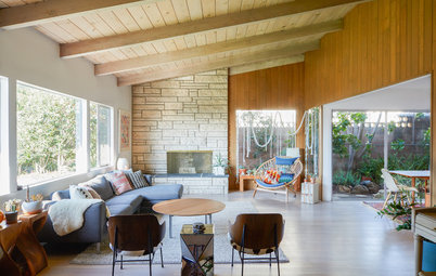
The couple removed a wall that wasn’t load-bearing between the kitchen and the living room. They are frequent hosts and knew that the open setup would be better for entertaining. Working within a tight budget, they chose their splurges carefully. The two most important ones were raising the ceiling over the kitchen and putting skylights in it, and opening up the house to the backyard with a wall of glass. “From the moment you walk into the house, you see the sunlight from the skylights above the kitchen and a view all the way through to the green outside,” Hughey says.
They used two elements to delineate the two spaces within the open plan: the vaulted ceiling and the peninsula.
The couple combined their furniture when they moved in together, and since they both love midcentury modern pieces, it worked out well. They bought the sofa and the painting above it for the new house.
Before: A wall divided the living room from the kitchen.
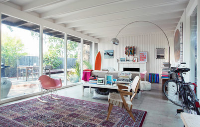
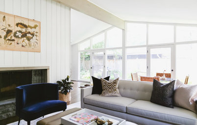
“We thought about how we’d function in here — mostly sitting and being lower, so the lower ceiling works for us,” Hughey says. The low-slung furniture suits the ceiling height. The painting by Japanese artist Mizuki Goto adds a vertical element.
Fine-Tuning the Circulation
Before: A strange partial door hid the old HVAC system. The doorway to the left led right into the home’s only bathroom. “It’s not great to be sitting on your sofa looking into a bathroom,” Jayne says. A bedroom is through the doorway to the right.
Before: A strange partial door hid the old HVAC system. The doorway to the left led right into the home’s only bathroom. “It’s not great to be sitting on your sofa looking into a bathroom,” Jayne says. A bedroom is through the doorway to the right.
They cleaned up that wall by moving the HVAC equipment to the attic. Then they created a hallway that leads to their master bedroom and the bathroom (to the left of the TV). This left room for the TV and a midcentury media console along the wall.
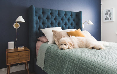
The couple decided that they would rather have two gracious bedrooms and a walk-in closet than three bedrooms with hardly any storage. By getting rid of the small third bedroom, they gained space for their master bedroom, a large master closet, the hallway and a kitchen appliance niche.
The couple decided that they would rather have two gracious bedrooms and a walk-in closet than three bedrooms with hardly any storage. By getting rid of the small third bedroom, they gained space for their master bedroom, a large master closet, the hallway and a kitchen appliance niche.
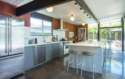
A Minimalist Kitchen Scheme
Hughey and Jayne were inspired by the black, white and wood palettes they saw in Japan. They wrapped the kitchen peninsula in hickory. “Hickory is a really hard wood, and we chose it for its durability and aesthetic,” Hughey says. They used a matte stain to protect it and maintain its natural look. The sides of the peninsula appear to be an extension of the flooring, which is an engineered hickory laminate.
Hughey and Jayne were inspired by the black, white and wood palettes they saw in Japan. They wrapped the kitchen peninsula in hickory. “Hickory is a really hard wood, and we chose it for its durability and aesthetic,” Hughey says. They used a matte stain to protect it and maintain its natural look. The sides of the peninsula appear to be an extension of the flooring, which is an engineered hickory laminate.
As for the kitchen layout, they knew that they didn’t have room for a dining table and an island, so they went with an L shape and put the table in the middle. “The kitchen table doubles as workspace,” Hughey says.
They splurged on lighting, which includes 4-by-4-inch square recessed lights and a few choice fixtures. They saved money by using the engineered hickory laminate for the floor and by having Semihandmade semicustomize ready-made cabinets.
Shop for modern white pendant lights
They splurged on lighting, which includes 4-by-4-inch square recessed lights and a few choice fixtures. They saved money by using the engineered hickory laminate for the floor and by having Semihandmade semicustomize ready-made cabinets.
Shop for modern white pendant lights
“Neither of us likes the look of lots of appliances, especially within view from the front door,” Hughey says. So they clustered the wall ovens, the panel-front fridge and lots of storage on the right side of the space.
They used some space from the third bedroom to create a niche enabling them to tuck the appliances off to the side. This means that when they walk in the front door, they look straight through the glass sliding doors to the yard without seeing appliances. This also left room for the floor-to-ceiling window to the right of the sliding doors, which expanded the backyard view. The slot on the left is for a project still on Hughey’s honey-do list — it’s where curtains for the wall of glass will hide.
By concentrating the storage in the niche, they were able to keep the opposite wall free of cabinets. This makes the kitchen feel larger, lighter and closer to the minimalist Japanese aesthetic they both admired on their trip.
By concentrating the storage in the niche, they were able to keep the opposite wall free of cabinets. This makes the kitchen feel larger, lighter and closer to the minimalist Japanese aesthetic they both admired on their trip.
Small Details Matter
To emphasize the three-quarter-inch thickness of the Silestone countertops and the clean lines of the wood cabinets, they had the contractor install black-painted MDF between the counters and the top of the cabinetry. The black that appears in the small reveal ties to the appliance wall.
To emphasize the three-quarter-inch thickness of the Silestone countertops and the clean lines of the wood cabinets, they had the contractor install black-painted MDF between the counters and the top of the cabinetry. The black that appears in the small reveal ties to the appliance wall.
Another detail worth noting is that they installed the 1-inch hexagonal white backsplash tile flush with the drywall and then capped it with long hickory shelves to enhance the minimalist look. A matte black faucet paired with a black granite composite sink by Blanco complete the scheme.
Learn more about granite composite sinks
Learn more about granite composite sinks
Making the Only Bathroom Count
Before: Besides its awkward door placement, the bathroom was dated, had limited storage and had a low tub that wasn’t conducive to a satisfying soak.
Before: Besides its awkward door placement, the bathroom was dated, had limited storage and had a low tub that wasn’t conducive to a satisfying soak.
After: Moving the HVAC unit to the attic increased the size of the bathroom to 5½ by 11 feet. Because the existing layout was awkward and they wanted to move the entrance to the bathroom, they had to move around the plumbing fixtures, a worthwhile splurge.
They decided to keep a tub-shower combo since they plan to have kids someday. But they replaced the low tub with a deeper soaking tub. A budget-saving ready-made vanity provides large drawers for storage. They also used cost-effective subway tiles for the walls and surround and laid them out in a modern grid pattern. The big bathroom splurge was the hexagonal black marble tile for the floor. “It’s just so striking with the white veins in it, and it really stands out,” Hughey says.
Find a floating vanity with modern style in the Houzz Shop
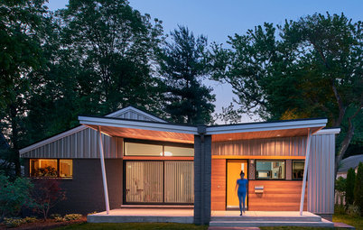
A New Office
Through the kitchen is an entrance to the new 100-square-foot addition. It primarily serves as Jayne’s office since she works from home full time. The addition also contains a new laundry room and utility closet. The couple plan to put Japanese tatami mats in the loft area, at top left, for a children’s fort and are considering setting it up as an overflow guest sleeping space as well.
Through the kitchen is an entrance to the new 100-square-foot addition. It primarily serves as Jayne’s office since she works from home full time. The addition also contains a new laundry room and utility closet. The couple plan to put Japanese tatami mats in the loft area, at top left, for a children’s fort and are considering setting it up as an overflow guest sleeping space as well.
Takeaways
- Write a letter to the homeowner when you’re in a bidding war for your dream house. It may just give you an edge.
- Research your home’s history when remodeling to restore any original elements that may have been replaced over the years.
- Consider the views from the front door when planning the layout.
- Think about using low-slung furniture when you have low ceilings.
- If you plan to stay for a while, consider your own needs and the way you live rather than resale. In this case, two gracious bedrooms, a walk-in closet and a pleasing layout outweighed the resale value of having a third bedroom.
More on Houzz
Read about other remodeled homes
Find a pro for your home project
Shop for home products

Sponsorisé
Rechargez la page pour ne plus voir cette annonce spécifique
House at a Glance
Who lives here: Architect Ed Hughey and graphic designer Valerie Jayne
Location: Austin, Texas
Size: 1,100 square feet (102 square meters); two bedrooms plus office, one bathroom
To celebrate their engagement, architect Ed Hughey and graphic designer Valerie Jayne took a trip to Japan and came back inspired to design the home they would share. They were drawn to the minimalist material and color palettes they saw in Japanese buildings and the simplified lifestyle that works well in small spaces there.
When they returned, a bungalow came up for sale in the Holly neighborhood of Austin, Texas, in an ideal spot only about a half-mile from downtown and a walkable mile from Hughey’s office. They wrote a heartfelt letter to the owner, saying that they were going to live in the home rather than build a giant spec house to sell and that they hoped to honor the home’s style and scale. Their offer beat out a slew of others.
Although Hughey and Jayne, who are now married, expected to do some major remodeling, they realized during demolition that the work was going to be more extensive than they had thought. They discovered fire damage in some walls that required lumber to be replaced, and they also wound up replacing the electric, plumbing and HVAC systems. In addition, they opened up the floor plan, reconfigured the layout and added an office.
Find the right front door for your home in the Houzz Shop