Kitchen of the Week: Functional G-Shape With White-and-Wood Style
A new layout creates an efficient work triangle, while larger windows and two-tone cabinets deliver a bright, warm look

Overall, this couple’s kitchen functioned fine. But several details and features added up to frustration. These included green porcelain tile flooring, a pair of decorative columns, beige backsplash tile, small windows, an awkward appliance layout and inefficient storage and counter space.
Wanting a brighter, more modern look and feel with a sensible layout that created space for their two kids and better views of a front garden, they turned to designer Beth Barter and builder Kevin Cradock. The remodeling team rejiggered the layout to create a G-shaped setup with a more practical appliance arrangement. A mix of white and walnut create a warm yet bright style. And enlarged windows let in the light and views.
Wanting a brighter, more modern look and feel with a sensible layout that created space for their two kids and better views of a front garden, they turned to designer Beth Barter and builder Kevin Cradock. The remodeling team rejiggered the layout to create a G-shaped setup with a more practical appliance arrangement. A mix of white and walnut create a warm yet bright style. And enlarged windows let in the light and views.
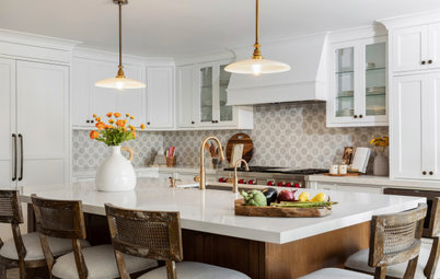
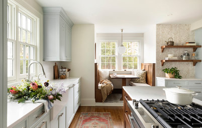
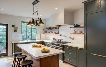
After: Barter and Cradock knocked the kitchen back to the studs and cleaned up the look by removing the columns and half wall, dropping the ceiling slightly to conceal the beam and simplifying the color and material palettes.
The pair matched new heart pine flooring to the flooring in surrounding areas. That move, coupled with fresh white walls and upper cabinets (White Dove by Benjamin Moore) and walnut lower cabinets and other details in the kitchen, created a cohesive style. “They really wanted to brighten up the space, because the previous kitchen felt dark,” Barter says. “By doing a lighter color on the uppers, we were able to keep things bright. By including the walnut, it helps ground the space.”
And by moving the fridge and creating a G-shaped layout with a peninsula, the remodeling team gave the owners a more functional work triangle with seating for the kids. “Now we have a strong connection throughout the whole home, with the kitchen at the center,” Barter says.
Find kitchen remodelers near you
After: Now a bank of counter-to-ceiling windows floods the kitchen with natural light and frames a substantial view of the leafy garden.
Marble-look quartz countertops offer a durable, stylish surface that helps enhance the light. The peninsula features a waterfall edge detail. Open storage on the outer side of the peninsula provides a spot for cookbooks. “The clients are avid cooks and this seemed like a natural spot for the books,” Barter says. “It’s a really good opportunity for storage and also adds a decorative element.”
Black aluminum-and-wood pendant lights over the peninsula complement the wood cabinets and black hardware.
New LED ceiling lights and a recessed LED light strip on the shelf above the range provide additional lighting.
Pendants: Blend in black and wood grain, Access Lighting; cabinetry hardware: Alaire pull in matte black, Atlas Homewares
Shop for bar stools and counter stools
The fridge’s new spot in a wall of walnut cabinetry creates an efficient work triangle with the sink and range.
The new 36-inch dual-fuel range sits below a built-in range hood that provides a clean look, with a shallow open walnut shelf for decorative items.
Glossy white ceramic tiles in a chevron pattern form a subtle yet effective backsplash. “We wanted to add a graphic element without taking away from the cabinet design,” Barter says.
Glossy white ceramic tiles in a chevron pattern form a subtle yet effective backsplash. “We wanted to add a graphic element without taking away from the cabinet design,” Barter says.
A combination of small cabinets with lift-up and flip-up doors surrounds the range area. A countertop cabinet shown here stores a toaster, helping to keep the counters clutter-free. A similar appliance garage sits on the opposite side of the range.
10 Ways to Design a Kitchen for Aging in Place
10 Ways to Design a Kitchen for Aging in Place
After: An additional counter-to-ceiling window that matches the sink wall windows brightens up the corner, while clean lines and open shelves simplify the design and lend it an airy look.
A glossy white single-basin apron-front fireclay sink replaced the former double-bowl stainless steel sink. A black pull-down faucet coordinates with other black details. A paneled dishwasher sits to the lower right of the sink.
New to home remodeling? Learn the basics
A glossy white single-basin apron-front fireclay sink replaced the former double-bowl stainless steel sink. A black pull-down faucet coordinates with other black details. A paneled dishwasher sits to the lower right of the sink.
New to home remodeling? Learn the basics
Before: A pair of stainless steel wall ovens sat opposite the former refrigerator and range top. The hallway on the right leads to a powder room.
After: The team combined the oven and cooktop function in the new range and flanked the new stainless steel refrigerator with tall pantry cabinets and other storage elements.
A 24-inch convection steam oven is installed on the interior side of the peninsula.
In the hallway, Barter created a new, larger powder room and mudroom, as well as additional pantry storage and a new home office niche, visible here.
A 24-inch convection steam oven is installed on the interior side of the peninsula.
In the hallway, Barter created a new, larger powder room and mudroom, as well as additional pantry storage and a new home office niche, visible here.
Here’s a look down the renovated hallway to the powder room.
This floor plan of the updated space shows the new G-shaped kitchen (upper left) and the hallway to the renovated home office niche, pantry storage, mudroom and powder room. “By moving around the appliances, we were able to improve the function of the kitchen,” Barter says.
More on Houzz
Read more kitchen stories
Browse kitchen photos
Hire a kitchen remodeler
Shop for kitchen products
More on Houzz
Read more kitchen stories
Browse kitchen photos
Hire a kitchen remodeler
Shop for kitchen products

Sponsorisé
Rechargez la page pour ne plus voir cette annonce spécifique
Kitchen at a Glance
Who lives here: A family of four
Location: Jamaica Plain neighborhood of Boston
Size: 170 square feet (16 square meters)
Designer: Beth Barter of Helios Design Group
Builder: Kevin Cradock Builders
Before: In the former kitchen, green tile flooring, medium-tone wood cabinets and yellow walls joined white columns and wrought iron lighting to create a style the homeowners found dated and underwhelming.
Meanwhile, the fridge and range top sat on one wall, chopping up the countertop space and creating an inefficient layout. A small island made up for some of the lack of counter space, but it impeded a clear path between the fridge and the wall ovens on the opposite side and didn’t offer a welcoming spot for the kids to sit.