Raise Your Glass to Marsala, Pantone’s 2015 Colour of the Year
Pantone opts for an earthy wine red in its selection this year. Here are ways to make it work in your home

Though the Colour of the Year selections from paint companies are geared specifically for use in home decor, Pantone’s choice is meant for broader application, such as in the field of graphic design and the fashion industry. Indeed, Marsala, Pantone’s pick for 2015, does remind me of a pair of trousers I sported as a kid growing up in the 1970s. But in all seriousness, this earthy wine-red hue also could work well in the home. I just think it needs to be partnered with colours that have a bit more life to them to keep the palette from feeling dull.
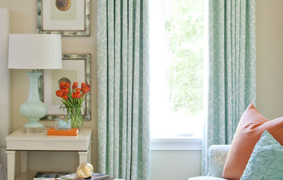
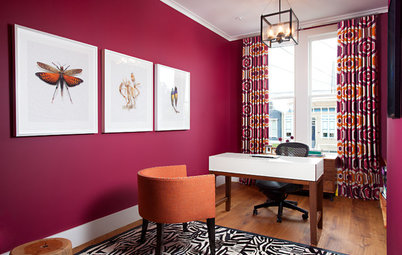
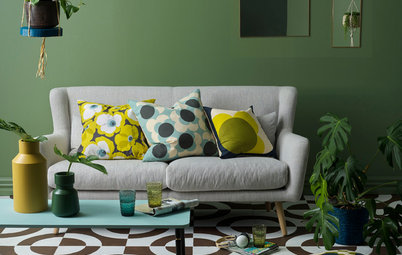
Red hues are thought to stimulate the senses and our appetites, so it’s a good choice for a dining area. In this space the ruddy hue is paired with a happy yellow in the adjacent room. The white ceiling and wall of windows join forces with the yellow walls to keep the space light, happy and bright.
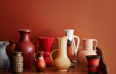
Here’s a similar red-brown, with more rust in it, that I think works well as an accent wall colour in this space. Because this colour is so deep and dark, and a bit muddy, it needs lots of white and natural light to keep it upbeat. I think it looks rich and sophisticated here.
I’m a fan of bold-coloured bathrooms and powder rooms, along with other rooms that we pass through only occasionally or don’t spend huge amounts of time in. You can pull off a more unusual or intense colour in those spaces, since you hopefully won’t find yourself spending hour upon hour there.
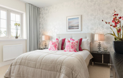
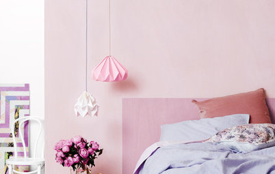
This hue is darker than Marsala and has a bit more red in it, but is a similar red-brown hybrid. A bright red bedroom might be too high energy for a room you plan to rest and sleep in, but by going with a deep red that has plenty of dark brown in it, you’ll get a more relaxed, mellower vibe.
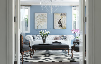
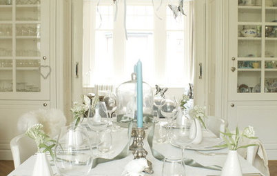
Marsala shades work well in traditional or transitional spaces when paired with other warm hues, such as reds, yellows, oranges and true browns. This space would feel warm and cosy on a cold winter evening.
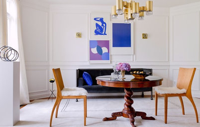
Or go for more contrast by combining Marsala with white painted trim and woodwork. The combination gives the room here a crisp and clean look, and the beautiful wood details really stand out.
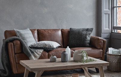
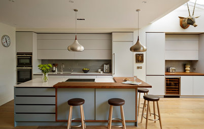
Or use it in small amounts, for niches, nooks and built-in cabinetry. The less you use of it, the more versatile the colour will be. By that I mean you can more easily work in other hues you love without going overboard on colour. And small amounts of colour are much easier to change in the future should you desire a different look.
I’m a big fan of bold colour for the exteriors of homes as well as for the interiors. And this reddish-brown hue is a nice choice for a stucco-clad home in a sunny climate. The rich colour feels as though it has been pulled directly from the surrounding earth, and it takes on a spectacular glow when lit by sunshine.
Last year I had one adventurous client opt for an accent wall in Exclusive Plum, Sherwin-Williams’ 2014 Colour of the Year – and fortunately she loves it! – but I had no takers for Pantone’s 2014 selection of Radiant Orchid or similar hues. I think that particular shade of hot pink is a bit too vibrant for most home interiors. It seemed more popular on the runways than in the home.
At any rate, it will be interesting to see how Pantone’s choice for this year will fare with homeowners.
TELL US
Did Pantone hit or miss with Marsala? Please share your thoughts in the Comments. And keep an eye out for more coverage of companies’ featured colours for 2015.
MORE COLOUR TIPS
Colour Forecast: Key Trends for 2015
Interior Designers Share the Best Colours to Paint Your Bedroom Walls
Is Colour Setting the Right Tone in Your Home?
20 Gorgeous Kitchen Colour Pairings


Sponsorisé
Rechargez la page pour ne plus voir cette annonce spécifique
It did not evoke pleasant comments when I posted it on social media sites soon after its release. Many found it too boring or dated. One friend simply said, “Yuck.” My favourite comment was from someone who said it reminded her of the mauvey-brown lipstick her grandmother wore in the early nineties.
But one friend did ask me how one could use this colour in the home, so let’s take a look.