See How Tile and Brass Updated This Tiny Bath
A fresh palette of white, gray and brass pairs with a floating vanity to keep things feeling light and airy

After moving into their Minneapolis duplex, this young couple got to work making changes to the kitchen themselves and repainting most of the home. But when it came to updating the master bathroom, they were stumped on what to do with the tight layout, dated tile, lack of storage and oddly long bathtub. For help, they hired designer Jaimie Nelson to strip the bathroom down to the studs and create a bright and airy feel with smarter storage, which included recessed shelves hidden behind picture frames.
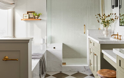
After: One of the homeowners initially wanted the shower wrapped in marble tile, but Nelson informed them that it would be way beyond their budget. Instead, she found 12-by-24-inch marble-look porcelain for less than $6 per square foot and had it set in a stacked pattern around the entire room, floor to ceiling. The thin white grout lines blend in with the white of the tile. “I love how it turned out,” Nelson says.
To give the homeowner some marble, Nelson used Bianco Puro marble hex tiles on the floor. “They are white and kind of chalky and the organic shape breaks up the lines of the straight stacked tile beautifully,” she says.
They went with a floating vanity to increase the open feel of the room and make it easier to clean the floor.
Shop for floating vanities on Houzz
The rest of the home features original door handles and hinges in really dark oil-rubbed bronze. Nelson knew the owners liked vintage and midcentury modern styles, so she suggested soft brass fixtures and accents for the mirror frame, light fixture and towel holder as a departure from the rest of the home. “And the gray veins of the tile look great with the soft brass,” she says.
Shower and sink fixtures: Purist, Kohler
Shower and sink fixtures: Purist, Kohler
After: Nelson removed the radiator but kept the plumbing in place for several reasons. For one, it was cheaper than spending money to move it. Two, the condo shares pipes with other units, so it would have been much more of a challenge to move anything. And finally, there just wasn’t a better layout to be found.
Nelson chose a European toilet because they all liked the slim shape and character and its skirted bottom for easier cleaning.
A top-down, bottom-up cellular shade lets light in while providing privacy.
Window casement paint: Chantilly Lace, Benjamin Moore; toilet: Duravit
Nelson chose a European toilet because they all liked the slim shape and character and its skirted bottom for easier cleaning.
A top-down, bottom-up cellular shade lets light in while providing privacy.
Window casement paint: Chantilly Lace, Benjamin Moore; toilet: Duravit
After: Nelson chose a shorter bathtub with high walls, then drywalled the leftover space and added a ledge tiled in the same marble-look porcelain as the walls to make it virtually disappear. “You can put a neck pillow there, a glass of wine or shower supplies,” she says.
She used a single glass shower panel instead of a shower door to keep things looking open. “Since we didn’t use a baseboard, just all tile, we weren’t worried about warping any wood,” Nelson says.
She used a single glass shower panel instead of a shower door to keep things looking open. “Since we didn’t use a baseboard, just all tile, we weren’t worried about warping any wood,” Nelson says.
They had lost a bit of potential storage by going with a floating vanity, so Nelson added two recessed cabinets hidden behind picture frames opposite the toilet.
Other than some green from this Sansevieria plant, the goal was to hold the color palette to white, gray and brass. “If this was a powder room we might have gone for some dramatic color,” Nelson says. “But here, I just didn’t think it called for any color. We wanted a simple, clean and airy space. And that’s what we got.”
More on Houzz
How to Design a Warm and Welcoming Bathroom
Get more bathroom design ideas
Find a bathroom remodeler near you
Shop for bathroom products and materials
More on Houzz
How to Design a Warm and Welcoming Bathroom
Get more bathroom design ideas
Find a bathroom remodeler near you
Shop for bathroom products and materials

Sponsorisé
Rechargez la page pour ne plus voir cette annonce spécifique
Bathroom at a Glance
Who lives here: A nanny, a hockey player and their pug
Location: Minneapolis
Size: 36½ square feet (3.4 square meters); 7 feet, 4 inches by 5 feet
Designer: Jaimie Nelson Design
Before: The existing bathroom had virtually no storage other than a recessed medicine cabinet. The shower didn’t have any niches, so the couple stored shampoo and other items on a pair of grab bars. Meanwhile, the blue square wall tile and small square mosaic floor tile — and all the old grout lines — had seen better days. Nelson ripped everything out and started over.
Find a bathroom designer near you