Paintbrushes Poised! 2023 Dulux Colour Awards Finalists Are In
Looking for interesting ways to add colour at home? Check out these shortlisted projects in the 2023 Dulux Colour Awards

Australia’s Dulux Colour Awards is an annual event that we always look forward to, giving us the chance to peek inside breathtaking homes where colour has been used in exciting and creative ways. And the 2023 finalists have just been announced…
“This year’s finalists demonstrate the capacity for colour to be a fundamental and versatile design tool,” says Andrea Lucena-Orr, Dulux colour and communications manager, who also sits on the judging panel. “There are residential projects in which colour is cleverly used to delineate contemporary additions to older homes, competing with houses bearing bold graphic statements, and others in which subtle yet all-encompassing tonal nuance is the primary design strategy.”
We’ve gathered together some of our favourite shortlisted projects from this year’s finalists for your reviewing pleasure, so whether you’re in Australia or NZ, grab a cuppa and prepare to get inspired for your next redesign project.
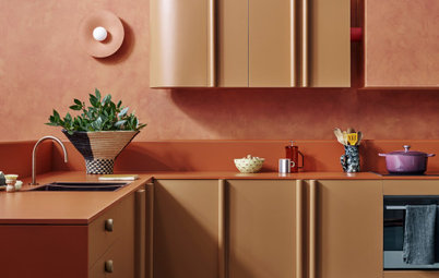
Colours used: Dulux Painted Bark on the trims, steel windows and doors, kitchen island and bathroom joinery. Dulux Reed Bed on the ceiling of the open-plan living/kitchen space. Dulux Antique White on all walls, internal doors and ceilings, other than in the open-plan room.
Through removing a third of the existing warehouse to add green space, we created a new facade of steel windows and doors and a perforated-steel bridge crossing the new courtyard to a bedroom. This entire facade is in Dulux Painted Bark – the ‘rosso’ of the project.
This colour is brought into the interior on the kitchen island, contrasting against the rich patterning of pink and burgundy marble.
We used Dulux Reed Bed for the ‘verde’, which highlights the existing timber rafters of the combined kitchen, living and dining space, paired with Dulux Apparition for the bedroom joinery and Dulux Bronze Medal for the joinery in the study.
Designer: Bloom Interior Design
Project: Williamstown Project
Photographer: Armelle Habib
Is your home crying out for colour? Find an interior designer near you on Houzz for a fresh new look
Project: Williamstown Project
Photographer: Armelle Habib
Is your home crying out for colour? Find an interior designer near you on Houzz for a fresh new look
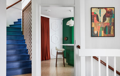
Colours used: Dulux Different Pink on upper bathroom walls, Dulux Black on the front door, other colours used include Dulux Natural White and Dulux Rangitikei River.
Designer’s comments: In this renovated Edwardian home in Williamstown, Melbourne, we used a bold black-and-white palette with touches of blue and pinks.
Dulux colours were chosen throughout this project to enhance the traditional details of the home and to combine the new bold extension with the rear of the home. The facade has street presence, using classic Dulux Natural White with a front door in Dulux Black.
Designer: Brett Mickan Interior Design
Project: Crawford Place
Photographer: Felix Forest
Designer’s comments: Since the demolition of three Victorian terraces in the early 1900s, this location has had many incarnations, from a factory to apartments and most recently as a secret underground gambling den accessed through a sliding bookcase.
When designing this space, I wanted to reference its chequered past and industrial roots, keeping some of the scars of change and continuing the legacy of a hidden room. Featuring original brick and concrete, which were uncovered as part of the renovation, contributes to the story of the space. It is a sustainable solution and influences the selection of the colour scheme.
The richly layered hue of Dulux Black Caviar picks up on the industrial steel, while the warm neutral tone of Dulux Grand Piano on the kitchen cabinetry complements the red base of the brickwork.
Colours used: Dulux Mt Aspiring, Dulux Black Caviar, Dulux Grand Piano, Dulux Piglet, Dulux Wing Commander, Dulux Texas Tea, Dulux Citrus Delight and Dulux Alien.
To create a bold statement in the dining room, we used the contrasting cool tone of Dulux Wing Commander on the panelling. A pivot door hidden in the panelled wall leads to the playroom, a space designed strictly for relaxing and having fun. Here, we bathed the walls in Dulux Piglet to complement the warm tones of the ochre carpet and caramel burl-wood cabinetry.
Three additional Dulux colours were used to add a contrasting trompe l’oeil cloud ceiling. Throughout the home, colour, luxurious fabrics and wallpaper with an eclectic collection of art and furniture from many periods create a truly individual space to reflect the inhabitants.
Designer: Hare + Klein
Project: The Chateau
Photographer: Jen Wilding
Browse more images of beautiful Australian living rooms featuring shades of grey
Project: The Chateau
Photographer: Jen Wilding
Browse more images of beautiful Australian living rooms featuring shades of grey
Colours used: Dulux Natural White and Dulux Stony Creek.
Designer’s comments: A 1920s chateau with strong French architectural detailing, extended and added to over the past 100 years, has acquired a delightful patina sitting comfortably in its Antipodean setting with a redefined contemporary interior that embraces the past and future.
Designer’s comments: A 1920s chateau with strong French architectural detailing, extended and added to over the past 100 years, has acquired a delightful patina sitting comfortably in its Antipodean setting with a redefined contemporary interior that embraces the past and future.
Designer: Wowowa
Project: Hermon
Photographer: Martina Gemmola
Designer’s comments: Hermon is an alteration to the most beautiful red-brick Federation home.
Project: Hermon
Photographer: Martina Gemmola
Designer’s comments: Hermon is an alteration to the most beautiful red-brick Federation home.
Colours used: Dulux Burnished Russet and Dulux Madame Mauve.
The brief was to manipulate the prior mock renovation, provide open living spaces and land a contemporary visual language as counterpoint to the decorative manor.
This project is the perfect balance of homage and embellishment, restraint and playfulness.
The brief was to manipulate the prior mock renovation, provide open living spaces and land a contemporary visual language as counterpoint to the decorative manor.
This project is the perfect balance of homage and embellishment, restraint and playfulness.
Designer: Studio Doherty and Enth Degree Architecture
Project: Gloss House
Photographer: Anson Smart
Designer Mardi Doherty’s comments: We were engaged to conceptualise a warm, welcoming and idiosyncratic home. Given the modest size of the two-bedroom home, it was essential to optimise communal spaces, with a keen focus on the kitchen, dining and living areas.
Our client’s love for design was unmistakable. We knew from the outset that their home had to be impactful and reflect their individuality. They expressed a strong preference for vivid hues throughout the house and underscored the importance of incorporating intricate and singular details.
Colours used: Dulux Natural White on the walls and ceilings, Dulux Summer Waters on the stair detailing and in the bathroom, Dulux Ticking on the basement study walls and main bedroom dresser plinths, Dulux Domino on the beams, Dulux Berry Grey in the main bedroom wardrobe, Dulux Black Ace on the fireplace trim, Dulux Silkwort in the kitchen, and Dulux Saxon and Dulux Bleaches on the main ensuite joinery.
To achieve this, we adopted a largely neutral palette for the walls, ceilings and floors, which allowed us to infuse carefully curated splashes of colour. The colours we selected were deliberately strong, as evidenced by the high-gloss, bright blue-painted staircase. This is juxtaposed with a more subdued approach to colour, such as the use of neutral greys and whites for the surrounding walls and joinery.
On the lower-ground level, we designed a bathroom near a conversation pit and outdoor pool, which had to make a lasting impression, especially when our client entertains. We chose to introduce bright blue high-gloss paint on the walls and ceiling of this space to create a truly arresting and immersive interior, reflecting our overall approach to the design.
Designer: Kaiko Design Interiors
Project: Darlinghurst Apartment
Photographer: Fiona Susanto
Designer’s comments: Situated in a historical part of Sydney, the original apartment had a tired fit-out that we stripped back, removing dated features and adding colour and
texture throughout. An important part of the design was to transition from the busyness of the city below. The way we found we could do that was through colour.
The marble slabs in the kitchen create something that’s both intimate but dramatic, with dynamic veining that is cloud-like in its movement. You really feel immersed [in this space], which plays back to that original vision of wanting to create a refuge from the city.
Colours used: Dulux Blood Mahogany on kitchen island front with 2-pac joinery to match. Dulux Rosetta on kitchen ceiling. Dulux Lexicon Quarter on other walls and ceilings. Dulux Western Myall on main bedroom walls.
The use of repeated lines and grooves was in response to the building’s architecture. The external louvres on the building’s facade cast dynamic shadows at different times of day. We have repeated this principle in a number of instances; through the joinery, the wallpaper in the main bedroom and the custom rug [in the living space].
The use of repeated lines and grooves was in response to the building’s architecture. The external louvres on the building’s facade cast dynamic shadows at different times of day. We have repeated this principle in a number of instances; through the joinery, the wallpaper in the main bedroom and the custom rug [in the living space].
Designer: Matt Gibson Architecture + Design
Project: Cobden Terrace
Photographer: Shannon McGrath
Designer’s comments: Cobden Terrace is a heritage-sensitive adaptation of a 1868 National Trust-classified terrace house in Fitzroy, Melbourne.
While a scholarly approach is taken to the application of good heritage principles, these symbiotically inform and drive the end appearance and narrative of the interior. New materials and colours reinterpret those of the Victorian era, creating a softness of light.
While the interior has been opened up programmatically, colours are still deployed compartmentally, providing enhanced legibility and recalling interior colour application strategies of yesteryear.
The mustard Dulux Osso Bucco tones of the hallway contrast with the ink blue Dulux Dark Door of the drawing and dining rooms. This elegant connection of front rooms, used as a reception space to host dinner parties, is layered with a mixture of mid-century Danish and contemporary furniture.
Colours used: Dulux Osso Bucco in the hall and circulation spaces, Dulux Dark Door in the drawing and dining rooms, Dulux Natural White and Dulux Showdown in the kitchen, Dulux Warmth in the shower space, Dulux Beige Filter in the bedrooms, and Dulux Maximus in the den.
The kitchen provides an important social space for the owners who love to cook, entertain or work from home. A wall of dark forest-green Dulux Showdown timber veneer provides a sense of calmness adjacent to the garden window, while providing dynamism to complement the brass kitchen accents.
This theme is continued through to the scullery and teamed with the terracotta-toned Dulux Warmth sliding door to the new rear bathroom.
The bedrooms provide a tranquil oasis, finished in dreamy, putty colours such as Dulux Beige Filter alongside soft oaks, woven sisal cabinets and lustrous carpet.
The outcome is a sophisticated showcase of colour, detail and craft.
Designer: Mihaly Slocombe
Project: Weather House
Photographer: Tatjana Plitt
Designer’s comments: Weather House is a bespoke home for a young family on a compact inner-northern Melbourne block. The clients cherished the character of their century-old worker’s cottage, but accommodating three children and the logistics of the [female] client’s night-shift schedule required more considered space and flexibility in their home. Our clients are nature enthusiasts, and in response their house is a rich, durable love letter to the outdoors.
Amid the ground floor’s palette of polished concrete, concrete brick, blackbutt and brass, selective pops of colour are introduced to bring playfulness and personality. Dulux Falkland decorates the hallway, cabinetry and bookshelves throughout the lower level; a counterpart to the warm timber and brass, and a fitting reference to our clients’ love of nature.
Colours used: Dulux Falkland on the first floor and in pops of ground-floor cabinetry, Dulux Fairy Pink in the ground-floor bathroom, Dulux Natural White in the heritage rooms, Dulux Monument on the exterior walls.
Journeying up to the first-floor retreat, Dulux Falkland transforms from colour pop to full envelopment.
Deviating from the popular bright and airy bedroom, our clients prioritised moodiness and light control for their bedroom and study: they wanted to create a designated zone for sleep and rest that could be dark at any time of day.
The serene green walls are complemented by a double set of linen curtains – heavy dark green and sheer off-white – which afford three options of natural light levels.
Designer: Kennedy Nolan
Project: Nightingale Leftfield
Photographer: Tom Ross
Designer’s comments: Nightingale Leftfield is an apartment building delivered under the Nightingale model, which means that it is a not-for-profit development that achieves high levels of sustainability and is focused on a functional and mutually supportive community of residents, including provision for both essential workers and social housing.
We were eager to create interiors that felt intensely domestic, warm, textural and gently colourful, always conscious that these apartments would accommodate people and their disparate things. We wanted to make them capable of providing a setting for idiosyncratic furniture and objects, but also, given that the purchasers were buying into a building that we both developed and designed, that they would get a piece of the domestic interior design we are known for – colourful, textural, natural and warm.
Colours used: Dulux Scotland Green (Master Palette) in the main bedroom, other colours used include Dulux Auburn Flair, Dulux Stony Creek and Dulux Hot Ginger.
The success of our Nightingale interiors resides in the balance of providing a single scheme for 28 dwellings, which also projects intensity and personality and, importantly, is also able to provide a setting for a diverse range of people and their possessions.
Our view is that this can be achieved without providing a white cube. Our interiors provide different forms of ‘neutral warm’, which is a softer setting for other colour, natural timber and cork, which is tactile and real, green, which we see as nature’s neutral, and accents of pink and orange – colours derived from the earthy terracotta and the wider colour thematic of the building.
We have introduced pattern and colour in the kitchen cabinets, which easily accommodates a diversity of appliances, books and objects and is softly joyous. Warm pink and ochre bathrooms reflect flatteringly onto skin tone, and timber and raw brass are touchable and authentic.
Designer: Williams Burton Leopardi
Project: Mount Mac
Photographer: Caroline Cameron
Designer’s comments: Mount Mac is grounded in its reconnection to place through warmth, texture and an honest approach. As an underlying current to the recrafting of the interior, the resulting home needed to capture the essence of its owners and their lineage with the surrounding landscape and farm life.
Designer: Sonelo Architects
Project: Gable Clerestory House
Photographer: Pier Carthew
Designer’s comments: Nestled amongst a street lined with well-preserved red-brick Federation-era houses, Gable Clerestory House presents a quiet and homogenous frontage to the street. Beyond the front two rooms is a mid-century inspired family home with a calming vibe, punctuated with playful and dynamic volumes, sky views and palette.
A downward curved ceiling and the sudden expansion of volume marks the junction of old and new [parts of the house]. Beyond that, a spacious living space, topped with clerestory windows on its ends, comes into view. The new extension brings a fresh experience. A subdued, earthy palette of colours, an ode to mid-century architecture, defines the living space.
Colours used: Dulux White Exchange Quarter on walls; joinery finished in Dulux Clay Court, Dulux Deep Bottlebrush, Dulux Malay Grey and Dulux White Exchange Quarter; timber battens in Colorbond Shale Grey.
The use of Dulux Clay Court creates warmth and evokes the essence of the Federation red-brick exterior. Meanwhile, Dulux Deep Bottlebrush and Dulux Malay Grey joinery elements complement the warm neutral stone, tile and timber [in the interior].
Through the play of colours, light and shadows, Gable Clerestory House has successfully created a generous home on a tight inner-city site committed [to filling] its occupants with delight and joy.
Designer: Madeleine Blanchfield Architects
Project: Dusk House
Photographer: Dave Wheeler
Designer’s comments: Once a tired and unassuming single-storey residence, Dusk House has been thoughtfully and carefully crafted into an evocative and serene family home.
The client’s love of art and design informed the approach, and the brief was to bring in warmth and light, and add colour and texture within the framework of a refined and elegant interior layout.
Light plays a crucial role and we were particularly interested in the play of light and shadow on different colours and surfaces. The materials palette was always to be rich and warm in pockets of the house.
Colours used: Dulux Armada in the powder room, Dulux Blue Quarry in the rumpus, Dulux Spanish Olive on the dressing-room joinery, Dulux Gamelan on the main bedroom walls, Dulux Antique White Quarter Strength on the remaining interior walls.
Our colour rationale was to evoke the darker stage of twilight, the beauty in the shadows and the celebration of the evolving hues of the day. Shades of green and blue serve this ethos and offer bold sophistication in the spaces. The moments of green and blue come through in more private spaces: the Dulux Spanish Olive in the dressing-room joinery and Dulux Gamelan in the main bedroom.
The powder rooms present an opportunity for sparks of playfulness, revealing whimsical Cipollini marble and deep sea-foam green walls (Dulux Armada). The client had this particular colourscape in mind from the very first meeting.
The result is an adventure through a shy house that unveils itself slowly to reveal moments of surprise through the uncovering of colourful rooms behind closed doors.
Designer: Studio Prineas
Project: Doria
Photographer: Felix Forest
Designer’s comments: Nestled in Sydney’s harbourside suburb of Double Bay, Doria Apartment crafts a cinematic interior experience – modest in scale yet rich in mood.
Project: Doria
Photographer: Felix Forest
Designer’s comments: Nestled in Sydney’s harbourside suburb of Double Bay, Doria Apartment crafts a cinematic interior experience – modest in scale yet rich in mood.
Colours used: Dulux Auburn Flair in the ensuite, the other bathroom ceilings and internal doors; Dulux Vivid White on the interior walls; Dulux Flat White on the remaining ceilings.
Single Residential Exterior Finalists
Designer: Studio Bright
Project: Garden Tower House
Photographer: Rory Gardiner
Designer’s comments: The resurrection of a dilapidated weatherboard Victorian sits within the dense urban fabric of Cremorne, Melbourne, with huge developments towering over original worker’s cottages. Within this context sits the new contribution by our studio – two petite breeze-block towers balanced against the architecture of the Victorian on a tight four-metre-wide site.
With a full house brief and no space, the need to build hard on boundaries was a challenging necessity, as was clarifying the jumble of existing walls and fences in the rear laneway. In response, Garden Tower House has a singular, all-encompassing outer skin of breeze block, employed to diffuse the boundary interface and moderate between opportunity and detriment.
The tower elements appear bluff and veiled, mediating the private realm from the surrounding context. Dulux Cuddlepot Half on the steel glazing and window reveals closely matches the terracotta of the breeze blocks for a unified appearance.
Colours used on the exterior: Dulux Cuddlepot Half on the steel glazing and window reveals, Dulux Black Caviar on walls behind the breeze blocks.
The wall behind the veil of breeze blocks is painted in Dulux Black Caviar to create a neutral and recessive backdrop. This was important to highlight the considered placement of windows, which are bright and light in contrast to the dark walls.
In such tight planning, every millimetre has to work hard to realise programmatic potential, and every wall surface needed to contribute to supporting family life.
All the components of a full-size house – water tank, solar panels, fireplace and flue, shed and services – have all been absorbed in pursuit of visual clarity, held together by a minimal palette of Dulux Light Rice, Dulux Warm Neutral, galvanised steel on the Victorian front, and Dulux Cuddlepot Half on the new extension at the rear, which will eventually be overtaken by climbing leafiness.
The ambition is that Garden Tower House will, over time, become increasingly attached to and embedded in nature, offering cooling and calming respite from the pressing urban context.
Designer: Licht Architecture
Project: Pop Top
Photographer: Adam Gibson
Designer’s comments: On a tight suburban block, Pop Top is a city pad perched on top of an existing garage. This project is an exercise in balancing a sense of spatial generosity in a small footprint, while maintaining the privacy of its occupants and surrounding neighbours. Pop Top reflects our client’s personality – sophisticated and always ready to host a party.
Closely nestled near its neighbours, the exterior presents as a sophisticated white-veiled facade characterised by fine screening that shields the occupants from [overlooking] neighbours. The colour selection of Dulux Casper White Quarter maximises the shadow play of the varied vertical screens and textures. Dulux Monument on the existing double garage and new carport below allow the crisp white addition to float above them.
Upon approach to the building, two offset rectangular extrusions frame a high-level window and opening to a deck. These sculptural insertions add a sense of playfulness, highlighted by the Dulux Template Quarter and Dulux Coral Blossom used on the inside face of the window surrounds. These colours were chosen for their pastel subtleties and [sense of] spritzy, summer fun.
Colours used: Dulux Coral Blossom and Template Quarter on window faces, Dulux Casper White Quarter on upper exterior cladding, Dulux Monument on existing garage and new carport.
External blockwork and garden beds have a bagged appearance by using Dulux Texture Medium Coat in Dulux Casper White Quarter. The fine texture is perfect for softening hard masonry edges and it matches the colour of the lightweight extension.
Dulux Casper White Quarter in combination with Dulux Monument provides the sophistication; Dulux Coral Blossom and Dulux Template Quarter provide the party.
Your turn
Which of these beautiful spaces catches your eye? Tell us in the Comments below and join the conversation.
More
Want to see more colourful homes? Check out this story: 14 Kitchens That Embrace Colour in Varying Amounts

Sponsorisé
Rechargez la page pour ne plus voir cette annonce spécifique

Sponsorisé
Rechargez la page pour ne plus voir cette annonce spécifique
Designer: Carter Williamson Architects
Project: Rosso Verde
Photographer: Pablo Veiga
Designer’s comments: Our design for Rosso Verde doesn’t follow the typical precedent for warehouse conversions. Instead, we opted for an interior narrative that combines earthy tones and textural materials to create warmth, while celebrating the warehouse bones of the building in a sophisticated and elevated way.
The anchoring colours are red and green, giving the project its name, against a base of neutral tones.