Résultats de la recherche pour "Renovation longere" dans la catégorie Idées de décoration et d'architecture
Turn on your TV to any HGTV or DIY show, and you’ll see them tearing down the walls and opening a home. Open floor plan living is a trend that shows no signs of slowing down anytime soon. If you’re still living with “rooms” dividing up your main living space like the kitchen for cooking, the dining room for eating in, and a living room/family room for entertaining, it is now time to check out an open floor plan.
This is a fantastic way to open the main living space of your existing home. It will improve workflows in the kitchen and traffic through your home and let in more natural light. As our lifestyles have shifted to a less formal way of living and entertaining, the idea of a traditional living room and dining room no longer fits how we use our space. Using our design build remodeling process, our clients in Howard County Maryland removed several dividing walls and got the open floor plan they had envisioned. Open living as in one room for all reasons, allows you to enjoy more of your home more of the time. It is the trend that keeps on trending.
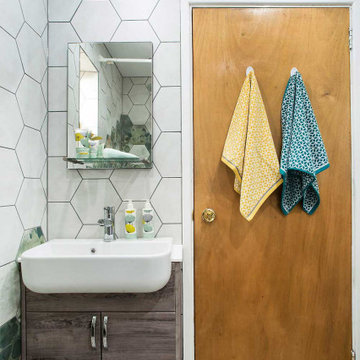
Practicality was key for this revitalised wet room, but spectacular tiles and clever, space-saving design ensure there’s wow-factor as well.
Robin and Chris’s ground-floor wet room is part of an extension they added to their 1930’s home some thirty years ago. It had been professionally installed, properly tanked and fully tiled to eliminate leaks, and had always functioned well. After decades of sterling service, and having coped with wet, outdoor clothing and muddy dogs as well as day-to-day use, it was starting to age. Rather than a complete re-design, Robin and Chris wanted to replace and update the existing fixtures and fittings, and address some minor issues,
“As the room is quite small, we’d originally fitted a space-saving, corner hand-basin, but it was too close to the shower area, and not big enough to be useful,” says Robin, “We also had a problem with water collecting along the wall on one side,”
“The floor-to-ceiling tiles were very practical, but they were just plain white and square, which made it feel stark and austere too,” adds Chris.
We had supplied Robin and Chris with bespoke curtains and upholstered furniture some years ago. Remembering how pleased they had been with our service at the time, they approached us again, and we were happy to help with their plans for the wet room. Our bathroom designer Lee Watkins set to work straightaway. Listening to the couple, he understood that the current layout needed only minor tweaks, so focussed on solving the main issues they had raised. Robin and Chris were open to the idea of a more colourful, eye-catching look for the wet room, as a change from the simple functionality they had previously had. Lee pointed them towards a range of tile suppliers they had not seen before, and browsing brochures and websites, Robin spotted some striking hexagonal patterned tiles in shades of green.
Beautiful feature hexagonal tiles from Ca' Pietra Tiles Shower system by Methven The feature tiles were complimented with a plain hexagonal tile
“Our taste is generally quite restrained, so the tiles were a big decision, but these looked spectacular, and we hadn’t come across anything else like them,” he says.
To reflect light and keep the room feeling bright, the patterned tiles have been balanced with plain white ones in the same hexagonal format. Their complex layout, which creates a loose, flowing effect, was the result of meticulous planning by Lee, followed by careful installation. Smaller mosaic tiles, colour-matched to the plain wall tiles, were chosen for the floor. They provide a safe, non-slip surface and follow the gradual slope of the floor towards the drain more easily than a larger size.
Turning his attention to the impractical hand-basin, Lee pinpointed the ideal spot for someone to stand to access the basin comfortably, and then adjusted the dimensions of the curtained shower area. This created just enough room to mount a new basin on the wall beside the door. Instead of the cramped corner style, Lee suggested a full-width, half-depth option that is easy to use and feels generous but doesn’t protrude awkwardly into the room. The basin sits on a smart, slimline cabinet, providing handy storage and cleverly maximising the limited space. Its modern, monobloc chrome tap echoes the style of other brassware in the couple’s home. To further coordinate, Chris and Robin picked a chrome-finish shower system, very similar in design to their previous one. To build on the streamlined, contemporary look, Lee recommended replacing the existing radiator too. He guided the couple towards a sleek, wall-mounted stainless-steel design, which will not rust or corrode in the humid atmosphere and can heat the room effectively.
Work on the new wet room took about two weeks. Lee suggested expert installer Mike to carry out the project, as it required specialist knowledge of tanking and wet room construction, to guarantee an absolutely watertight finish. All the old tiles were removed and the soundness of the existing plumbing carefully checked, before the entire room was re-screeded, re-tanked and tiled again. Robin and Chris were impressed by the team assigned, especially the way in which they minimised disruption for the couple, by isolating the wet room plumbing and electrics, so the work did not impact on other areas of the home. The re-laid floor is now perfectly smooth and slopes imperceptibly, so water no longer pools at one side. The shower drain, which had always been just off-centre, was neatly re-positioned exactly in the corner, adding to the crisp, clean feel,
“It’s turned out better than we imagined,” says Chris, “There’s nothing we’d change, and it’s just what we wanted.”
“This wasn’t a straightforward bathroom renovation, and it’s not easy to find a company that can offer a service so tailored to our situation,” adds Robin, “Lee was so flexible and responsive, and we would definitely recommend Gardiner Haskins – they were able to do things other companies couldn’t.”
KitchenLab Interiors’ first, entirely new construction project in collaboration with GTH architects who designed the residence. KLI was responsible for all interior finishes, fixtures, furnishings, and design including the stairs, casework, interior doors, moldings and millwork. KLI also worked with the client on selecting the roof, exterior stucco and paint colors, stone, windows, and doors. The homeowners had purchased the existing home on a lakefront lot of the Valley Lo community in Glenview, thinking that it would be a gut renovation, but when they discovered a host of issues including mold, they decided to tear it down and start from scratch. The minute you look out the living room windows, you feel as though you're on a lakeside vacation in Wisconsin or Michigan. We wanted to help the homeowners achieve this feeling throughout the house - merging the causal vibe of a vacation home with the elegance desired for a primary residence. This project is unique and personal in many ways - Rebekah and the homeowner, Lorie, had grown up together in a small suburb of Columbus, Ohio. Lorie had been Rebekah's babysitter and was like an older sister growing up. They were both heavily influenced by the style of the late 70's and early 80's boho/hippy meets disco and 80's glam, and both credit their moms for an early interest in anything related to art, design, and style. One of the biggest challenges of doing a new construction project is that it takes so much longer to plan and execute and by the time tile and lighting is installed, you might be bored by the selections of feel like you've seen them everywhere already. “I really tried to pull myself, our team and the client away from the echo-chamber of Pinterest and Instagram. We fell in love with counter stools 3 years ago that I couldn't bring myself to pull the trigger on, thank god, because then they started showing up literally everywhere", Rebekah recalls. Lots of one of a kind vintage rugs and furnishings make the home feel less brand-spanking new. The best projects come from a team slightly outside their comfort zone. One of the funniest things Lorie says to Rebekah, "I gave you everything you wanted", which is pretty hilarious coming from a client to a designer.
Trouvez le bon professionnel près de chez vous
The kitchen-diner in this Victorian semi-detached property in south-west London was designed to meet the functional and lifestyle needs of the client, as well as being ergonomically efficient.
Being avid entertainers, the couple wanted their new room to accommodate seating for up to 8 people, a traditional-style dresser and a bar area for making cocktails. ‘Holkham’ shaker-style cabinetry was chosen for its simplicity and pared-back feel. The uncomplicated design and focus on proportion make it a perfect fit for smaller kitchens.
Using the space either side of the original fireplace, the kitchen accommodates a large semi-glazed dresser as well as a small bar area which is topped with the same natural stone worktop, and is within easy reach of the fridge and dining table.
A banquette on the opposite side of the room was designed to provide additional space-saving seating and helps to balance the amount of furniture in the room without it feeling overcrowded.
The banquette seating is hand painted in the same colour as the kitchen cabinetry to help make the room appear longer, whilst also providing additional seating around the large family dining table. A dresser unit with bi-folding cabinet doors also maximises the amount of storage in this smaller room: designed and made to fit perfectly inside the alcove alongside the original Victorian fireplace.
Hand painted in calming Little Greene’s Sage Green, the room scheme combines natural stone, glass and oak elements which evoke a feeling of nature and space, helping the room flow seamlessly into the outdoor area beyond the traditional-style French doors.
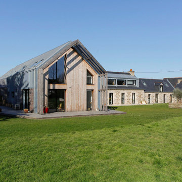
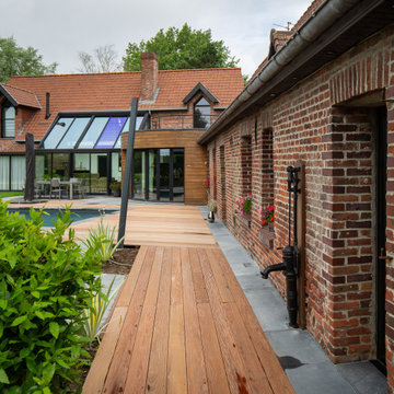
Construction d'une maison individuelle et réhabilitation d'une ferme.
Inspiration pour une grande maison design.
Inspiration pour une grande maison design.
CURE Senior Designer, Cori Dyer's personal home. Takes you through a home tour of her exquisitely designed spaces. Recently Renovated Kitchen, here is what Cori has to say about that process...Initially, I had to have the "upgrade" of thermafoil cabinets, but that was 25 years ago...it was time to bring my trendy kitchen space up to my current design standards! Ann Sachs.... Kelly Wearstler tile were the inspiration for the entire space. Eliminating walls between cabinetry, appliances, and a desk no longer necessary, were just the beginning. Adding a warm morel wood tone to these new cabinets and integrating a wine/coffee station were just some of the updates. I decided to keep the "White Kitchen" on the north side and add the same warm wood tone to the hood. A fresh version of the traditional farmhouse sink, Grohe faucet and Rio Blanc Quartzite were all part of the design. To keep the space open I added floating shelves both on the north side of the white kitchen and again above the wine refrigerator. A great spot in incorporate my love of artwork and travel!
Cure Design Group (636) 294-2343 https://curedesigngroup.com/
The “No longer peach abode” is a well loved house from the 1990s. The thing with the 90s, is peach was a big deal. Thankfully, we had a large footprint to work with, so my client’s dream kitchen was possible! With beautiful counters from Allstone and custom made cabinet refacing, we were able to bring a dated kitchen into this decade. While we were at it, Certapro painters repainted the house top to bottom, and all the light fixtures were replaced! The original hardwood floors were refinished and turned out beautifully with the darker stain.
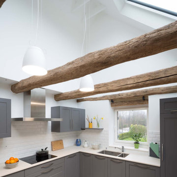
Le client souhaitait réaliser une extension pour avoir une pièce lumineuse. Une extension aurait, pour un coût important et des travaux lourds, dénaturé l'harmonie existante des façades extérieures et de la composition du bâti. En outre, le client trouvait sa cuisine peu pratique et sombre.
Il a été proposé de détruire une partie d'un grenier peu exploité, et de réaliser une verrière en toiture. Il en résulte un espace au volume généreux, baigné de lumière naturelle, et une cuisine optimisée. Les poutres existantes, de très belle qualité, sont mises en valeur.
This 1922 home’s kitchen was due for a functional and aesthetic uplift. The homeowner was unhappy with the layout, so a new layout was designed to streamline usage for modern day living. A chimney that was no longer used was removed in order to create a more open space. The design was created in order to create a warm and inviting space, as well as relate to the home’s traditional styling – old ranch base trim and casing where replaced to match the old existing trim in the rest of the home, and the hardwood floors were installed to match what was in the living and dining room in the front of the house. Traditional light fixtures and handmade tiles round out the timeless details in the renovation. Overall, a neutral color palette allows the wood grain in the cabinetry and the beautiful colors and pattern in the new quartz countertops to shine. The homeowners gained much more usable storage – a large pantry, and cabinet function like the blind corner cabinet shelving system.
Our clients had a very comfortable getaway home in Williams Bay. But, like the wall of fame that displayed the memorable fish they’d landed over the years, their kitchen needed to be rearranged and refreshed to better serve the friends and family they looked to host.
The small gallery-style kitchen was small and blocked off to the rest of the home. It was very restrictive when friends and family gathered. It needed a new layout to accommodate more people, more comfortably. This required a change to the layout of the adjoining great room and entryway.
Walls were removed and modified to accept the larger kitchen layout and integrate seamlessly with the great room and entryway, creating a warm and comfortable area where our clients could now entertain and interact at the same time – no longer hidden away in the tight quarters of their old kitchen.
And of course … We made plenty of room to display their wall of fame with room to add even more memories.
Traditional Kitchen Renovation & Design Of A First Floor Ranch.
See what our client say about this project:
It went as smooth as it possibly could go. The only bumps in the road was with what we found during demolition, you never know what your gonna run into when all the walls, floors and fixtures come out. Paul had explained to us that depending on what we found under all the out dated stuff it might take a little longer. Paul was there doing the work with his workers he showed up on time and finished on schedule. It was no problem being in touch with Paul because he answered his phone or got back to us in a timely fashion. He has an excellent sense of design he knows what goes well together and makes the house flow with comfort and usability.
Traditional Kitchen Renovation & Design Of A First Floor Ranch.
See what our client say about Paul Lopa Designs:
It went as smooth as it possibly could go. The only bumps in the road was with what we found during demolition, you never know what your gonna run into when all the walls,floors and fixtures come out. Paul had explained to us that depending on what we found under all the out dated stuff it might take a little longer. Paul was there doing the work with his workers he showed up on time and finished on schedule. It was no problem being in touch with Paul because he answered his phone or got back to us in a timely fashion. He has an excellent sense of design he knows what goes well together and makes the house flow with comfort and usability.
(R)Haw Ron
CURE Senior Designer, Cori Dyer's personal home. Takes you through a home tour of her exquisitely designed spaces. Recently Renovated Kitchen, here is what Cori has to say about that process...Initially, I had to have the "upgrade" of thermafoil cabinets, but that was 25 years ago...it was time to bring my trendy kitchen space up to my current design standards! Ann Sachs.... Kelly Wearstler tile were the inspiration for the entire space. Eliminating walls between cabinetry, appliances, and a desk no longer necessary, were just the beginning. Adding a warm morel wood tone to these new cabinets and integrating a wine/coffee station were just some of the updates. I decided to keep the "White Kitchen" on the north side and add the same warm wood tone to the hood. A fresh version of the traditional farmhouse sink, Grohe faucet and Rio Blanc Quartzite were all part of the design. To keep the space open I added floating shelves both on the north side of the white kitchen and again above the wine refrigerator. A great spot in incorporate my love of artwork and travel!
Cure Design Group (636) 294-2343 https://curedesigngroup.com/
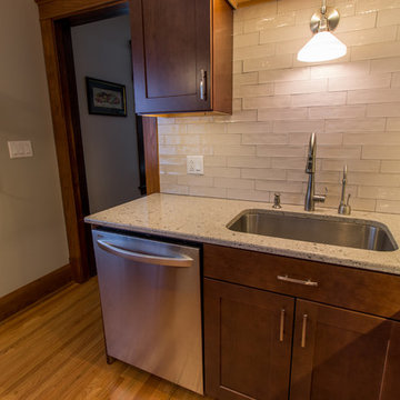
Our recent home remodeling project in San Jose, CA was truly one-of-a-kind. We worked closely with our client to create a space that was not only functional but reflected their unique style and personality. The project included a complete kitchen remodel, as well as two full bathroom remodels. We also demolished and replaced the flooring throughout the house, as well as completed a detailed painting job. To open up the space even more, we removed skylights and walls that were no longer needed.
Our team at Mayer's Construction was committed to ensuring that every aspect of this project was executed flawlessly. Project manager Mike Mayer worked tirelessly to ensure that the final result exceeded our client's expectations. We pride ourselves on open communication with our clients and this project was no exception. We worked with our client every step of the way to ensure that their needs were met and their vision was brought to life. We're proud to have created a space that our client can enjoy for years to come.
Our clients had a very comfortable getaway home in Williams Bay. But, like the wall of fame that displayed the memorable fish they’d landed over the years, their kitchen needed to be rearranged and refreshed to better serve the friends and family they looked to host.
The small gallery-style kitchen was small and blocked off to the rest of the home. It was very restrictive when friends and family gathered. It needed a new layout to accommodate more people, more comfortably. This required a change to the layout of the adjoining great room and entryway.
Walls were removed and modified to accept the larger kitchen layout and integrate seamlessly with the great room and entryway, creating a warm and comfortable area where our clients could now entertain and interact at the same time – no longer hidden away in the tight quarters of their old kitchen.
And of course … We made plenty of room to display their wall of fame with room to add even more memories.
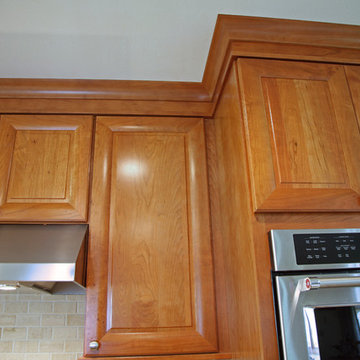
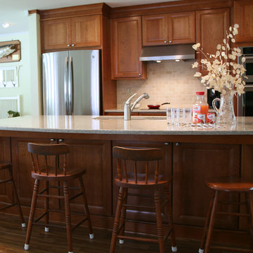
When envisioning their kitchen remodel, it was important to these homeowners that their existing cherry kitchen would be given a facelift in transitional style. Cathy and Ed of Renovisions achieved the owners’ wishes while making sure the kitchen still looked like a natural extension to the rest of their traditional styled home. The update made room for added storage and appliance space. We installed 48” wide cabinetry in a natural cherry finish with roll-out shelves and space to accommodate a microwave and pull-out double trash receptacle. These custom built cherry cabinets and crown molding matched existing cabinets and were within easy reach of the newly installed stainless steel Viking gas range, Zephyr hood and GE hybrid dishwasher.
A large rectangular stainless steel sink was under-mounted on a beautiful new gold granite countertop. An absolute black granite countertop was installed on the new wine/beverage center featuring a U-Line dual-zone wine refrigerator, deep drawers for linens and stem ware holder in natural cherry finish.
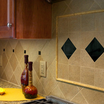
A standout feature is the beautifully tiled backsplash cut in with absolute black granite tile and an artful mix of granite/porcelain tile design over the new gas range. This draws attention to the newly remodeled space and brings together all the elements.
The homeowners were tired of the original builders brick surrounding their fireplace hearth and wanted to update to a more formal, elegant look. They chose a solid polished granite material in absolute black.
Outdated no longer, the design details in the kitchen and adjacent family room come together to create a formal yet warm and inviting ambiance with their wish fulfilled. The owners love their newly remodeled spaces.
Résultats de la recherche pour : Renovation longere
This 1922 home’s kitchen was due for a functional and aesthetic uplift. The homeowner was unhappy with the layout, so a new layout was designed to streamline usage for modern day living. A chimney that was no longer used was removed in order to create a more open space. The design was created in order to create a warm and inviting space, as well as relate to the home’s traditional styling – old ranch base trim and casing where replaced to match the old existing trim in the rest of the home, and the hardwood floors were installed to match what was in the living and dining room in the front of the house. Traditional light fixtures and handmade tiles round out the timeless details in the renovation. Overall, a neutral color palette allows the wood grain in the cabinetry and the beautiful colors and pattern in the new quartz countertops to shine. The homeowners gained much more usable storage – a large pantry, and cabinet function like the blind corner cabinet shelving system.
79