Idées déco de cuisines avec un sol bleu et un plan de travail gris
Trier par :
Budget
Trier par:Populaires du jour
101 - 120 sur 153 photos
1 sur 3
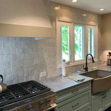
A concrete farmhouse sink is another organic choice, balancing natural and manmade items.
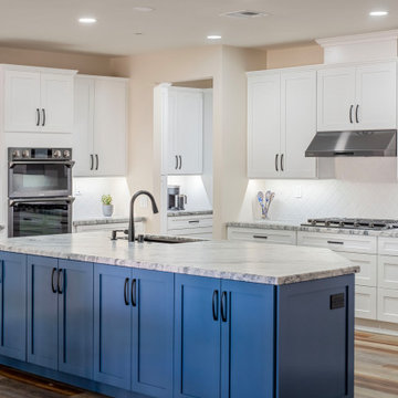
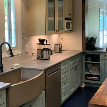
Aménagement d'une cuisine américaine parallèle classique de taille moyenne avec un évier de ferme, un placard avec porte à panneau encastré, des portes de placard bleues, un plan de travail en quartz modifié, une crédence beige, une crédence en céramique, un électroménager en acier inoxydable, parquet peint, îlot, un sol bleu et un plan de travail gris.
Aménagement d'une cuisine américaine parallèle classique de taille moyenne avec un évier de ferme, un placard avec porte à panneau encastré, des portes de placard bleues, un plan de travail en quartz modifié, une crédence beige, une crédence en céramique, un électroménager en acier inoxydable, parquet peint, îlot, un sol bleu et un plan de travail gris.
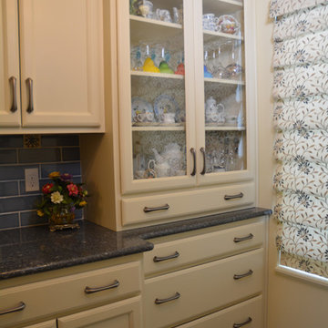
Pairing cream colored Medallion Silverline kitchen cabinets with a vibrant blue and gold color scheme, this kitchen design in Haslett achieves the ideal French country style. Cambria quartz countertops and Jeffrey Alexander hardware beautifully accent the cabinetry. A custom hutch in matching cabinet finish offers extra storage and glass front cabinets for displaying dishes and glassware. A Blanco undermount sink fits in perfectly with this design, along with the Eclipse single lever faucet. The tile selection really sets the tone for this kitchen design, with Jeffrey Court blue and gold backsplash tile giving the kitchen a splash of color. The hexagonal shaped floor tile from Artistic Tile Saigon collection is a practical and stylish addition.
Flipping the laundry room space with the walk-in pantry was designed to remove the laundry area from a heavily trafficked hall. In the new pantry area, a coffee bar was envisioned. Black stainless-steel appliances were selected to contrast with white cabinetry. Granite would be ‘honed’ to not be shiny smooth; a white arabesque backsplash tile complemented the cabinetry. No seating was planned on the back side of the island, making cabinets easier to access.
Артистический интерьер для яркой пары.
Общие параметры:
Тип недвижимости: Квартира в доме 1956 года.
Где находится (если не секрет): Москва, Соколиная Гора
Метраж: 80 м2
Стиль (как бы вы его сами определили): Артистический интерьер
Основная идея проекта: создать яркое артистичное пространство с множеством деталей, подчеркивающее характер его владельцев.
Цветовая гамма: смешанная гамма, композиция теплых и холодных оттенков.
1. Особенности планировки.
В квартире имеется спальня с эркером, гостиная и отдельная кухня. До перепланировки помещения были мало освещенными и тесными. За счёт объединения гостиной и кухни, а также цветовой палитры удалось создать достаточно светлый, жизнерадостный интерьер.
Кухню с подведенным газом, как и требуют правила, отделили от гостиной герметичной перегородкой.
В квартире присутствует помещение, в котором находится законсервированный мусоропровод, который не удалось удалить, без согласования всех жильцов дома, а их, к слову, оказалось не мало (в 135 квартирах). В итоге в этой комнате расположился гардероб и дополнительные места для хранения.
Прихожая продолжается длинным коридором, имеющим большой шкаф с множеством мест для хранения одежды и костюмов, которые наши герои создают для музыкальных фестивалей. С противоположной стороны расположен вход в спальню
2. Если можно, пару слов о заказчиках. Основные пожелания заказчиков.
Владельцы квартиры – творческие и неординарные молодые люди, приобрели себе квартиру площадью 80 м2 в доме 1956 года, которая отчаянно требовала ремонта.
Ребята круто играют на гитарах, ежегодно участвуют в музыкальных фестивалях и фестивалях Burning Man, а еще успешно занимаются созданием световых инсталляций. Заказчики в первую очередь хотели создать необычное пространство, которое вдохновляло бы их на творческие порывы и отражало их внутренние миры.
3. Какие декораторские и архитектурные приемы вы использовали в оформлении этого интерьера.
Особую атмосферу при входе в спальню создают парадные двустворчатые двери, которые привносят особую эстетику и дополняют образ спальни.
Пол и фартук в кухне декорированы орнаментом английской плитки, которая напоминает советскую.
Спальня светлая, свежая и яркая, как и ее обитатели. Цветовая гамма - чистые ясные оттенки голубого и синего.
В изголовье кровати Обои с узором по мотивам керамики местечка Кап-д’Ай, что на юго-востоке Франции, который символизирует слияние неба и земли на растительном фоне, как слияние мужского и женского.
Растительный мотив поддерживает кровать и тумбы из природных материалов.
Интерьер наполнен предметами искусства, которые придали пространству лёгкие ироничные нотки.
Чтобы шкаф в гостиной не выглядел просто шкафом, на его фасадах мы расположили печатную графику и декор, теперь он напоминает больше стеновые панели, нежели гардероб.
4. У меня в голове возникла история. Жизнь, как игра, она жонглирует разными событиями, ситуациями, а мы всегда учимся поймать и отреагировать на то или иное. Весь интерьер, как заказчики - активный и наполнен адреналином. В интерьере много цветного стекла, совсем как шарики жонглера, а скульптура Льва Ефимова (синие пенящиеся шары) словно символ пойманных и сложенных воедино пойманных моментов и впечатлений. Литография на стене — это ещё один символ легкости бытия и позитивного отношения к жизни. Дизайнерские светильники в гостиной — это отражение легкости мысли. А скульптура в спальне на подоконнике, говорит о течении времени и каждый раз просыпаясь утром, возникает понимание, что жизнь течёт и нужно наслаждаться ей и стремиться сделать много нового и с любовью, нового и вместе. «Вместе» — это о литографии в прихожей «Поцелуй». Эта работа, с входа в квартиру говорит о гармонии и ярких отношениях пары, а скульптура на консоли из стекла вторит этой работе, красное и голубое стекло сплелось в единую композицию. На мой взгляд - эти две работы из разных эпох, а словно созданы друг для друга.
5. Самым важным в этом проекте было вдохнуть вторую жизнь в обветшалое и сало похожее на жилище пространство. Впервые попав на объект, мы даже не знали за что схватиться первым делом. Задачи были повсюду, начиная от мусоропровода в середине квартиры и заканчивая стенами, которые были в шатком состоянии.
6. В каждом помещении есть акценты и образующие интерьер конструкции, например в кухне-гостиной это перегородка из стекла, которая выглядит легко, но в то же время зонирует пространство. В спальне акцент на эркер, это первое что понравилось в квартире, когда мы зашли, много света из окон большой плюс особенно зимой.
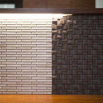
ニースペース側は
カウンター下に照明を施すことで
立体的なデザインから美しい陰影が生まれています
Cette photo montre une grande cuisine ouverte linéaire craftsman en bois brun avec un évier intégré, un plan de travail en inox, une crédence en bois, un électroménager en acier inoxydable, parquet clair, une péninsule, un sol bleu et un plan de travail gris.
Cette photo montre une grande cuisine ouverte linéaire craftsman en bois brun avec un évier intégré, un plan de travail en inox, une crédence en bois, un électroménager en acier inoxydable, parquet clair, une péninsule, un sol bleu et un plan de travail gris.
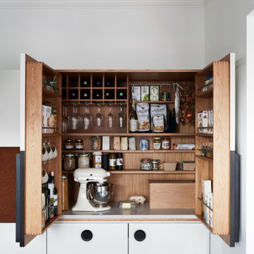
Our design process is set up to tease out what is unique about a project and a client so that we can create something peculiar to them. When we first went to see this client, we noticed that they used their fridge as a kind of notice board to put up pictures by the kids, reminders, lists, cards etc… with magnets onto the metal face of the old fridge. In their new kitchen they wanted integrated appliances and for things to be neat, but we felt these drawings and cards needed a place to be celebrated and we proposed a cork panel integrated into the cabinet fronts… the idea developed into a full band of cork, stained black to match the black front of the oven, to bind design together. It also acts as a bit of a sound absorber (important when you have 3yr old twins!) and sits over the splash back so that there is a lot of space to curate an evolving backdrop of things you might pin to it.
In this design, we wanted to design the island as big table in the middle of the room. The thing about thinking of an island like a piece of furniture in this way is that it allows light and views through and around; it all helps the island feel more delicate and elegant… and the room less taken up by island. The frame is made from solid oak and we stained it black to balance the composition with the stained cork.
The sink run is a set of floating drawers that project from the wall and the flooring continues under them - this is important because again, it makes the room feel more spacious. The full height cabinets are purposefully a calm, matt off white. We used Farrow and Ball ’School house white’… because its our favourite ‘white’ of course! All of the whitegoods are integrated into this full height run: oven, microwave, fridge, freezer, dishwasher and a gigantic pantry cupboard.
A sweet detail is the hand turned cabinet door knobs - The clients are music lovers and the knobs are enlarged versions of the volume knob from a 1970s record player.
Another look at this organic concrete sink and handmade tile as the backsplash.
Inspiration pour une cuisine américaine parallèle traditionnelle de taille moyenne avec un évier de ferme, un placard avec porte à panneau encastré, des portes de placard bleues, un plan de travail en quartz modifié, une crédence blanche, une crédence en céramique, un électroménager en acier inoxydable, parquet peint, îlot, un sol bleu et un plan de travail gris.
Inspiration pour une cuisine américaine parallèle traditionnelle de taille moyenne avec un évier de ferme, un placard avec porte à panneau encastré, des portes de placard bleues, un plan de travail en quartz modifié, une crédence blanche, une crédence en céramique, un électroménager en acier inoxydable, parquet peint, îlot, un sol bleu et un plan de travail gris.
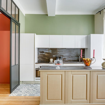
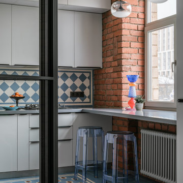
Idées déco pour une cuisine américaine linéaire, encastrable et beige et blanche contemporaine de taille moyenne avec un évier encastré, un placard à porte plane, des portes de placard blanches, carreaux de ciment au sol, îlot, un sol bleu, un plan de travail gris et poutres apparentes.
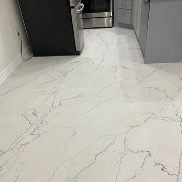
Kitchen Renovation using white blue vein large tiles, size 2 x 4 inch ceramic tiles. High end look. makes a huge difference on a budget friendly remodel project.
matching kitchen cabinets with the new flooring makes a great effect.
This space will house hor d'oeuvres, demonstrations and cooking classes. Mostly, it will be filled with art!
Idée de décoration pour une cuisine bohème en bois vieilli fermée avec un évier posé, un plan de travail en stratifié, une crédence grise, un électroménager noir, un sol en vinyl, une péninsule, un sol bleu, un plan de travail gris et un plafond voûté.
Idée de décoration pour une cuisine bohème en bois vieilli fermée avec un évier posé, un plan de travail en stratifié, une crédence grise, un électroménager noir, un sol en vinyl, une péninsule, un sol bleu, un plan de travail gris et un plafond voûté.
Pairing cream colored Medallion Silverline kitchen cabinets with a vibrant blue and gold color scheme, this kitchen design in Haslett achieves the ideal French country style. Cambria quartz countertops and Jeffrey Alexander hardware beautifully accent the cabinetry. A custom hutch in matching cabinet finish offers extra storage and glass front cabinets for displaying dishes and glassware. A Blanco undermount sink fits in perfectly with this design, along with the Eclipse single lever faucet. The tile selection really sets the tone for this kitchen design, with Jeffrey Court blue and gold backsplash tile giving the kitchen a splash of color. The hexagonal shaped floor tile from Artistic Tile Saigon collection is a practical and stylish addition.
Our design process is set up to tease out what is unique about a project and a client so that we can create something peculiar to them. When we first went to see this client, we noticed that they used their fridge as a kind of notice board to put up pictures by the kids, reminders, lists, cards etc… with magnets onto the metal face of the old fridge. In their new kitchen they wanted integrated appliances and for things to be neat, but we felt these drawings and cards needed a place to be celebrated and we proposed a cork panel integrated into the cabinet fronts… the idea developed into a full band of cork, stained black to match the black front of the oven, to bind design together. It also acts as a bit of a sound absorber (important when you have 3yr old twins!) and sits over the splash back so that there is a lot of space to curate an evolving backdrop of things you might pin to it.
In this design, we wanted to design the island as big table in the middle of the room. The thing about thinking of an island like a piece of furniture in this way is that it allows light and views through and around; it all helps the island feel more delicate and elegant… and the room less taken up by island. The frame is made from solid oak and we stained it black to balance the composition with the stained cork.
The sink run is a set of floating drawers that project from the wall and the flooring continues under them - this is important because again, it makes the room feel more spacious. The full height cabinets are purposefully a calm, matt off white. We used Farrow and Ball ’School house white’… because its our favourite ‘white’ of course! All of the whitegoods are integrated into this full height run: oven, microwave, fridge, freezer, dishwasher and a gigantic pantry cupboard.
A sweet detail is the hand turned cabinet door knobs - The clients are music lovers and the knobs are enlarged versions of the volume knob from a 1970s record player.
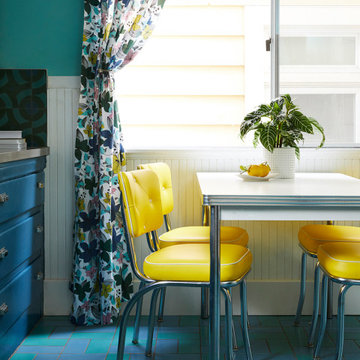
The homeowners, an eclectic and quirky couple, wanted to renovate their kitchen for functional reasons: the old floors, counters, etc, were dirty, ugly, and not usable; lighting was giant fluorescents, etc. While they wanted to modernize, they also wanted to retain a fun and retro vibe. So we modernized with functional new materials: quartz counters, porcelain tile floors. But by using bold, bright colors and mixing a few fun patterns, we kept it fun. Retro-style chairs, table, and lighting completed the look.
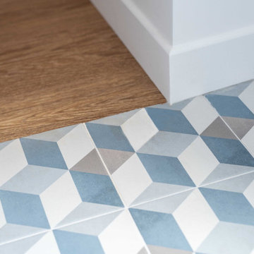
Sol cuisine
Cette image montre une petite cuisine linéaire design fermée avec un évier encastré, un placard à porte plane, des portes de placard blanches, un plan de travail en stratifié, une crédence blanche, une crédence en céramique, un électroménager en acier inoxydable, carreaux de ciment au sol, un sol bleu et un plan de travail gris.
Cette image montre une petite cuisine linéaire design fermée avec un évier encastré, un placard à porte plane, des portes de placard blanches, un plan de travail en stratifié, une crédence blanche, une crédence en céramique, un électroménager en acier inoxydable, carreaux de ciment au sol, un sol bleu et un plan de travail gris.
Idée de décoration pour une cuisine vintage en bois brun avec un évier intégré, un placard à porte plane, un plan de travail en stéatite, une crédence blanche, une crédence en céramique, un électroménager en acier inoxydable, un sol en linoléum, un sol bleu et un plan de travail gris.
This rambler’s small kitchen was dysfunctional and out of touch with our client’s needs. She desired a larger footprint without an addition or expanding the footprint to stay within a realistic budget for her homes size and neighborhood.
The existing kitchen was “boxed-in” at the back of the house. The entrance from
the hallway was very narrow causing congestion and cramping the cook. In the living room the existing fireplace was a room hog, taking up the middle of the house. The kitchen was isolated from the other room’s downstairs.
The design team and homeowner decided to open the kitchen, connecting it to the dining room by removing the fireplace. This expanded the interior floor space. To create further integration amongst the spaces, the wall opening between the dining and living room was also widened. An archway was built to replicate the existing arch at the hallway & living room, giving a more spacious feel.
The new galley kitchen includes generous workspaces and enhanced storage. All designed for this homeowners’ specific needs in her kitchen. We also created a kitchen peninsula where guests can sit and enjoy conversations with the cook. (After 5,6) The red Viking range gives a fun pop of color to offset the monochromatic floor, cabinets and counters. It also plays to her Stanford alumni colors.
One of our favorite and most notable features of this kitchen is the “flip-out” window at the sink. This creative solution allows for an enhanced outdoor living experience, without an expansive remodel or addition. When the window is open the party can happen inside and outside with an interactive experience between spaces. The countertop was installed flush to the window, specifically designed as a cocktail/counter rail surface.
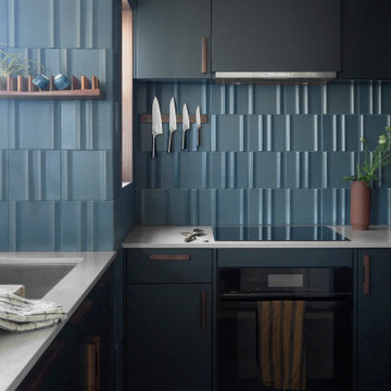
Every now and then, we take on a smaller project with clients who are super fans of Form + Field, entrusting our team to exercise their creativity and produce a design that pushed their boundaries, which ultimately led to a space they love. With an affinity for entertaining, they desired to create a welcoming atmosphere for guests. Although a wall dividing the entryway and kitchen posed initial spatial constraints, we opened the area to create a seamless flow; maximizing the space and functionality of their jewel box kitchen. To marry the couple's favorite colors (blue and green), we designed custom wood cabinetry finished in a deep muted pine green with blue undertones to frame the kitchen; beautifully complementing the custom walnut wooden fixtures found throughout the intimate space.
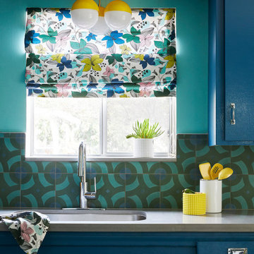
The homeowners, an eclectic and quirky couple, wanted to renovate their kitchen for functional reasons: the old floors, counters, etc, were dirty, ugly, and not usable; lighting was giant fluorescents, etc. While they wanted to modernize, they also wanted to retain a fun and retro vibe. So we modernized with functional new materials: quartz counters, porcelain tile floors. But by using bold, bright colors and mixing a few fun patterns, we kept it fun. Retro-style chairs, table, and lighting completed the look.
Basement kitchenette space with painted terra-cotta cabinets.
Aménagement d'une cuisine américaine linéaire moderne de taille moyenne avec un évier 1 bac, un placard avec porte à panneau surélevé, des portes de placard oranges, un plan de travail en stratifié, une crédence blanche, une crédence en brique, un électroménager blanc, un sol en carrelage de porcelaine, îlot, un sol bleu et un plan de travail gris.
Aménagement d'une cuisine américaine linéaire moderne de taille moyenne avec un évier 1 bac, un placard avec porte à panneau surélevé, des portes de placard oranges, un plan de travail en stratifié, une crédence blanche, une crédence en brique, un électroménager blanc, un sol en carrelage de porcelaine, îlot, un sol bleu et un plan de travail gris.
This rambler’s small kitchen was dysfunctional and out of touch with our client’s needs. She desired a larger footprint without an addition or expanding the footprint to stay within a realistic budget for her homes size and neighborhood.
The existing kitchen was “boxed-in” at the back of the house. The entrance from
the hallway was very narrow causing congestion and cramping the cook. In the living room the existing fireplace was a room hog, taking up the middle of the house. The kitchen was isolated from the other room’s downstairs.
The design team and homeowner decided to open the kitchen, connecting it to the dining room by removing the fireplace. This expanded the interior floor space. To create further integration amongst the spaces, the wall opening between the dining and living room was also widened. An archway was built to replicate the existing arch at the hallway & living room, giving a more spacious feel.
The new galley kitchen includes generous workspaces and enhanced storage. All designed for this homeowners’ specific needs in her kitchen. We also created a kitchen peninsula where guests can sit and enjoy conversations with the cook. (After 5,6) The red Viking range gives a fun pop of color to offset the monochromatic floor, cabinets and counters. It also plays to her Stanford alumni colors.
One of our favorite and most notable features of this kitchen is the “flip-out” window at the sink. This creative solution allows for an enhanced outdoor living experience, without an expansive remodel or addition. When the window is open the party can happen inside and outside with an interactive experience between spaces. The countertop was installed flush to the window, specifically designed as a cocktail/counter rail surface.
Idées déco de cuisines avec un sol bleu et un plan de travail gris
6