Idées déco de salons avec une bibliothèque ou un coin lecture et sol en stratifié
Trier par :
Budget
Trier par:Populaires du jour
81 - 100 sur 912 photos
1 sur 3
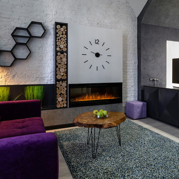
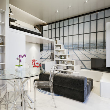
Photo: Tatiana Nikitina Оригинальная квартира-студия, в которой дизайнер собрала яркие цвета фиолетовых, зеленых и серых оттенков. Гостиная с диваном, декоративным столиком, камином и большими белыми часами. Необычная мебель, отделяющая спальню от гостиной. Телевизор, при необходимости может быть развернут как в сторону кровати в спальне, так и в сторону дивана в гостиной.
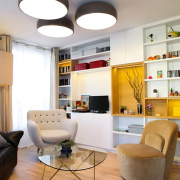
Inspiration pour un salon vintage ouvert avec une bibliothèque ou un coin lecture, un mur blanc, sol en stratifié, une cheminée double-face, un manteau de cheminée en brique et un téléviseur fixé au mur.
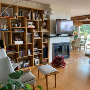
Réalisation d'un salon blanc et bois tradition de taille moyenne et ouvert avec une bibliothèque ou un coin lecture, un mur beige, sol en stratifié, un téléviseur indépendant, un sol marron et poutres apparentes.
Soft modular furniture with limitless possibilities is great for a small living space to support various activities. Either a place to read or a place for your private jamming session, it's up to you to make the most of your quality time.
Photo Credits: We Heart
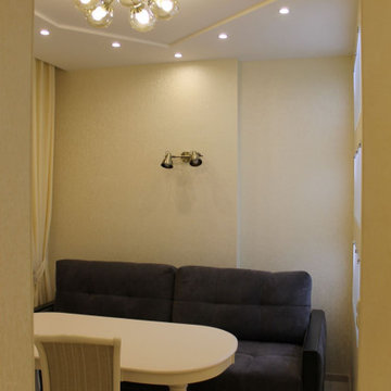
Cette image montre un petit salon design ouvert avec une bibliothèque ou un coin lecture, un mur multicolore, sol en stratifié, un sol beige et un téléviseur indépendant.
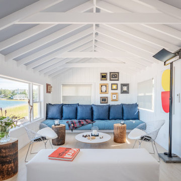
This Atlantic holiday cottage is located in the unique landscape of the creek at Towd Point, in Southampton, one of only 28 Federal Ecological Preserves in the US. Caterina and Bob, a design couple who owns the architecture firm TRA studio in the city, chose the property because of their historic ties to the area and the extraordinary setting and its precise location within it: it is the only house whose site is at the bend of the Towd Point peninsula, right where the views of the protected creek are at the widest and where a little beach naturally occurred.
Although the views are open and vast, the property is minimal, way too small to even consider a small pool or spa: the pristine creek is the house water feature, the recreation expansion of the diminutive back yard. We often joke that at TRA we can make small spaces feel big, which is, exactly what we did.
As often happened with TRA’s renovation projects, as well as with the most recent art pieces by Robert Traboscia, one of the Studio’s founders, the house is an “object trouve’’, originally a modest fishing outpost, that went through many alterations, to finally find a refreshed life as a modern cottage for a New York family. A vintage busted kayak, repurposed as a planter, completes the process.
The cottage is actually a collection of objects: the original Bayman’s cottage now houses two bedrooms, the adjoining deck soon afterwards was enclosed to make space for the kitchen/dining volume and a newer living room addition was later built to complete the compound.’
The compactness of the volumes contributes to the environmental quality of the house, whose
simple natural materials have been carefully restored and insulated, while the simplicity of the volumes, which has been respectfully retained, talks about a nostalgia for the past Long Island seaside retreats. The single level recognizable gabled roof silhouette sits comfortably on the private beach, the greyed cedar deck acting as a platform to connect with the landscape.
The informal weathered materials and the reductive color palette weave effortlessly from the exterior to the interior, creating a serene environment, echoing the coastal landscape, which emphasizes the line where the water meets the sky, the natural beach, tall breezy grasses and the multitude of happy birds who call the creek home.
The restoration process started with the modest goal of cleaning up the walls and replace the worn uneven floor, it soon turned into a forensic research for the original elements, uncovering the historic foam-green siding gabled façade that is now the backdrop of the dining pavilion. The renovation respected the history of the place: everything changed and everything stayed the same.
In an area known for vast, affluent, estates, the house is often the place where friends and family gather: the size of the house, the largeness of the creek, the wild life coexisting in harmony with the visitors, the availability of a swim in the bay or kayak adventure, are all interesting and inviting. We often observed that people do not want to leave our interiors, we love the little house because is a place that you never need to leave, this is definitely a house where there is always something to do. In the Hamptons, the question is often “what you are looking at”, usually the pool or landscaped nature, here it is easy to respond: our private beach and protected nature.
The landscaping simply aims at enhancing the existing: three sculptural and weathered trees were given new life, the natural arch of the Creek, further outlined by the bulkhead, is amplified and repeated, similarly to rock stratifications, to connect to the house and define the different modes of the landscape: native grasses, private beach, gravel lawn, fence and finally Towd Point Road. Towd Point Little Beach is a habitat meant to be shared with birds and animals.
Décoration salon ouvert sur cuisine dans le style scandinage
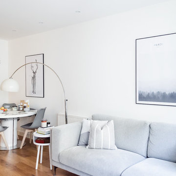
Cette photo montre un petit salon scandinave ouvert avec une bibliothèque ou un coin lecture, un mur beige, sol en stratifié, aucune cheminée, un téléviseur indépendant et un sol marron.
Cette photo montre un petit salon scandinave ouvert avec une bibliothèque ou un coin lecture, un mur beige, sol en stratifié, aucune cheminée, un téléviseur indépendant et un sol marron.
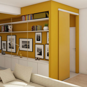
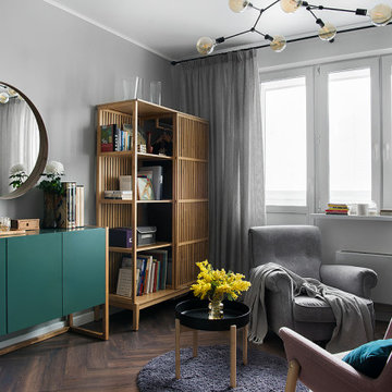
Cette image montre un salon design de taille moyenne et ouvert avec une bibliothèque ou un coin lecture, un mur jaune, sol en stratifié, un téléviseur encastré et un sol beige.
Painted brick wall
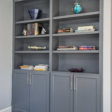
Cette image montre un salon minimaliste de taille moyenne et fermé avec un mur gris, sol en stratifié, un sol marron, une bibliothèque ou un coin lecture, aucune cheminée et aucun téléviseur.
Cette image montre un salon minimaliste de taille moyenne et fermé avec un mur gris, sol en stratifié, un sol marron, une bibliothèque ou un coin lecture, aucune cheminée et aucun téléviseur.
INT2architecture
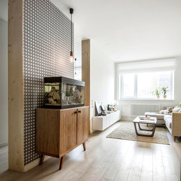
Cette photo montre un petit salon scandinave ouvert avec une bibliothèque ou un coin lecture, un mur blanc et sol en stratifié.
Cette photo montre un petit salon scandinave ouvert avec une bibliothèque ou un coin lecture, un mur blanc et sol en stratifié.
Reforma integral Sube Interiorismo www.subeinteriorismo.com
Biderbost Photo
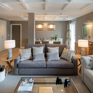
Exemple d'un grand salon chic ouvert avec une bibliothèque ou un coin lecture, un mur gris, sol en stratifié, une cheminée ribbon, un manteau de cheminée en bois, un téléviseur encastré, un sol beige, un plafond à caissons et du papier peint.
Exemple d'un grand salon chic ouvert avec une bibliothèque ou un coin lecture, un mur gris, sol en stratifié, une cheminée ribbon, un manteau de cheminée en bois, un téléviseur encastré, un sol beige, un plafond à caissons et du papier peint.
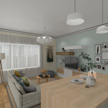
Homewings designer Francesco created a beautiful scandi living space for Hsiu. The room is an open plan kitchen/living area so it was important to create segments within the space. The cost effective ikea rug frames the seating area perfectly and the Marks and Spencer knitted pouffe is multi functional as a foot rest and spare seat. The room is calm and stylish with that air of scandi charm.
Designer credit: Francesco Savini
Photo credit: Douglas Pulman
Помните, как сказке про Золушку: "Жаль, королевство маленькое, развернуться мне негде". Вот что-то такое чувствует женщина, глядя на маленькую гостиную.
Но нет нерешаемых проблем. И даже если ваша гостиная является "большой комнатой" только по названию, в ней можно разместить все необходимое.
Больше света!
Это касается и светлых оттенков в интерьере, и освещения. Добавьте точечные источники света, встраиваемые светильники, бра. А естественный свет из окон должен отражаться от светлой мебели и стен.
Зеркала
А также зеркальные поверхности. Отлично множат свет и расширяют пространство. Интересное решение - зеркало, встроенное в нишу в стене. Комната будет казаться больше из-за отражения.
Обман зрения
Видели крутые картинки из интернета, которые создают эффект движения? На одну стену можно наклеить обои с перспективой: дорога вдаль, веранда, улица. И вот уже комната не так и мала.
Легкая мебель
С дизайном квартиры покончено, теперь приступаем к обстановке. Хотите громоздкий обеденный стол? Не рекомендую. Чем легче мебель - тем лучше. Открытые полки вместо книжных шкафов - отличное решение.
До потолка
Кстати, о полках. Используйте пространство стен по максимуму - заказывайте книжные шкафы до самого потолка. Вешайте полки как можно выше.
Встроенные шкафы
В идеале с раздвижными дверями. А еще неплохо смотрятся варианты с ширмой или занавеской. Для маленькой гостиной лучше заказать мебель, чтобы не купить стандартный вариант, который не подойдет.
Освободить плинтус
Самая большая обманка - расставить мебель возле стен. Диваны, кресла и столы лучше отодвинуть. За счет этого пространство будет казаться больше.
Inspiration pour un salon gris et blanc design de taille moyenne avec une bibliothèque ou un coin lecture, un mur gris, sol en stratifié et un sol marron.
In brief
Location, location, location
When looking for your perfect home where you can put down your grass roots and start a family there are many ‘must haves’ that we all have on our wish lists. The obvious contenders are price and location with many other niceties, like the number of bedrooms, layout and decor taking a back seat. As we all know, location can sell a home to those who strive to be in the right area, for transport links, local amenities and the all-important school catchment areas.
Like many other families throughout the UK our clients chose their house for its excellent location. Just ten minutes from the centre of Stafford by car, our client’s house is in a popular and sought-after suburb of the town for couples and families alike. They have always loved the location of their house for its easy access to work, schools, leisure facilities and social connections, but they were becoming increasingly frustrated with the layout of the ground floor of their home.
It’s inevitable that families will evolve and our needs from our properties will change too. Since the young family of four moved to their large four-bedroom detached house a few years ago, their property has been unable to meet their lifestyle needs and living patterns.
Although their property has adequate bedroom space for them and their two children, the layout of the downstairs living area was not functional and it obstructed their everyday life, making entertaining and family gatherings difficult.
Our First Meeting
Upon our initial consultation with our clients it was clear from the outset why they sought to make changes to the layout of their house. The property had been extended to create extra space by the previous owners, but unfortunately the design and build hadn’t been executed well at all. The rooms and layout were awkward in size and shape and it didn’t allow the family to come together and enjoy their home. They had the floor space, but it was sectioned off into separate rooms, some without a purpose.
The garden surrounds the house on all three sides and is of a good size in its entirety with different areas on each aspect. We could clearly see that the house itself didn’t address any particular aspect of the garden in any way.
Moving to a new house wasn’t an option, the family were happy with the location and size of the property. What they wanted was a modern, functional, stylish space for everyday family life, with the flexibility to accommodate their large extended family when needed and to ultimately add value to their property.
We were appointed by our clients to create a design solution to redesign the ground floor living area with a modern, light filled, open plan space that connects with the garden. It was clear from outset that our design intention was to break down the room barriers and to respond to the needs of the family, supporting their lifestyle now and for the future, bringing them together and creating a house they could call a home.
Delivering a project on time and within our client’s budget are always a top priority for our team. The family decided to stay in their house during construction, therefore it was even more essential to minimise the level of disruption to their daily lifestyle with a young family living on site.
The family needed help from our team at Croft Architecture to swiftly and successfully acquire Building Control Approval for their project to progress rapidly, ensuring project completion on time and to their determined budget.
Our Approach
Surveying the site
The client’s home is located on the entrance to a quiet cul-de-sac on a mature, leafy, suburban housing estate. Their home nestles into its well-established site, with ample space between the neighbouring properties and has considerable garden space to the rear and both sides.
During our initial visit we spent a long time with the family observing the existing layout, talking about how they currently live in the property, their annoyances with the house in its current form, how they would like to be able to live in their family home and how they aspired it to feel, look and live.
We walked through the house and it was clear that the existing layout didn’t work downstairs. The house had been extended onto before they had bought the property and the space hadn’t been well thought through in terms of how it would be used effectively.
The rooms directly to the left off the hallway, didn’t really have a proper function. The previously extended space had resulted in the house with too many rooms and subsequently this had led to a series of impractical spaces.
The long and narrow extension was home to a small U-shaped kitchen at the front of the house, which led onto the dining area and then onto a small room at the back of the extension. For the size of the house the kitchen and dining room in a much smaller and narrower area, leaving larger living areas to the rear of property with copious amounts of dead space. The small kitchen was tucked away at the front of the property which made life difficult for our clients to observe their children playing safely in the garden whilst preparing food and carrying out work in the kitchen. On the opposite side of the property there was another old extension which had a step down into it. This living area had a tiled floor and large glazed windows on all sides which made it feel almost like a conservatory.This area was rarely used by the family as it had no real function, plus it was hot in the summer and cold in the winter. It had become an under utilised space.
We walked around the property and it was clear that the house itself didn’t address their private garden space to any particular aspect in any way, meaning that the garden space was under used because of the poor connections.
The family wanted a combined kitchen, dining, lounge space for daily life and also for entertaining their family.
Design Approach
The size of the property presented the opportunity to substantially reconfigure the family home to create a series of dynamic living spaces oriented towards the large, south-facing garden.
Our team suggested removing the little kitchen from the front of the property and re positioning it within the unused glazed space at the back of the house.
The glazed room had internal French doors with a step down into the space separating it from the lounge. We proposed to remove the French doors, level the floor and make it into one room with the existing lounge.
To connect the new open plan kitchen and living space to the rear and side garden sliding and folding doors were the solution, extending the family’s usable living space by creating a seamless indoor-outdoor flow. There was already a patio area there and it made sense for the kitchen to move to the rear of the house to be close to the patio for easy outside dining.
It was therefore logical to retain the existing living space in it's current location next to the new kitchen, maintaining the natural flow of the house for the family after eating and entertaining in the kitchen.
When making decisions regarding the kitchen design, we worked closely with the family. They thoroughly enjoy spending time cooking and entertaining with their large extended family. To assist with their culinary preparations our clients had aspired to have an induction hob within their new kitchen. As they were working through the design with us, they weren’t sure about an induction hob because of different cooking methods required for certain meals that they like to produce. They particularly like making chapatis which require a round pan and a gas hob. We didn’t see this as a problem and suggested having a single gas burner for purely this purpose whilst still installing an induction hob. They decided to go ahead with our idea, choosing a single gas burner and an induction hob, and it looks great!
The existing lounge space had a corner aspect at the rear property that protruded into the garden. Positioned next to the kitchen and dining space it seemed logical to us for the living area to also open out onto the patio, thus connecting the garden to the house on a wider aspect. To enhance the connection between the garden and the living room we thought that a corner door would work extremely well to really open up this space. The clients really liked the design concept to create a feature of the corner with glazed sliding doors that would completely open the house up to the garden. They were excited about the prospect of the allowing huge amounts of natural light into their home and the flexible access it would provide to the garden.
Once the new kitchen, dining and living space had been concluded, we then had to consider what the previous kitchen and dining area was going to be used for within the small, long side extension. We talked with our clients about a few possible uses. We noticed that the family have a piano and few other musical instruments. It made sense for this space to become a quiet part of the house for them to escape to, play music, read and generally relax in a snug area.
To shorten the length of the new music room and make an additional feature in the newly created open plan kitchen, dining and living area, we reclaimed some of the space from the back of the side extension and opened it up to the main open-plan space, thus creating another new snug. We added an additional design feature within the snug by creating a timber window seat. Not only does it provide extra seating, but it’s also created a snug within a snug, a haven for reading, napping and gazing out into the garden.
As part of their brief our clients also wanted a to incorporate a log burner into their newly remodelled home. To connect the new music room and snug to the living space we proposed to position a two-way log burner where the existing gas fire was located. By retaining a fire in the original location it would minimise the disruption and work required to install the wood burner. However, the theory didn’t turn into reality and the new fire resulted in being quite a task to get it to work. When the contractor began to strip back the existing fireplace, they discovered that fitting the pipe within the building was going to be more challenging than they anticipated because of the poorly constructed extension. It was difficult to execute but it was ultimately achieved.
What lies beneath?
It’s not until you uncover the fabric of the building that you fully understand what’s going on underneath. When the contractor exposed the structure of the house, we found out that the property had been poorly constructed, and they uncovered a lot of poor workmanship from the original builders. As the build progressed the inner skin of the extended structure was exposed, we found that it wasn’t actually strong enough and we needed to make it safe in order to proceed. Going forwards we ensured that the structure was safe, and all issues were identified and immediately rectified.
The previous extensions to the house also presented further challenges as the build progressed. We found that the floors between rooms were not level. We wanted to create the appearance of one space rather than lots of chopped up areas. To do so we needed to alter the floor and ceilings to ensure that they were flush right through the new open plan living space. Also, after removing the internal French doors, the down-stand beam where the doors had previously been were subsequently left prominent down from the ceiling. The design required careful planning and attention to detail to achieve the best looking finished results for the client.
For us, in principle our clients’ scheme at the outset was quite a simple project but when the strip out commenced there was actually a more going on underneath that needed attention before the project could start to take shape. A lot of things needed to be considered to make it work structurally and properly for the family.
When the carpet was initially lifted, we found a parquet floor underneath. The family and our team were extremely excited at the prospect of having a traditional parquet floor that could be sanded down and made good. However, when ‘all’ of the carpet was removed only half of the living room had been covered in parquet flooring and the other half was actually a solid concrete floor. Unfortunately, we couldn’t proceed with the flooring and our clients chose another floor finish.
Making connections
Our team at Croft Architecture have created a new, sleek, spacious family ‘hub’ that’s light with clean lines. The open plan space unites the family of four whilst providing the ability to gather the wider family and seamlessly connecting their home with the garden through the new full length sliding doors. Although they now have plenty of space to gather with the family, they also have areas of seclusion to spread out and escape to when needed.
A strong working relationship between our team, the client and Building Control enabled us to gain the necessary permissions promptly. We enjoyed working with the project team and we’re extremely pleased to successfully deliver the completed project. Although it wasn't in accordance with our client’s timescales with the discovery of hidden structural challenges, we spent the time carefully resolving the issues to unsure that our clients home was not only safe, but also looks great and functions perfectly.
Surface : 50m2
Nombre de pièces : 2
Style : Dans l’air du temps
Objectifs : Moderniser, sécuriser et créer des espaces différenciés
Période de construction : Fin 19eme
Durée de l’étude : 5 mois y compris les autorisations de copropriété
Durée des travaux : 4 mois
Zona de lectura en el salón
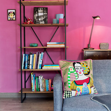
Inspiration pour un salon bohème de taille moyenne et ouvert avec une bibliothèque ou un coin lecture, un mur rose, sol en stratifié et un sol gris.
Inspiration pour un salon bohème de taille moyenne et ouvert avec une bibliothèque ou un coin lecture, un mur rose, sol en stratifié et un sol gris.
Cette photo montre un salon rétro de taille moyenne et ouvert avec une bibliothèque ou un coin lecture, un mur gris, sol en stratifié, un téléviseur indépendant et un sol gris.
Настроение этой небольшой квартире (52 кв. м) задает история здания, в котором она расположена. Городская усадьба в центре Киева, на улице Пушкинской, была построена в 1898 году по проекту Андрея-Фердинанда Краусса — любимого зодчего столичной знати конца XIX — начала XX веков. Среди других его работ — неоготический «Замок Ричарда Львиное Сердце» на Андреевском спуске, Бессарабский квартал, дома на Рейтарской, Большой Васильковской и других улицах.
Владелица квартиры издает книги по архитектуре и урбанистике, интересуется дизайном. Подыскивая жилье, она в первую очередь обращала внимание на дома, ставшие важной частью архитектурной истории Киева. В подъезде здания на Пушкинской — широкая парадная лестница с элегантными перилами, а фасад служит ярким примером стиля Краусса. Среди основных пожеланий хозяйки квартиры дизайнеру Юрию Зименко — интерьер должен быть созвучен стилистике здания, в то же время оставаться современным, легкими функциональным. Важно было продумать планировку так, чтобы максимально сохранить и подчеркнуть основные достоинства квартиры, в том числе четырехметровые потолки. Это учли в инженерных решениях и отразили в декоре: тяжелые полотна бархатных штор от пола до потолка и круглое зеркало по центру стены в гостиной акцентируют на вертикали пространства.
Об истории здания напоминают также широкие массивные молдинги, повторяющие черты фасада, и лепнина на потолке в гостиной, которую удалось сохранить в оригинальном виде. Среди ретроэлементов, тактично инсталлированных в современный интерьер, — темная ажурная сетка на дверцах кухонных шкафчиков, узорчатая напольная плитка, алюминиевые бра и зеркало в резной раме в ванной. Центральным элементом гостиной стала редкая литография лимитированной серии одной из самых известных работ французского художника Жоржа Брака «Трубка, рюмка, игральная кисточка и газета» 1963 года.
В спокойной нейтральной гамме интерьера настроение создают яркие вспышки цвета — глубокого зеленого, электрического синего, голубого и кораллового. В изначальной планировке было сделано одно глобальное изменение: зону кухни со всеми коммуникациями перенесли в зону гостиной. В результате получилось функциональное жилое пространство с местом для сна и гостиной со столовой.
Но в итоге нам удалось встроить все коммуникации в зону над дверным проемом спальни». — комментирует Юрий Зименко.
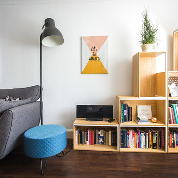
Cosy Scandinavian living room with multiple functions: Seating area & TV corner; Reading nook & play corner.
3 functions in a very small living room without the feeling of overwhelm.
Idées déco de salons avec une bibliothèque ou un coin lecture et sol en stratifié
5