Idées déco de salons avec une bibliothèque ou un coin lecture et un sol gris
Trier par :
Budget
Trier par:Populaires du jour
121 - 140 sur 1 720 photos
1 sur 3
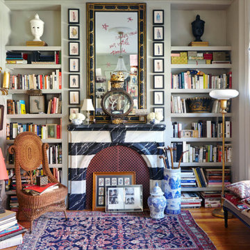
Idée de décoration pour un salon bohème avec une bibliothèque ou un coin lecture, un mur gris, un sol en bois brun, une cheminée standard et un sol gris.
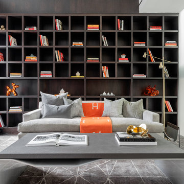
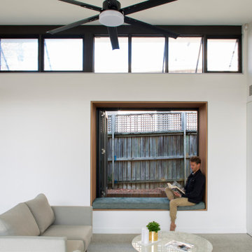
Inspiration pour un salon design avec une bibliothèque ou un coin lecture, un mur blanc, moquette, aucune cheminée, aucun téléviseur et un sol gris.
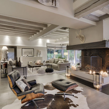
Idée de décoration pour un grand salon tradition ouvert avec une bibliothèque ou un coin lecture, un mur gris, moquette, une cheminée standard, un manteau de cheminée en pierre, aucun téléviseur et un sol gris.
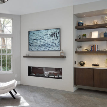
A sleek, modern design, combined with the comfortable atmosphere in this Gainesville living room, will make it a favorite place to spend downtime in this home. The modern Eclipse Cabinetry by Shiloh pairs with floating shelves, offering storage and space to display special items. The LED linear fireplace serves as a centerpiece, while maintaining the clean lines of the modern design. The fireplace is framed by Emser Surface wall tile in linear white, adding to the sleek appearance of the room. Large windows allow ample natural light, making this an ideal space to recharge and relax.
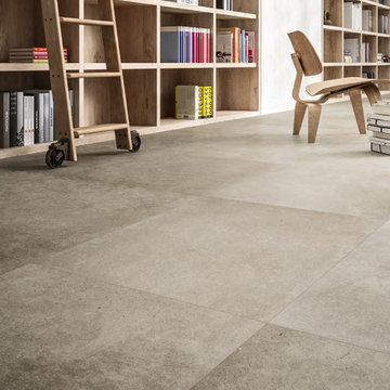
This modern living room library has a large cement look porcelain tile called Astor Greige. There are other colors and styles available. This tile is great for indoor and outdoor use.
STEPHANE VASCO
Cette image montre un salon design de taille moyenne et ouvert avec une bibliothèque ou un coin lecture, un mur blanc, parquet clair, un sol gris, aucune cheminée et aucun téléviseur.
Cette image montre un salon design de taille moyenne et ouvert avec une bibliothèque ou un coin lecture, un mur blanc, parquet clair, un sol gris, aucune cheminée et aucun téléviseur.
心地よい広さを設定したリビング・ダイニング・キッチンの床材は、全てフローリング。
幅185㎜だが、表面のエッジは丁寧に面取りされてとても上品なマット仕上げ。
北欧の暮らしが育てた歩行間は、素足が気持ち良い。
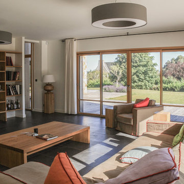
Réalisation d'un salon minimaliste ouvert et de taille moyenne avec une bibliothèque ou un coin lecture, un mur gris, un sol en contreplaqué, aucune cheminée, un manteau de cheminée en béton, un téléviseur indépendant et un sol gris.
Réalisation d'un salon minimaliste ouvert et de taille moyenne avec une bibliothèque ou un coin lecture, un mur gris, un sol en contreplaqué, aucune cheminée, un manteau de cheminée en béton, un téléviseur indépendant et un sol gris.
Exemple d'un très grand salon chic ouvert avec une bibliothèque ou un coin lecture, un mur beige, sol en stratifié, une cheminée standard et un sol gris.
Aménagement d'un très grand salon classique ouvert avec une bibliothèque ou un coin lecture, un mur beige, sol en stratifié, une cheminée standard et un sol gris.
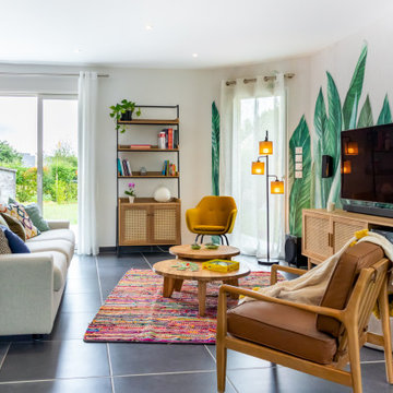
Quoi de plus agréable que de sentir en vacances chez soi? Voilà le leitmotiv de ce projet naturel et coloré dans un esprit kraft et balinais où le végétal est roi.
Les espaces ont été imaginés faciles à vivre avec des matériaux nobles et authentiques.
Un ensemble très convivial qui invite à la détente.
Réalisation d'un grand salon tradition ouvert avec une bibliothèque ou un coin lecture, un mur blanc, sol en béton ciré, un téléviseur encastré et un sol gris.
Philippe Bourdin
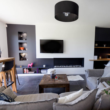
Cette image montre un salon design de taille moyenne et ouvert avec une bibliothèque ou un coin lecture, un mur noir, un sol en carrelage de céramique, une cheminée standard, un téléviseur fixé au mur et un sol gris.
Cette image montre un salon design de taille moyenne et ouvert avec une bibliothèque ou un coin lecture, un mur noir, un sol en carrelage de céramique, une cheminée standard, un téléviseur fixé au mur et un sol gris.
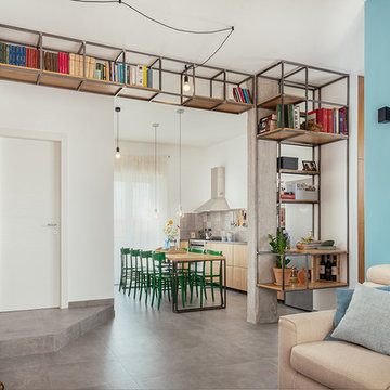
Foto di Gabriele Rivoli
Réalisation d'un salon urbain ouvert avec une bibliothèque ou un coin lecture, un mur bleu, un sol en carrelage de porcelaine, un sol gris et aucune cheminée.
Réalisation d'un salon urbain ouvert avec une bibliothèque ou un coin lecture, un mur bleu, un sol en carrelage de porcelaine, un sol gris et aucune cheminée.
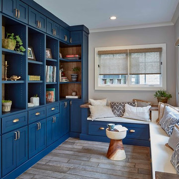
Aménagement d'un petit salon classique fermé avec une bibliothèque ou un coin lecture, un mur gris, un sol en bois brun, aucune cheminée, aucun téléviseur et un sol gris.
Idée de décoration pour un salon marin de taille moyenne et ouvert avec une bibliothèque ou un coin lecture, un mur blanc, un sol en carrelage de céramique, une cheminée standard, un manteau de cheminée en pierre, aucun téléviseur et un sol gris.
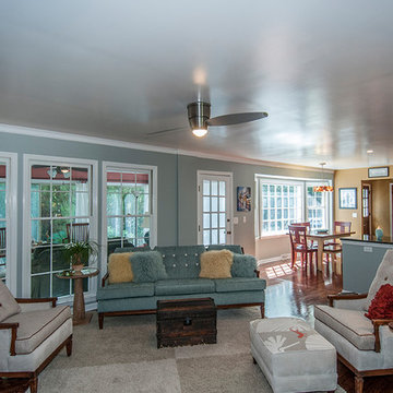
A comfortable living room renovation in Charleston, South Carolina.
Cette image montre un salon traditionnel ouvert et de taille moyenne avec une bibliothèque ou un coin lecture, un mur gris, parquet foncé, un téléviseur encastré et un sol gris.
Cette image montre un salon traditionnel ouvert et de taille moyenne avec une bibliothèque ou un coin lecture, un mur gris, parquet foncé, un téléviseur encastré et un sol gris.
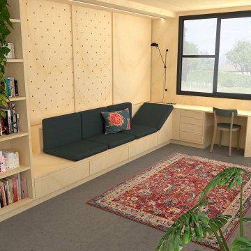
Dans un but d'optimisation d'espace, le projet a été imaginé sous la forme d'un aménagement d'un seul tenant progressant d'un bout à l'autre du studio et regroupant toutes les fonctions.
Ainsi, le linéaire de cuisine intègre de part et d'autres un dressing et une bibliothèque qui se poursuit en banquette pour le salon et se termine en coin bureau, de même que le meuble TV se prolonge en banc pour la salle à manger et devient un coin buanderie au fond de la pièce.
Tous les espaces s'intègrent et s'emboîtent, créant une sensation d'unité. L'emploi du contreplaqué sur l'ensemble des volumes renforce cette unité tout en apportant chaleur et luminosité.
Ne disposant que d'une pièce à vivre et une salle de bain attenante, un système de panneaux coulissants permet de créer un "coin nuit" que l'on peut transformer tantôt en une cabane cosy, tantôt en un espace ouvert sur le séjour. Ce système de délimitation n'est pas sans rappeler les intérieurs nippons qui ont été une grande source d'inspiration pour ce projet. Le washi, traditionnellement utilisé pour les panneaux coulissants des maisons japonaises laisse place ici à du contreplaqué perforé pour un rendu plus graphique et contemporain.
A sleek, modern design, combined with the comfortable atmosphere in this Gainesville living room, will make it a favorite place to spend downtime in this home. The modern Eclipse Cabinetry by Shiloh pairs with floating shelves, offering storage and space to display special items. The LED linear fireplace serves as a centerpiece, while maintaining the clean lines of the modern design. The fireplace is framed by Emser Surface wall tile in linear white, adding to the sleek appearance of the room. Large windows allow ample natural light, making this an ideal space to recharge and relax.
Photography by Richard Chivers https://www.rchivers.co.uk/
Marshall House is an extension to a Grade II listed dwelling in the village of Twyford, near Winchester, Hampshire. The original house dates from the 17th Century, although it had been remodelled and extended during the late 18th Century.
The clients contacted us to explore the potential to extend their home in order to suit their growing family and active lifestyle. Due to the constraints of living in a listed building, they were unsure as to what development possibilities were available. The brief was to replace an existing lean-to and 20th century conservatory with a new extension in a modern, contemporary approach. The design was developed in close consultation with the local authority as well as their historic environment department, in order to respect the existing property and work to achieve a positive planning outcome.
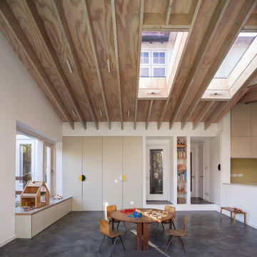
Like many older buildings, the dwelling had been adjusted here and there, and updated at numerous points over time. The interior of the existing property has a charm and a character - in part down to the age of the property, various bits of work over time and the wear and tear of the collective history of its past occupants. These spaces are dark, dimly lit and cosy. They have low ceilings, small windows, little cubby holes and odd corners. Walls are not parallel or perpendicular, there are steps up and down and places where you must watch not to bang your head.
The extension is accessed via a small link portion that provides a clear distinction between the old and new structures. The initial concept is centred on the idea of contrasts. The link aims to have the effect of walking through a portal into a seemingly different dwelling, that is modern, bright, light and airy with clean lines and white walls. However, complementary aspects are also incorporated, such as the strategic placement of windows and roof lights in order to cast light over walls and corners to create little nooks and private views. The overall form of the extension is informed by the awkward shape and uses of the site, resulting in the walls not being parallel in plan and splaying out at different irregular angles.
Externally, timber larch cladding is used as the primary material. This is painted black with a heavy duty barn paint, that is both long lasting and cost effective. The black finish of the extension contrasts with the white painted brickwork at the rear and side of the original house. The external colour palette of both structures is in opposition to the reality of the interior spaces. Although timber cladding is a fairly standard, commonplace material, visual depth and distinction has been created through the articulation of the boards. The inclusion of timber fins changes the way shadows are cast across the external surface during the day. Whilst at night, these are illuminated by external lighting.
A secondary entrance to the house is provided through a concealed door that is finished to match the profile of the cladding. This opens to a boot/utility room, from which a new shower room can be accessed, before proceeding to the new open plan living space and dining area.
The corner site, at the junction of St. Matthews Avenue and Chamberlain Way and delimited by a garden with mature trees, is located in a tranquil and leafy area of Surbiton in Surrey.
Located in the north-east cusp of the site, the large two-storey Victorian suburban villa is a large family home combined with business premises, whereby part of the Ground Floor is used as Nursery. The property has been extended by FPA to improve the internal layout and provide additional floor space for a dedicated kitchen and a large Living Room with multifunctional quality.
FPA has developed a proposal for a side extension to replace a derelict garage, conceived as a subordinate addition to the host property. It is made up of two separate volumes facing Chamberlain Way: the smaller one accommodates the kitchen and the primary one the large Living Room.
The two volumes - rectangular in plan and both with a mono pitch roof - are set back from one another and are rotated so that their roofs slope in opposite directions, allowing the primary space to have the highest ceiling facing the outside.
The architectural language adopted draws inspiration from Froebel’s gifts and wood blocs. A would-be architect who pursued education as a profession instead, Friedrich Froebel believed that playing with blocks gives fundamental expression to a child’s soul, with blocks symbolizing the actual building blocks of the universe.
Although predominantly screened by existing boundary treatments and mature vegetation, the new brick building initiates a dialogue with the buildings at the opposite end of St. Matthews Avenue that employ similar materials and roof design.
The interior is inspired by Scandinavian design and aesthetic. Muted colours, bleached exposed timbers and birch plywood contrast the dark floor and white walls.
Gianluca Maver
Idées déco de salons avec une bibliothèque ou un coin lecture et un sol gris
7