Houzz Logo Print
victorialeigh

NEED HELP WITH MEDALLION COLOR

Victoria Pitsinger
il y a 11 ans
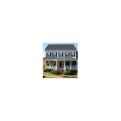
I am painting my house according to everyone's suggestions. White brick, red door and black shutters. I have a dilema of what color to paint the medallion above the front door. If I leave it white, I am afraid it will just disappear. HELP!

Commentaires (60)

  • Paula Andrews
    il y a 11 ans
    Do it in a gold color---using very good paint.
  • PRO
    WPL Interior Design
    il y a 11 ans
    I agree with the gray comments. You really want to antique the medallion not paint it. Start with the wall color as your base color then use a dark gray or brown glaze that would get into all the crevices but be wiped off of the high spots. This would not only draw attention to the medallion it would also make it blend with the house since the base color is the same and it would accentuate all of the medallions intricacies.
  • Discussions associées

    Choosing an Interior Designer

    Q

    Commentaires (0)
    Choosing an Interior Designer If you are thinking of working with an interior designer, be aware that the relationship is, by its very nature, intimate. Given this, you reap immeasurable benefits when you take some time upfront to consider just what it is you want from this person you're about to invite into your life. As with any relationship, clear communication can go a long way to alleviating any misunderstandings. Here are a few questions to ask yourself, questions to ask prospective designers, and some hard-won tips we've picked up along the way. Assess Your Work Style Before you pick up the phone and start calling prospects, spend a few moments thinking carefully about your preferred method of working. This little bit of soul searching will go a long way to ensuring you hire the right person, and will help to lay a solid foundation for a successful working relationship. For starters, think carefully about your answer to these questions: At what level do you want to be involved in the creative process? Do you want to be consulted on the nitty-gritty, day-to-day details, or are you more interested in big picture issues? Similarly, at what level do you want to be involved in the product research? Are you looking for comprehensive, "soup to nuts" guidance, or do you consider yourself design-savvy and only in need of assistance with color, space planning and resources? Are you a visual person or a tactile person? Will you be satisfied with a designer showing you photos of products, or do you prefer to see and feel everything before deciding whether it is right for you? Do you prefer to be shown many options or fewer? Are you open to the input of others? Are you able to make choices with confidence, or do you tend to vacillate? What are your expectations in terms of a timeline Determine the Scope of Your Project The scope of a project to some extent dictates the qualifications and experience required of the interior designer you are hiring. If you are building a new home or addition, or undertaking a major renovation to existing space, you are likely already working with an architect. This is good. Architects and designers often work in concert, balancing the aesthetics of the home's structure, or "bones," with the interior furnishings and finishes. You may want to get your architect involved in the selection of the interior designer—whether it's recommending someone he or she has already worked with, or using one of the interior designers the firm may have on staff. If you're redecorating a single room or have a limited budget for a space that does not require structural change, you may not need an interior designer at all. You may be happy hiring a specialist, such as a color consultant, who can work with your existing furnishings and help you revamp the space with new paint color and fabric selections.
    ... Voir plus

    Choosing an Interior Designer

    Q

    Commentaires (2)
    So do you think an architect is necessary? This is my decision.
    ... Voir plus

    Cuisine 11 m2 avec ilot ?

    Q

    Commentaires (761)
    Ces derniers sont meilleure en finition et juste la couleur qui me reste a chosir. c'est du parquet imitation bois made in spain.
    ... Voir plus

    Wall art idea needed

    Q

    Commentaires (7)
    Hello Velvet Ninja You seem concerned with that one wall. I'm not trying to criticize, the space seems new, with quality materials and well-lit, but have you also noticed the other big white walls? and ceiling? Why just the wall with the mirror? You've got a majority of white, a good dose of black, some chrome / stainless steel details and an uninterrupted shiny pale wood floor. It's relatively astonishing that you have a white door and only one white window, but the other window is black? Everything is relativement anonymous, nice, but nothing too ground-breaking. Is this a rental or your own home? Are you sure that just some art on that one wall will make it cozy and beautiful? Have you thought about any window treatments? Store venetien? Rideaux? Store bateaux? Any type of rug under the dining table? A rug called Bolon, made of woven vinyl fibers, easily cleaned ant anti-allergy. Is the mirror not on the axis of the table on purpose? And why a dark wood? It adds to the "window types", a black one, a white one and the wooden mirror one... Some more information would be helpful. good luck, Lynn
    ... Voir plus
  • 7768
    il y a 11 ans
    PLEASE NO RED-YIKES
  • PRO
    Beth Web Marketing Group
    il y a 11 ans
    Gold leaf!
  • PRO
    Beth Web Marketing Group
    il y a 11 ans
    Gold leaf!
  • avajane
    il y a 11 ans
    Oh dear. Please don't paint it anything but the same color as the wall. This is a lovely piece of classic architecture and its contrast is a result of its relief and the texture and shadows. Just like your dentil molding. Such a pretty house! Stay classic! Don't mess with it.
  • grantslanding
    il y a 11 ans
    Depending on the shade of white you are using for your house, I would paint the medallion a much darker shade of white. Painting it a gold, red or black would give it wrong effect and you want it to stay classy! I would also be careful with the greys, if going that direction, do a barely there light grey. The medallion is almost like putting blush on your face, it should highlight your assests, not make you look like a clown! Good Luck, and cute home!
  • houssaon
    il y a 11 ans
    I would say that it is not any different than the dentil molding. Paint it the same as that.
  • houssaon
    il y a 11 ans
    I would say that it is not any different than the dentil molding. Paint it the same as that.
  • Gary Zielinski
    il y a 11 ans
    I would Paint it gold Leaf and accent Black shutters with it also and goldleaf hardware for shutters. ..Z Tip of the day
  • lyrics1967
    il y a 11 ans
    Dernière modification :il y a 11 ans
    Is the medallion iron? Like a metal? I can't tell? If it is. I'd go with black. My personal fav would be taupe on the brick with black shutters and a rich burnished oak stained door. The door frame and eves should be in a crisp white. Found this house on this site. Just so happens they have a red door too, not my preference. https://www.houzz.com/discussions/what-colors-are-these-exactly-and-the-brand-of-paint-dsvw-vd~178132
  • tracey m
    il y a 11 ans
    Please keep it the same color as the wall or one shade darker. Detail like that should be subtle. And I agree with painting the door black to match the shutters. Red is not appropriate for the style.
  • Kevin Graves
    il y a 11 ans
    Keep the walls white. Paint the shutters and the medallion a creamy beige. Very classy.
  • greenthumb2
    il y a 11 ans
    Dernière modification :il y a 11 ans
    Look at the lines by the roof, and cornices. They are also beautiful, as well as her columns and caps. When it comes to this kind of makeover, it would not do your home justice to ignore the details if you know you are going to start colorizing it. Take your photo and enlarge it. Do some overlays either in photoshop or manually using color ideas. Painting such a home is going cost bucks, so please consider using the details of the home's fascia as I mentioned above to your advantage. Awesome acquisition. Lovely choice of structures. Kevin has some good ideas. warm grey would work with his white, beige theme. Honestly, when I saw your home I thought immediately of Florence, Rome, and TJefferson. Believe it or not.
    Keep her a warm trend if you paint her white. Shutters if colorized should harmonize with entire fascia of the home, including the front door. I dare say although I love black , not for a door. Wood, white, off white, warm greys, or combination. But, tread carefully. I even noticed the roofline, archline and shutter line is repeated. And the fancy relief moulding. Preserve, protect and present her respectfully. She is a full-on beauty.
  • beckyg66
    il y a 11 ans
    Oh dear are you sure you want to paint your house red? that seems a bit much if you ask me. What about a very very pale soft yellow with black shutters and black door? I would not paint the madalion a differant colour it will look strange a differant colour then the house colour...
  • victorianbungalowranch
    il y a 11 ans
    Honestly I think grey shutters rather than black, or maybe even a subtle wedgewood or prussian blue or a verdigris type color, would be much better than black..

    It is very European looking--almost Beaux Arts-- and the soft colors suggested above with a low-contrast color palette would be more appropiate. It really reminds me of late Baroque (1700s) garden structures in scale and detailing, like at the palaces in Potsdam and Versailles. I can even see a very pale yellow or terra cotta/salmon fir this one. I don't see a need to repaint the brick--the weathering gives it some dimension and character. Buildings of this type were made of white limestone and stucco, which weathers to nice pastel tones.

    Modern tastes tend toward high contrast color schemes, and that just isn't the best for all buildings. I normally like a bright door too, but not always.

    As for the door, the black it is is nice and classic, but maybe a Charcoal grey or a pale grey could could work too, or the verdigris (weathered garden furniture) colors..

    This is a high-end architecture firm who does mansions the old fashioned way and detailing that can give you some ideas in coloration. http://www.crowellandbaker.com/Photo_Gallery/201#/pub/images/image-library/3973.jpg?w=440&h=330
  • PRO
    Victoria Pitsinger
    Auteur d'origine
    il y a 11 ans
    the medallion appears to be made of some type of plaster
  • PRO
    Southern Patina Home
    il y a 11 ans
    I'm over that black/red color scheme. Your house has a very impressive front. I like those dark wood doors, and unless they're in bad shape, would just clean them up and keep them natural. You can paint the dome of your entrance a soft robins egg blue. As for the color of the shutters, I'd look around at what other colors are in your neighborhood and pick a color that works off your neighbor's house or compliments their house..........there are so many beautiful colors, it's hard to pick from, but please go with something other than the black/red/white scheme.
  • Jenny Farmer Melton
    il y a 11 ans
    Dernière modification :il y a 11 ans
    Hi, Victoria. First, I want to say how much I LOVE your house...how lucky to have such a beautiful home. It looks old, I would love to know its age. Given the historical nature of your home, I offer you the following advice.
    I know how hard it is to make a decision like this...it overwhelms me when I have to do it. I usually have to spend a long time thinking about it, as I'm sure you have. Of the folks who have responded to you so far, some of them have really good ideas, great ideas, actually. But, ultimately, you have to go with your gut, your heart.
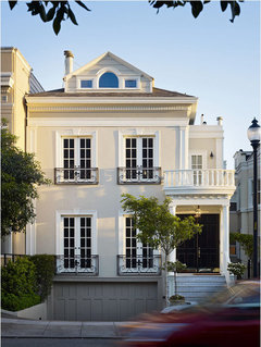
    I did a little research and looked at your idea books in exterior paint colors. Voila!!! There it was! The very first photo you have posted, the Presidio Heights Residence by Dijeau Poage Construction. I also looked at the additional images of that house on their website. Based on the fact that you were obviously drawn to this image, and listening to some of the feedback you received, especially from victorianbungalowranch and greenthumb2, I think this is a good choice for your home.
    I like the warmer tones, a more european flavor, yet very historical vibe. The warm grey on the garage doors could go on your shutters and door, although, I must say, I love the look of a classic high-gloss black door! Very classic and historic and european. DO NOT PAINT YOUR DOOR RED OR ANYTHING RESEMBLING RED. Sorry, didn't mean to yell, just wanted to make that clear. Your medallion should be painted the same as your trim, semi-gloss or gloss white-of-your-choice. It should not be painted a different color than the brick, unless your trim is also painted a different color. Imagine a traditional fireplace -- the medallions and trim should always be painted the same color as the rest of the mantle.
    I also noted that you live in the south. If you look to the famous old painted homes in Charleston, SC, these colors look like they would fit right in! Someone also made the suggestion to leave the existing aged painted white brick alone. I can't really see it very well in the photo, but this might be a good idea. I like that it would give your project some patina, some of it's existing age, very important when renovating or restoring an older property. DO NOT try to make it all new, new, new!!! That will take all the charm away from your lovely old home!
    Please know that I am not an expert. This is just my opinion. I am a well-travelled, well-read, educated artist and designer who has a passion for old houses and european style. I do not like "trends", as they come and go, such as the all the white/greige combos and the robins egg blues. Stay classic and traditional if you can, just like your home. Painting your home's exterior is a large investment, one that you cannot make frequently{ aka, no trendy colors}.
    Best of luck to you and keep us updated on your progress and the ultimate fabulous results!!! Go with your gut and your heart and it will be perfect!!!

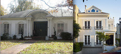
    The more I look at the photo of your home, the more I like the colors of the Presidio Heights Residence; it would mean painting your brick a "soft, warm, peachy, beige", or as victorianbugalowranch described it, "terra cotta/salmon", but if you put the photos side by side { your house and the PHR }, I really think it would be a standout!!!
    Also, is that the trim around your door that is painted black? That should be white. The way it is now, same color as the door, it makes the square shape it creates too large proportionally for the space and for the rest of the house. It also makes the doors themselves stand out less. The moulding around the door also looks like it matches the medallion? Definitely needs to be white.
    And, yes, I am very opinionated. But I care. I really do :D
  • PRO
    Giambastiani Design
    il y a 11 ans
    How about "Less is more". Leave as is, don't overdo the medallion.The black door and trim look great. Shutters could be black or grey but I don't mind it as it is...understated.
  • Jenny Farmer Melton
    il y a 11 ans
    Here is a side-by-side. Imagine how these colors would translate to your home...lovely! Good luck!
  • PRO
    User
    il y a 11 ans
    I would recommend painting it black. would give a finished look and would enhance and give your doorway a nice prescense.
  • PRO
    Mint Design
    il y a 11 ans
    Your house is quite classic and should reflect its design. I prefer to see your door in a high gloss Charleston green (appears black), yellow, or grey. The door frame however should be a semi or high gloss complementary white. The shutters can be a less glossy black or white or grey...I prefer grey as I believe the door should be entirely different from the other trim on the house. The medallion should match the house or be a tiny bit deeper in color, but the same color just a tad darker.. It should appear to be carved, not applied You can improve the curb appeal with more formal landscaping and, unless it is brick or stone, paint the landing a medium to dark grey. It appears reddish in the photo. Please do not deviate from classic. :)
  • PRO
    Hibbler-Properties
    il y a 11 ans
    Red, white and black are far too contemporary for the style of your home. Suggest muted grays or taupe hue with off-white contrasting pillars and arc over door. Black is classic no matter what the style, so you can still keep the dark shutters and matching front door in either a rich dark brown or black. I believe this color combination with add a warm richness to the front of the house that is very appealing to passersby.
  • Anna
    il y a 11 ans
    I like black shutters, black door with brass accessories
  • Anna
    il y a 11 ans
    I like black shutters, black door with brass accessories
  • lyrics1967
    il y a 11 ans
    Here's what I'm talking about. Stately, yet, not stuffy. Clean contrast with the soft gray and black or taupe and black with the crisp white trim around red door and on eves, Very classic and timeless.
  • Jenny Farmer Melton
    il y a 11 ans
    Dernière modification :il y a 11 ans
    I agree with Mint Design's comment. The landing would be nice in grey. I also prefer grey for the shutters as I too believe the door should be different from the other trim on the house. I still stand by the colors on the PHR house, especially that lovely grey on the garage doors. Leaving your brick white would be the ultimate classic American style for your house; the pale terra cotta/peach tone would be a more european look, although very "Charlestonesque". I know that your house will be gorgeous either way ~ I cannot wait to see how it turns out!

    I thought I'd give you a website that is a personal fav of mine for further inspiration, for both the interior and exterior of your new home! Really get way back into the timeline on this blog ~ it's exceptional!

    http://houseofbliss.blogspot.com
  • Alison Guerriere
    il y a 11 ans
    Dernière modification :il y a 11 ans
    I agree with victorianbungalowranch. Don't do black shutters which would look severe. I think a Wedgwood blue or something closer to it would be softer and more French looking and give your home more panache. I would also consider painting the door. Those big black doors are not very inviting. In a couple of weeks I will post a pic of a similarly styled home that I think will be a good guide for you. In the interim, here are some nice French homes to see. Notice no red doors. The effect is typically subtle, monochromatic or tone on tone. http://www.thingsthatinspire.net/2010/07/more-french-style-houses.html
  • Jenny Farmer Melton
    il y a 11 ans
    Dernière modification :il y a 11 ans
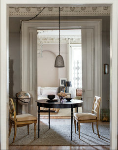
    Look at the wonderful colors in this photo and imagine pulling from them for your color palette. Some of them are similar to colors already discussed, even the pale terra cotta/peach on the chair cushions. That background wall color, the pinkish one, is also striking and could be very interesting on your brick. Lovely palette!

    Just a note: Some are suggesting no black in your palette at all. I feel that black grounds a design, interior or exterior, and used on just one element, such as on the table here, just makes everything else come alive! It would look great on your double doors and nothing else, with the exception of your "accessories" like light fixtures, iron railings, planters, mailbox, etc, which would pull the look together. The lampshade, bowls, and background picture serve this purpose in the photo here.
  • greenthumb2
    il y a 11 ans
    A valid point. But take a moment and look at the picture of the home. Without any color at all other than white - the beauty is already there.

    Notice the percentage of black in your photo is about 3%. The front door represents at least 30% of this fascia. If owner of home likes black that much(and black in design does help some homes) 1) keep the chair on porch black, 2) add two huge planters of black filled with something complimentary to landscape, if still wants black. Owner can build from there but believe once another less strong color is introduced may see the benefit of lighter darks. Right now, and even with black shutters added -- it will not be a welcome home look, but more of a show-off look not doing the stately home pictured any justice at all.

    Architecture like this (which we rarely see in America) should be loved in colors that are more easy on the eye. Google Paris and Italy if anyone wants verification on less black. Stone homes with wood trim lend best to understated. And those two countries are abound with gorgeous homes like the subject home at the top. Not pretentious looking, just beautiful. There is a big difference.

    Victoria, if you love the black, do it. But, please, if you aren't happy with it, go the other direction. You will love the look of "not so contrasted." It's the stone. Stone buildings need subtlety. Trust.
  • Jenny Farmer Melton
    il y a 11 ans
    Dernière modification :il y a 11 ans
    Point well taken, greenthumb2. I would like to clarify, though, if I may, that in the photo of Victoria's home, the very wide and beautiful trim around her double doors is also painted black, giving the illusion that they are larger than they actually are. I have suggested that that trim be painted white, or whatever trim color she chooses for the rest of the house. So, in actuality, the black would only take up MAYBE 10% of the facade, if that {also keep in mind that we are only seeing a portion of the home}.

    I, too, am a huge fan or the homes of Italy, Belgium, and France. Oh, how I dream of living there one day! I would love to restore an old farmhouse or a beautiful Parisian apartment. But Victoria's home isn't Italian or French. It is a classic American Federal Style with perhaps some beau arts details? Also, it's brick, not stone.

    We were just making some suggestions to her color palette to bring in and accent a more european flavor to the home, if she chooses to take that path. The white brick would be a classic American style.

    And I do not suggest she paint the shutters black; only the double doors, nothing else. All the other colors in the palette are very soft and low contrast, warm and beautiful. Keeping the bricks white, would be the cooler color option.
  • Angelena Checchi
    il y a 11 ans
    Like many people, I love a red door. Your home has a very classic look. Painting the shutters black to match the existing door would give it an elegant finish. If you do not want the medallion to blend in to the home. Have it shadowed with a dark grey. It will accentuate the piece without it being the sole focal point.
  • greenthumb2
    il y a 11 ans
    Oh, bricks that someone covered with white paint.
  • Jenny Farmer Melton
    il y a 11 ans
    Yes.
  • lyrics1967
    il y a 11 ans
    I have a few concerns with you using red. First, you have double doors. Rather large double doors. That's a lot of red paint. Next, my observation has been that red is most often seen on doors on a more cottage-like home which yours is not or contemporary which yours is not either. Considering the stateliness of your house, I wish you would consider the picture I posted above. It is classic and not trendy. Red has exploded the last couple of years and to me it is in danger of running it's course. Your style of home is timeless. Paint it in a timeless way. Since you picked that style, I assume you are drawn to things that are timeless, meaning that no matter how many times you see it, you love looking at it? Do what you have been drawn to for years. Once it red, and you're not happy with it or you grow tired and decide to go with a rich stain, you will pay a pretty price to have those doors stripped and stained. So consider that. I was going to put in a glass door at my home as everyone was doing it. I'm now tired of that fact that everyone up and down my street has a glass door or doors. I am now going with a richly stained craftsman door. Some trends last longer than others but they are still trends. Nothing beats the look like warm rich wood from the front of a house. How I wish you had the computer capabilities to see that door stained and then compare it painted red with all your other color choices. That would make it so much easier to decide. Either way, once those choices are made and completed you will be able to decide on the porch and walkway. Funny, but with my color choices, the porch might look cool in a red brick? Also, keep in mind, black is not harsh when paired with a soft neutral such as taupe. Crisp white can be more harsh. But even that gets toned done next to a neutral.

    Lastly, if you're feeling the need to step out of your comfort zone a little, before you do something costly and drastic to the entire front of your house, if you have a shed in the back or a willing neighbor or relative, paint it's door red and all the other colors you are imagining! If you're still not certain, find another volunteer and paint another shed with a different color combo! LOL
  • lyrics1967
    il y a 11 ans
    Here is just what I was trying to describe. Taupe paint, White Trim, Black Shutters, AND a Stained Door rather than Red, Red Brick Landing and a good look at how you can change your walkway too. It's all there. If you can't see the image well enough, I included the link to the larger photo. Clean, crisp, stately, current, yet timeless. Very classic but not tired looking. Still maintaining the character.

    http://st.houzz.com/fimgs/33312ecb00046f0f_0153-w69-h69-b0-p0--home-design.jpg
  • lyrics1967
    il y a 11 ans
    Sorry, the link I did above just gives you a thumb nail. This is the correct one for a much larger picture.
    http://www.houzz.com/photos/Houston/p/152 While at it, notice not only are the shutters are black the the window and it's panes are as well. Really dresses it up.
  • Jenny Farmer Melton
    il y a 11 ans
    lyrics1967 I have to say I just think there's too much going on with this exterior...too many different and contrasting elements. It has a heaviness about it that is just not in keeping with what Victoria's house needs. And I see this look all the time, in every average new neighborhood. Victoria's home is a rare classic that seems fairly untouched by a "renovators" hands. It needs a very gentle, subtle, and simple, clean look, i.e., classic. Please, no offense intended. I know you are well intentioned and everyone has their own opinion. I just don't want her to be led astray...so many of our historic old homes have gone the way of a bad reno. So, let us agree to disagree. :D {and PLEASE, no haters}

    Victoria ~ we would certainly love to hear some feedback from you at this point, to let us know what you are thinking...? Thanks!!!
  • lyrics1967
    il y a 11 ans
    Oh, beloved, bless your heart. Well, we do agree on one thing. No red door. I love the neutral colors you have suggested as well as the ones I have shown. I think Victoria has my problem. We love them both and find them both quite common to see in the South. She needs to decide what she is drawn to the most as she will be the one to drive up to it daily. It needs to feel not just beautiful to her but like her home. It really is that simple, isn't it? At her budget, of course. Yes, the home I showed is often seen, quite traditional and I am so thankful it never goes out of style. Both are beautiful but one says Home for The Holidays to me more than the other. Guess which one? LOL
  • Jenny Farmer Melton
    il y a 11 ans
    lyrics1967, you really made me smile :D when you said "bless your heart"! Such a classic southern thing to say! I've lived in the south for 39 years now, and I understand the comment in all its nuances.

    And you are absolutely right. Victoria will need to choose what pleases her and makes the house home. Well said.
  • lyrics1967
    il y a 11 ans
    Yes, beloved, I caught on that you lived in the south so I knew you would be OK with such an expression of affection. Not all parts of our country find it endearing. I noticed too that Victoria liked very neutral colors pallets as do I. I love white on white, beige on beige, egg shell, cream on white. Love it all. But I also like color as I noticed she does. I love jewel tones and deep earth tones and nature colors and color washes and heritage colors...all of it. So being that I cannot change my decor including exterior annually and assuming that perhaps Victoria cannot as well, I offer this suggestion to her and others. Look through magazines, a heap of them and see what catches the eye. Then pull out what you know has traditionally caught your eye for years. There are choices we look back on and think, "What was I thinking?" and then there are choices that we run across and love more each time we look. THAT is a keeper. There are places where we can afford to take risks, ie, a bedroom. The exterior of that house is not one of them unless she can afford to hire someone to change it should she not be pleased with the results. The fact that she mentioned a red door tells me she is in the mood for some color. You and I both agree that red in not in the best interest of the door. The color for the brick I chose is neutral and black for the shutters is neutral as well. I thought perhaps the red brick landing would make up for her not having a red door and be much less intrusive.

    Victoria, Sherwin -Williams has something that they call a color visualizer. You can use one of their "model" homes and play around with the colors or upload a photo of your home which I really recommend or have someone do photoshop for you which is even better. We are fortunate to live in a time where we can apply many of the suggestions here, even combine many and see what does and what doesn't work without all the cost not to mention the time that comes with the labor and people in and around your home.

    We are all pulling for you and look forward to seeing your choices and the results. It will be beautiful, I'm sure!
  • Jenny Farmer Melton
    il y a 11 ans
    Dear Victoria,

    If your heart is at all swayed in the way of the Presidio Heights Residence color palette, I have researched and found the colors for the exterior walls and the garage doors. They are Benjamin Moore paints, which I would recommend over all other american paint brands; they are certainly the decorators choice. They are more expensive, but SO worth it with the end product! {I personally prefer Farrow and Ball, but it can be hard to find and is quit expensive}

    This house in featured in the book "House Colors" by Susan Hershman. In it the colors are provided as follows:
    Grant Beige, #HC-83 for the exterior and River Gorge Gray, # 1537 for the garage doors, both by Benjamin Moore.

    Also, if you google Benjamin Moore Grant Beige, quite a few images come up for you to look at so you can see how the color looks in other settings, including interior rooms.

    Hope that helps! :)
  • Jenny Farmer Melton
    il y a 11 ans
    Victoria, I found more from the book:

    The choice of warm neutrals for this elegant Edwardian Victorian is outstanding. The home features almost as much trim as field color, so it’s especially important that the colors are balanced properly. Good whites are difficult to achieve with great results, but this one hits the nail right on the head. It’s warm and fresh, it blends without losing its identity, and it isn’t so bright that the colors lose their equilibrium with each other. The addition of the delicately sculpted railings, matching gate, and hanging light fixture reinforce the black door color without overpowering the house with contrasting color. The garage door color recedes and grounds the house, allowing the eye to shift to the right and focus on the stately entry of this gorgeous home, with its handsome portico and black double entry doors.

    Hershman, Susan (2007-09-07). House Colors (Kindle Locations 2061-2066). Gibbs-Smith. Kindle Edition.
  • Jenny Farmer Melton
    il y a 11 ans
    More....

    Field Paint Color Manufacturer: Benjamin Moore Color number: HC-83 Color name: Grant Beige Window, Window Frame, Portico, and Railing Paint Color Manufacturer: Benjamin Moore Color
    number: HC-27 Color name: Monterey White
    Door Paint Color Manufacturer: Benjamin Moore Color number: EXT.RM. Color name: Black
    Wrought-Iron Balcony, Railings, and Gate Paint Color Manufacturer: Rust-Oleum Product: Satin
    Enamel Finish Number: 7777 Color name: Satin Black Note: My match
    Garage Door Manufacturer: Carriage House Doors Product: Classic Line Style: Recessed Panel Note: My match Paint Color Manufacturer: Benjamin Moore Color name: Custom Tinting base: N096-2B One gallon formula: BK 1 x 13 BR 0.5 MA 0.5 OY 2 x 30 RX 7
    Cornice Horizontal Trim Paint Color Manufacturer: Benjamin Moore 75% of formula: Color number: HC-86 Color name: Kingsport Gray Note: My match
    Steps Material: White marble
    Hanging Light Fixture Manufacturer: Sea Gull Lighting Product name: Lancaster Product number: 6039-12 Color: Black Material: Solid brass Glass: Clear curved, beveled Note: My match

    Hershman, Susan (2007-09-07). House Colors (Kindle Locations 7517-7520). Gibbs-Smith. Kindle Edition.
  • PRO
    Avedon Designs
    il y a 11 ans
    I think a red door is too much, I would keep it black laquer to match the shutters. Also, the medallion should be highlighted not painted (tacky). A light greyish antiquing on the medallion will make it "pop".
  • nevadan
    il y a 11 ans
    Medallion should be a pale blue.
  • greenthumb2
    il y a 11 ans
    ?
  • designmuse
    il y a 11 ans
    I recently did similar color scheme to my home. I vote for black.
  • User
    il y a 11 ans
    Why would you change anything about the color scheme? It's perfect, timeless and nostalgic. I would sooner work on your topiary and rose garden...
France
Personnaliser mon expérience à l'aide de cookies

Houzz utilise des cookies et d'autres technologies de suivi similaires pour personnaliser mon expérience utilisateur, me proposer du contenu pertinent et améliorer ses produits et services. En cliquant sur « Accepter », j'accepte l'utilisation des cookies telle qu'elle est décrite plus en détail dans la Politique d'Utilisation des Cookies de Houzz. Je peux rejeter les cookies non essentiels en cliquant sur « Tout rejeter » ou « Gérer mes préférences ».