Idées déco de cuisines classiques avec des portes de placard grises
Trier par :
Budget
Trier par:Populaires du jour
41 - 60 sur 44 884 photos
1 sur 3
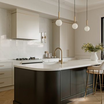
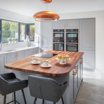
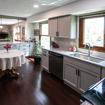
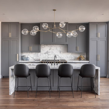
Aménagement d'une cuisine ouverte parallèle classique avec un évier encastré, un placard à porte shaker, des portes de placard grises, un plan de travail en quartz modifié, une crédence multicolore, une crédence en marbre, un sol en bois brun, îlot, un sol marron et un plan de travail blanc.
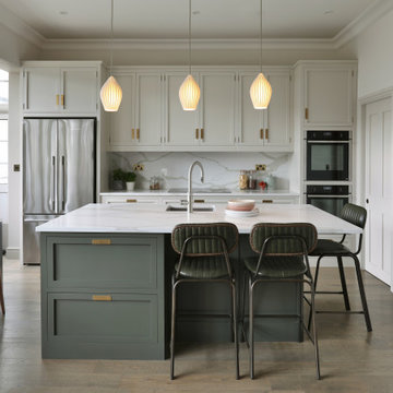
With its painted shaker-style cabinets featuring our bespoke inset handles, this kitchen is a visual delight. The island stands out in a captivating dark green tone (Pompeian Ash by Little Greene) while the main cabinetry is graced with a lighter shade (Little Greene's Slaked Lime Deep). Embracing functionality, the pantry to the right of the kitchen is a storage haven, ensuring a tidy kitchen by concealing any chaos.
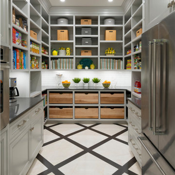
Pantry with built-in cabinetry, patterned marble floors, and natural wood pull-out drawers
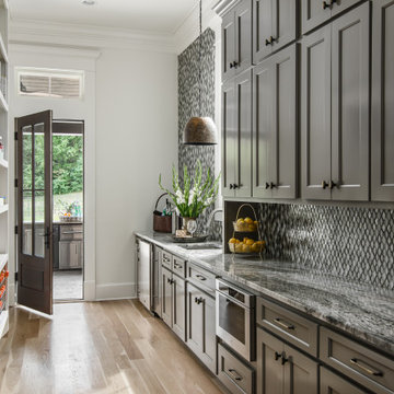
Réalisation d'une grande arrière-cuisine tradition en U avec un placard à porte plane, des portes de placard grises, un plan de travail en quartz modifié, une crédence blanche, une crédence en céramique, un électroménager en acier inoxydable, un sol en marbre, un sol blanc et un plan de travail gris.
Réalisation d'une grande arrière-cuisine tradition en U avec un placard à porte plane, des portes de placard grises, un plan de travail en quartz modifié, une crédence blanche, une crédence en céramique, un électroménager en acier inoxydable, un sol en marbre, un sol blanc et un plan de travail gris.
The open kitchen space allows plenty of room for entertaining, without compromising on counterspace.
Réalisation d'une cuisine américaine tradition en U de taille moyenne avec un évier de ferme, un placard à porte shaker, des portes de placard grises, un plan de travail en quartz modifié, une crédence blanche, une crédence en céramique, un électroménager en acier inoxydable, aucun îlot, un sol marron et un plan de travail blanc.
Réalisation d'une cuisine américaine tradition en U de taille moyenne avec un évier de ferme, un placard à porte shaker, des portes de placard grises, un plan de travail en quartz modifié, une crédence blanche, une crédence en céramique, un électroménager en acier inoxydable, aucun îlot, un sol marron et un plan de travail blanc.
Silk painted Shaker style kitchen designed for a busy family who desired a kitchen which would grow with the family.
A space which would inspire aspiring young cooks, teenagers grabbing a midnight snack, and adults entertaining friends.
Shades of grey combined with the warm tone of copper and iroko make for an easy living come work space.
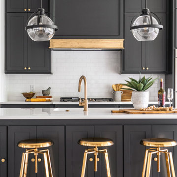
This black, gray and gold urban farmhouse kitchen is the hub of the home for this busy family. Our team changed out the existing plain kitchen hood for this showstopper custom stainless hood with gold strapping and rivets. This provided a much needed focal point for this lovely kitchen. In addition, we changed out the 36" refrigerator to a roomier 42" refrigerator and built-in a matching paneled refrigerator cabinet. We also added the antique gold linear hardware and black and gold lighting to give it a streamlined look. Touches of black tie the kitchen design into the rest of the home's mostly black and white color scheme. The woven counter stools give the space a touch of casual elegance. A new champagne gold kitchen faucet and potfiller add additional style, while greenery and wood accessories add a touch of warmth.
Bilotta Senior Designer, Thomas Vecchio, and Patrick J. Hamilton of Patrick James Hamilton Designs, partnered on this Manhattan upper east side kitchen renovation. This nondescript ‘60’s co-op and galley kitchen were reimagined into a pre-war era gem by adding architectural details: paneling, coffers, and moldings. Widening the opening created an open vista. Upper panes of glass on the Bilotta Collection wall cabinets echo the apartment’s transoms and unite the two sections that are interrupted by the paneled structural column. To compensate for the shorter wall, storage is optimized with plentiful pullouts, dividers, and specialized organizers. The “dead end” under the window was eliminated by continuing cabinetry and countertop materials around the room.
Countertop wall cabinets create a hutch in full view of the dining room. With dark gray paint, corner posts and furniture base molding, the peninsula reads like an island and bridges the two areas. Quartz countertops sport “lightning bolt” veins for pattern. Sophisticated on-
trend brushed brass was employed on the cabinet pulls and knobs, faucet, sconces, and pendants. A gamechanger was extending the footprint of the kitchen into the hallway with two tall cabinets. One is allocated for cleaning supplies, bulk items, recycling, and the vacuum. The other conceals a built-in wine rack; glassware and bar items; a docking drawer for charging devices; and a Penda-flex rack for files. An absolutely stunning metamorphosis.
Written by Paulette Gambacorta adapted for Houzz.
Bilotta Designer: Tom Vecchio
Interior Designer: Patrick J. Hamilton of Patrick James Hamilton Designs
Photographer: John Bessler
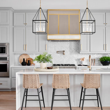
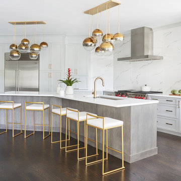
Exemple d'une grande cuisine ouverte linéaire et grise et blanche chic avec un évier encastré, un placard à porte plane, des portes de placard grises, un plan de travail en quartz, une crédence blanche, une crédence en dalle de pierre, un électroménager en acier inoxydable, carreaux de ciment au sol, îlot, un sol blanc et un plan de travail blanc.
In this kitchen, Medallion Walton cabinets in Harbor Mist Sheer were installed with Luna Pearl granite countertop. Anatolia Marlow tile was installed on the backsplash. Two Kichler Wynberg Mini Pendent lights were installed over the peninsula. A Crosstown undermount sink with Harmony pull-out faucet
A mixture of greige (Thistledown) and dark gray (Eclipse) cabinets add a contemporary look to this galley kitchen. Clean, shaker style lines in Crestwood Cabinet’s Cranbrook door style add to that look. The random pattern mosaic tile backsplash is brought up to the ceiling with a floating shelve installed above the sink. The upper trim was painted to match the dark cabinets while the lower trim matches the lighter cabinets. A Blanco undermount sink keeps the Cambria Skara Brae Quartz countertop clean to fully appreciate the beautiful bold movement. The simple, clean faucet was in the former kitchen and goes perfectly in the new space.
Download our free ebook, Creating the Ideal Kitchen. DOWNLOAD NOW
This client was referred to us from a past client. They are a busy 2-career household with young children and enjoy entertaining friends and family in their home. They have a beautiful open concept home but unfortunately the kitchen was not fitting for the rest of the home. They were not quite sure what to do with the space. We talked about trying to refresh it or do more of a minor remodel, but in the end they decided a full gut would get them to where they wanted to be.
One problem was there was no place for guests to hang out other than the large and awkward banquette area. The brick wall and tiled hood area were feeling a bit dated and tired. The space was just not functional for their lifestyle. There was no prep space near the cooktop and no landing area for items coming out of the ovens or refrigerator, plus a big dead zone in the center of the room.
Banquettes, like the one they previously had in the space, are great for small spaces, but when they get really large like this one, it makes getting in and out of the seating area awkward and uncomfortable. Plus, there was room for a large table, so we eliminated the awkward built in.
We started by removing the faux brick wall between the kitchen and back entry. We relocated the entry to the garage over a couple feet in order to get every last inch out of the new kitchen. We also made the decision to close up the primary window that faced the pretty ho hum brick wall of the neighbor’s house. There was plenty of light coming in from the seating area, so we just didn’t feel the window was adding much to the room.
Construction went smoothy. There was a bit of rework with electrical, flooring and HVAC, but in the end, we think it was well worth it.
The clients really wanted a sleek contemporary look, and we originally had planned for a full height slab backsplash, but due to it’s size, it was a budget buster. Instead, we got creative and settled on large format porcelain tiles that have a similar feel but were a fraction of the cost. We made sure the wall was plumb and level so that the fit and finish would mimic that of slab material.
The final space was quite a change. A large prep sink sits directly across from the new pro-style range with plenty additional prep space on the large island. The refrigerator and ovens now have miles of landing space, and a nice tight work triangle makes cooking a breeze.
Since we wanted a more contemporary feel, not many wall cabinets were included. Instead, we outfitted some of the drawers for dish storage with a peg system. Two large pantries flanking the refrigerator hold baking supplies and small appliances. Large drawers by the cooktop hold pots and pans, and an appliance garage tucked away to the left of the range hides away miscellaneous items. The large island also houses a microwave drawer and tons of storage, most of which is drawers offering maximum convenience.
The island now seats 5-6 people comfortably along with the new table in the seating area which can seat up to 8. Entertaining will be a breeze in this space. With such a clean backdrop, we knew we would need some drama with the lighting, so we chose two sets of staggered pendants, which we adjusted for the right visual balance above the island.
We also included a small coffee station to the right of the main kitchen, which helps keep the coffee clutter out of the kitchen proper. Two tones of complimentary gray are featured in this kitchen. The perimeter is a light gray that reads almost white. The island is a gray stain that adds some depth and interest with the visible wood texture. The countertops are clean white quartz, and the hardware, barstools and light fixtures add warm brass tones. I see lots of cooking and entertaining with family and friends in the near future in this bright and airy new space.
Designed by: Susan Klimala, CKD, CBD
Photography by: Michael Kaskel
For more information on kitchen and bath design ideas go to: www.kitchenstudio-ge.com
With a light and airy color palette, the glossy white backsplash tile in a timeless offset pattern takes center stage in this kitchen.
DESIGN
Caitlin Flemming
PHOTOS
Stephanie Russo
Tile Shown: 4x4 in White Wash
The kitchen features Calacatta Oro slabs on the counter, backsplash, and waterfall island.
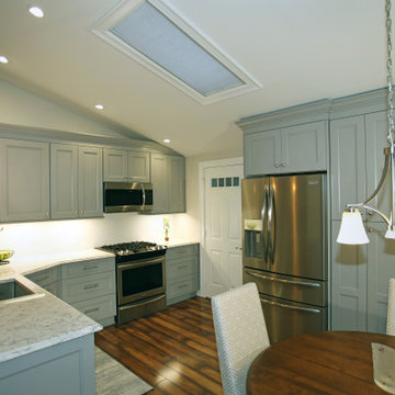
Cette image montre une cuisine américaine traditionnelle de taille moyenne avec des portes de placard grises, plan de travail en marbre, une crédence en marbre, un sol en bois brun, îlot et un plan de travail blanc.
Cette image montre une cuisine américaine traditionnelle de taille moyenne avec des portes de placard grises, plan de travail en marbre, une crédence en marbre, un sol en bois brun, îlot et un plan de travail blanc.
Architecture: Noble Johnson Architects
Interior Design: Rachel Hughes - Ye Peddler
Photography: Garett + Carrie Buell of Studiobuell/ studiobuell.com
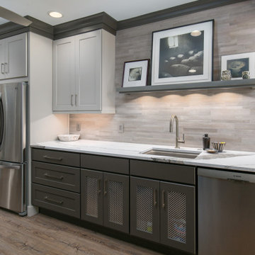
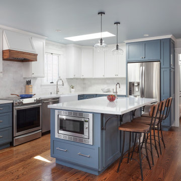
Aménagement d'une grande arrière-cuisine parallèle classique avec un évier encastré, une crédence métallisée, un électroménager en acier inoxydable, un placard avec porte à panneau encastré, des portes de placard grises, une crédence en mosaïque, parquet clair, aucun îlot, un sol beige et un plan de travail gris.
Aménagement d'une grande arrière-cuisine parallèle classique avec un évier encastré, une crédence métallisée, un électroménager en acier inoxydable, un placard avec porte à panneau encastré, des portes de placard grises, une crédence en mosaïque, parquet clair, aucun îlot, un sol beige et un plan de travail gris.
Cabico Unique Cabinetry
Gray Full Overlay Cabinetry
Idée de décoration pour une grande cuisine tradition en U avec un évier de ferme, un placard à porte shaker, des portes de placard grises, un plan de travail en quartz modifié, une crédence blanche, une crédence en marbre, un électroménager en acier inoxydable, parquet foncé, aucun îlot, un sol marron et plan de travail noir.
Idée de décoration pour une grande cuisine tradition en U avec un évier de ferme, un placard à porte shaker, des portes de placard grises, un plan de travail en quartz modifié, une crédence blanche, une crédence en marbre, un électroménager en acier inoxydable, parquet foncé, aucun îlot, un sol marron et plan de travail noir.
Modern classic Hand painted In Frame shaker kitchen in Zoffany Gargoyle with Silestone Eternal Classic Calacatta quartz worktop. Finished with Copper sink and brass handles to complete the look.
Exemple d'une cuisine américaine chic en U de taille moyenne avec un évier 2 bacs, un placard à porte shaker, des portes de placard grises, un plan de travail en quartz, un électroménager noir, aucun îlot et un plan de travail blanc.
Inspiration pour une cuisine américaine traditionnelle de taille moyenne avec un évier encastré, un placard avec porte à panneau surélevé, des portes de placard grises, un plan de travail en quartz, une crédence blanche, un électroménager en acier inoxydable, un sol marron, un plan de travail blanc et un plafond voûté.
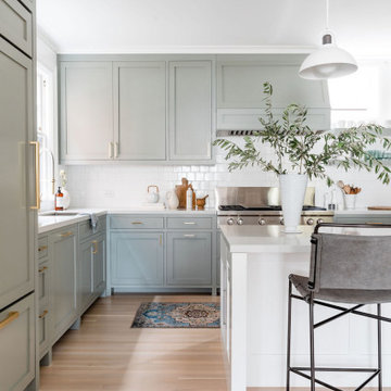
Idées déco pour une cuisine parallèle classique avec un évier encastré, un placard à porte shaker, des portes de placard grises, une crédence blanche, une crédence en carrelage métro, un sol en bois brun, îlot, un sol marron et un plan de travail blanc.
This house was a very small mid-century bungalow with previous additions that resulted in a large but chaotic layout. The owners wanted to convert the house to a super-efficient, and charming Craftsman-style, 6 bedroom home for their large family and work at home.
We achieved the space needs by moving a few walls for a more efficient, organized layout, setting up spaces for overlapping uses, and making a small upstairs addition. Every bit of square footage was optimized to meet the goals of the project without making the house huge or adding unnecessary cost.
Much thought was given to the entry sequence near the front door. A large flow-through mudroom with storage for each family member, and adjacent laundry, make it easy for children to be taught to keep their things organized and to contribute to household chores. A mail station and central home admin area at the mudroom help keep clutter down at other areas and minimize home management tasks. A garage door near the kitchen gives quick access to bulk items.
The existing house had too much view to the street from the living room through large corner windows, and too little entry transition, to the extent that the family did not feel comfortable using the living room much without shades drawn. We raised the window sills and brought the new windows in from the corner of the house, allowing plenty of light while protecting privacy and a sense of enclosure in the living room. We enlarged the front porch to create a more graceful transition from the public to private space. We located the front door so that the circulation from entry into the house would allow for furnishing the living room with a sitting circle that is not intruded upon by people walking through the room.
Sight lines through the living spaces were an important consideration in the design. The owners wanted discreet spaces for living room, kitchen, dining and family room, but also wanted the living spaces to feel connected and to be able to easily watch their children. Being able to see the children playing in the yard while getting things done inside the house was also important. While largely working with the existing structure, we opened walls and rearranged the use of spaces to make a series of connected living spaces with long views through them.
The character of the remodeled house is a contemporary Craftsman with classic materials and cool, consistent colors. A few arches echo through the house to frame spaces and soften the feeling of the rooms.
Photography: Kurt Manley
https://saikleyarchitects.com/portfolio/bungalow-expansion/
Idées déco de cuisines classiques avec des portes de placard grises
3