Idées déco d'entrées avec une porte blanche
Trier par :
Budget
Trier par:Populaires du jour
1 - 20 sur 21 208 photos
1 sur 2
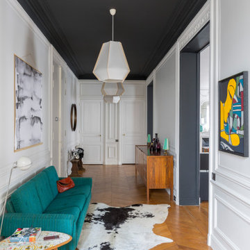
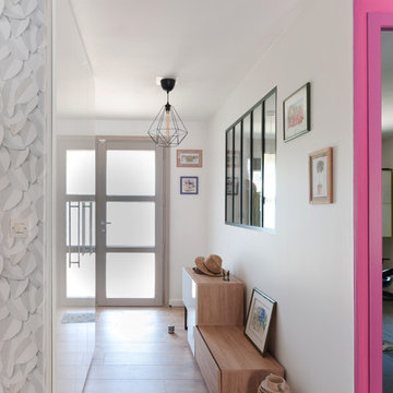
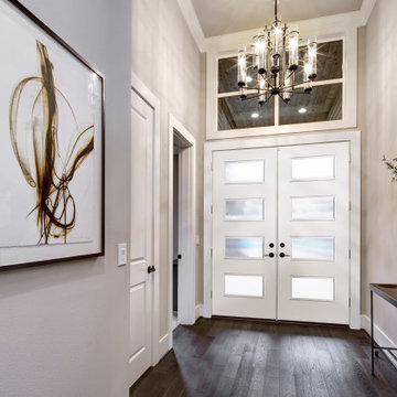
Cette image montre un grand hall d'entrée design avec un mur blanc, un sol en bois brun, une porte double, une porte blanche et un sol marron.
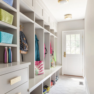
Entrée optimisée avec rangements chaussures sur-mesure
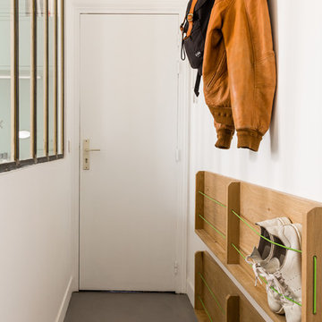
Réalisation d'une petite entrée design avec un couloir, un mur blanc, sol en béton ciré, une porte simple, une porte blanche et un sol gris.
Réalisation d'une petite entrée design avec un couloir, un mur blanc, sol en béton ciré, une porte simple, une porte blanche et un sol gris.
Dans cet appartement haussmannien un peu sombre, les clients souhaitaient une décoration épurée, conviviale et lumineuse aux accents de maison de vacances. Nous avons donc choisi des matériaux bruts, naturels et des couleurs pastels pour créer un cocoon connecté à la Nature... Un îlot de sérénité au sein de la capitale!
Vue sur l'entrée
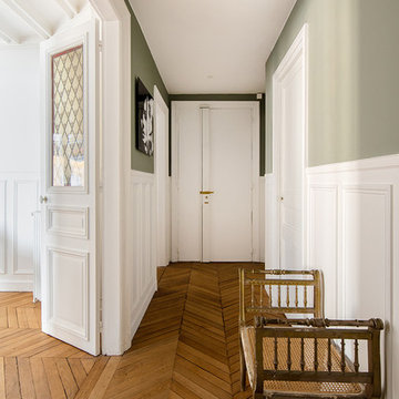
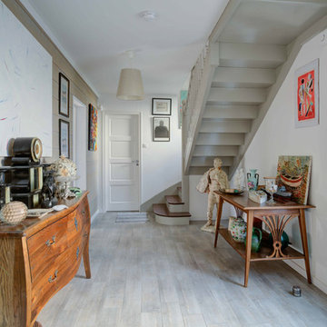
Inspiration pour une entrée traditionnelle avec un couloir, un mur vert, un sol en bois brun, une porte simple, une porte blanche et un sol marron.
Inspiration pour une entrée traditionnelle avec un couloir, un mur vert, un sol en bois brun, une porte simple, une porte blanche et un sol marron.
Résolument Déco
Exemple d'une entrée tendance de taille moyenne avec un mur blanc, parquet clair, un couloir, une porte simple, une porte blanche et un sol beige.
Exemple d'une entrée tendance de taille moyenne avec un mur blanc, parquet clair, un couloir, une porte simple, une porte blanche et un sol beige.
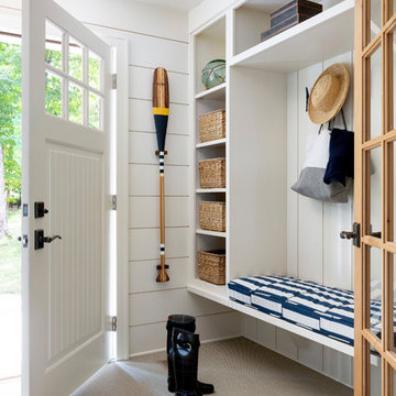
Aménagement d'une entrée bord de mer avec un couloir, un mur blanc, parquet clair, une porte simple, une porte blanche et un sol gris.
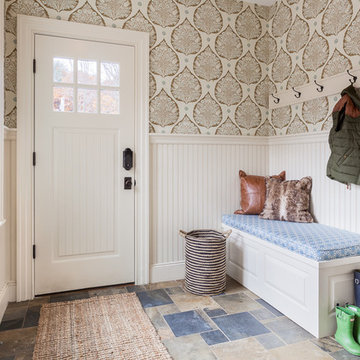
Idées déco pour une entrée craftsman de taille moyenne avec un vestiaire, un mur bleu, un sol en carrelage de porcelaine, une porte simple, une porte blanche et un sol gris.
Ellen McDermott
Inspiration pour une entrée rustique de taille moyenne avec un mur vert, une porte simple, une porte blanche et un sol beige.
Inspiration pour une entrée rustique de taille moyenne avec un mur vert, une porte simple, une porte blanche et un sol beige.
© Greg Perko Photography 2014
Idée de décoration pour une petite entrée tradition avec un mur multicolore, un sol en ardoise, une porte simple, une porte blanche et un sol multicolore.
Idée de décoration pour une petite entrée tradition avec un mur multicolore, un sol en ardoise, une porte simple, une porte blanche et un sol multicolore.
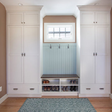
Inspiration pour une entrée traditionnelle de taille moyenne avec un vestiaire, un mur beige, un sol en carrelage de céramique, une porte simple, une porte blanche et un sol gris.
Enhance your entrance with double modern doors. These are gorgeous with a privacy rating of 9 out of 10. Also, The moulding cleans up the look and makes it look cohesive.
Base: 743MUL-6
Case: 145MUL
Interior Door: HFB2PS
Exterior Door: BLS-228-119-4C
Check out more options at ELandELWoodProducts.com
(©Iriana Shiyan/AdobeStock)
The doorway to the beautiful backyard in the lower level was designed with a small, but very handy staging area to accommodate the transition from indoors to out. This custom home was designed and built by Meadowlark Design+Build in Ann Arbor, Michigan. Photography by Joshua Caldwell.
The entryway, living, and dining room in this Chevy Chase home were renovated with structural changes to accommodate a family of five. It features a bright palette, functional furniture, a built-in BBQ/grill, and statement lights.
Project designed by Courtney Thomas Design in La Cañada. Serving Pasadena, Glendale, Monrovia, San Marino, Sierra Madre, South Pasadena, and Altadena.
For more about Courtney Thomas Design, click here: https://www.courtneythomasdesign.com/
To learn more about this project, click here:
https://www.courtneythomasdesign.com/portfolio/home-renovation-la-canada/
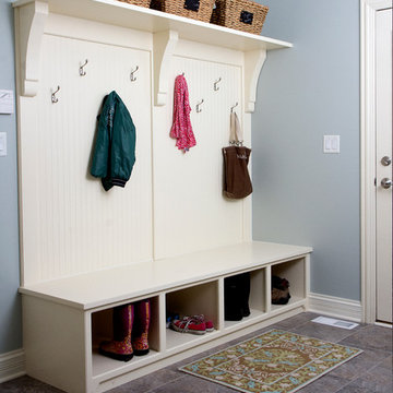
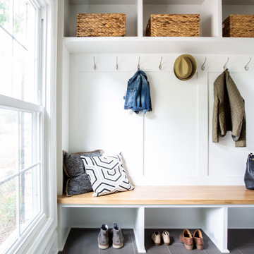
Entering from the garage, this mud area is a welcoming transition between the exterior and interior spaces. Since this is located in an open plan family room, the homeowners wanted the built-in cabinets to echo the style in the rest of the house while still providing all the benefits of a mud room.
Kara Lashuay
Spacecrafting Photography
Cette image montre une petite entrée marine avec un vestiaire, un mur blanc, moquette, une porte simple, une porte blanche, un sol beige, un plafond en lambris de bois et du lambris de bois.
Cette image montre une petite entrée marine avec un vestiaire, un mur blanc, moquette, une porte simple, une porte blanche, un sol beige, un plafond en lambris de bois et du lambris de bois.
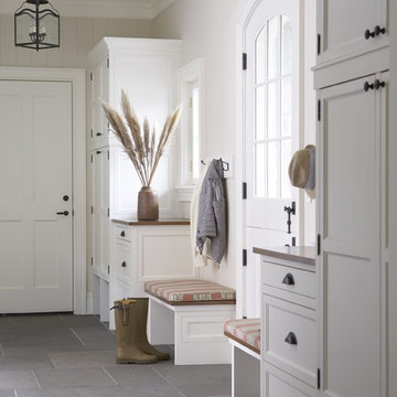
Aménagement d'une entrée campagne avec un vestiaire, un mur blanc, une porte simple, un sol gris et une porte blanche.
Regan Wood Photography
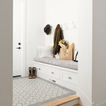
Réalisation d'une entrée tradition avec un vestiaire, un mur beige, une porte simple, une porte blanche et un sol blanc.
Réalisation d'une entrée tradition avec un vestiaire, un mur beige, une porte simple, une porte blanche et un sol blanc.
Lauren Rubenstein Photography
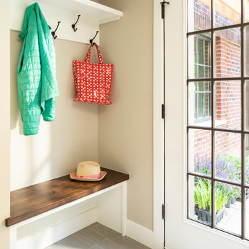
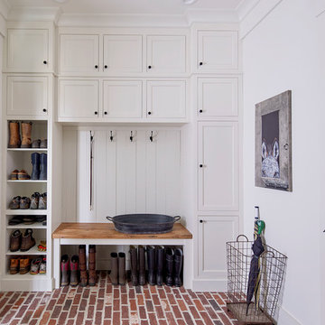
Cette photo montre une entrée nature avec un vestiaire, un mur blanc, un sol en brique, une porte hollandaise, une porte blanche et un sol rouge.
Cette photo montre une entrée nature avec un vestiaire, un mur blanc, un sol en brique, une porte hollandaise, une porte blanche et un sol rouge.
Mudroom with Dutch Door, bluestone floor, and built-in cabinets. "Best Mudroom" by the 2020 Westchester Magazine Home Design Awards: https://westchestermagazine.com/design-awards-homepage/
Kyle J. Caldwell Photography
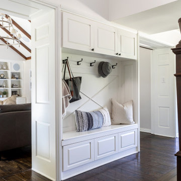
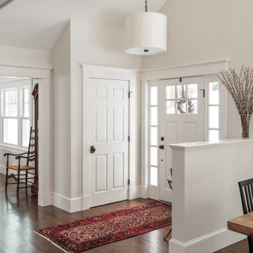
Aménagement d'une porte d'entrée classique avec un mur blanc, parquet foncé, une porte simple, une porte blanche et un sol marron.
Aménagement d'une porte d'entrée classique avec un mur blanc, parquet foncé, une porte simple, une porte blanche et un sol marron.
Idées déco d'entrées avec une porte blanche
1