Idées déco d'entrées avec un vestiaire
Trier par :
Budget
Trier par:Populaires du jour
1 - 20 sur 14 713 photos
1 sur 2
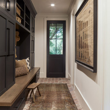
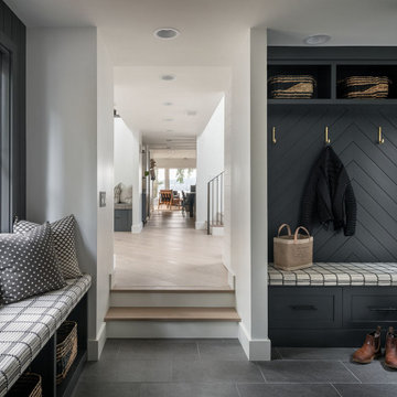
Réalisation d'une entrée avec un vestiaire, un sol en brique, une porte simple et une porte noire.
mudroom entry
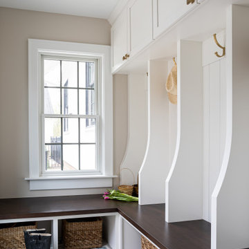
Aménagement d'une entrée classique de taille moyenne avec un vestiaire, un mur beige et sol en béton ciré.
Aménagement d'une entrée classique de taille moyenne avec un vestiaire, un mur beige et sol en béton ciré.
Interior Design: Tucker Thomas Interior Design
Builder: Structural Image
Photography: Spacecrafting
Custom Cabinetry: Engstrom
Wood Products
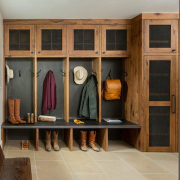
Cette photo montre une entrée chic de taille moyenne avec un vestiaire et un sol multicolore.
Cette photo montre une entrée chic de taille moyenne avec un vestiaire et un sol multicolore.
Idées déco pour une entrée craftsman de taille moyenne avec un vestiaire, un mur bleu, un sol en carrelage de porcelaine, une porte simple, une porte blanche et un sol gris.
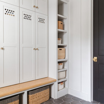
Photo: Rachel Loewen © 2019 Houzz
Cette photo montre une entrée scandinave avec un vestiaire, un mur blanc, un sol gris et du lambris.
Cette photo montre une entrée scandinave avec un vestiaire, un mur blanc, un sol gris et du lambris.
Free ebook, Creating the Ideal Kitchen. DOWNLOAD NOW
We went with a minimalist, clean, industrial look that feels light, bright and airy. The island is a dark charcoal with cool undertones that coordinates with the cabinetry and transom work in both the neighboring mudroom and breakfast area. White subway tile, quartz countertops, white enamel pendants and gold fixtures complete the update. The ends of the island are shiplap material that is also used on the fireplace in the next room.
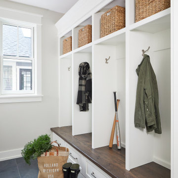
In the new mudroom, we used a fun porcelain tile on the floor to get a pop of pattern, and walnut accents add some warmth. Each child has their own cubby, and there is a spot for shoes below a long bench. Open shelving with spots for baskets provides additional storage for the room.
Designed by: Susan Klimala, CKBD
Photography by: LOMA Studios
For more information on kitchen and bath design ideas go to: www.kitchenstudio-ge.com
Idées déco pour une entrée campagne de taille moyenne avec un vestiaire, un mur blanc, une porte simple, une porte en bois foncé, un sol gris et un sol en carrelage de porcelaine.
Design & Build Team: Anchor Builders,
Photographer: Andrea Rugg Photography
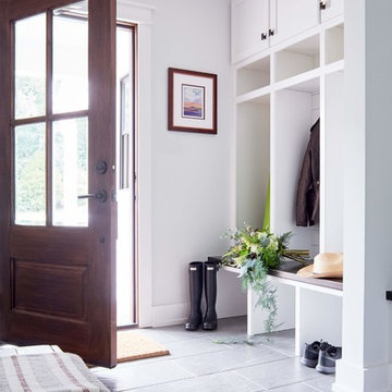
Inspiration pour une entrée traditionnelle de taille moyenne avec un vestiaire, un mur blanc, un sol en carrelage de porcelaine et un sol noir.
Inspiration pour une entrée traditionnelle de taille moyenne avec un vestiaire, un mur blanc, un sol en carrelage de porcelaine et un sol noir.
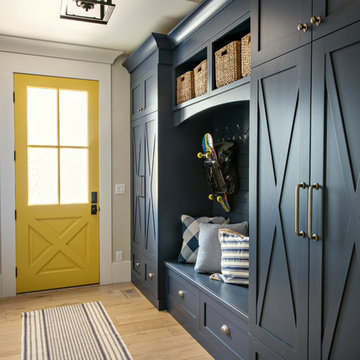
Idée de décoration pour une entrée tradition avec un vestiaire, un mur beige, parquet clair, une porte jaune et un sol beige.
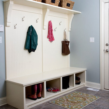
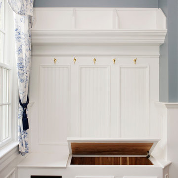
We designed this built in bench with shoe storage drawers, a shelf above and high and low hooks for adults and kids.
Photos: David Hiser
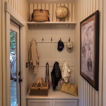
Cette image montre une petite entrée traditionnelle avec un mur multicolore, une porte simple, une porte en verre et un vestiaire.
Cette image montre une petite entrée traditionnelle avec un mur multicolore, une porte simple, une porte en verre et un vestiaire.
www.robertlowellphotography.com
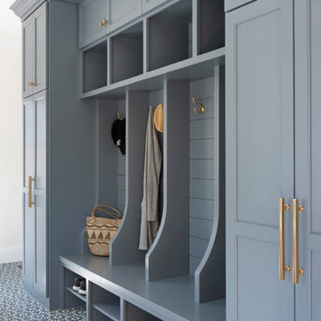
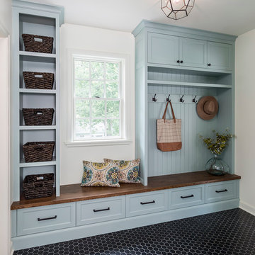
Idée de décoration pour une entrée tradition de taille moyenne avec un vestiaire, un sol en ardoise et un mur bleu.
Idée de décoration pour une entrée tradition de taille moyenne avec un vestiaire, un sol en ardoise et un mur bleu.
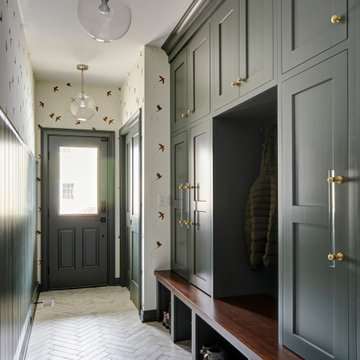
Idées déco pour une grande entrée classique avec un vestiaire, un mur vert, un sol en carrelage de porcelaine, un sol blanc et du lambris de bois.
Inspiration pour une grande entrée chalet avec un vestiaire, un mur beige et un sol beige.
Exemple d'une petite entrée nature avec un vestiaire, un mur blanc, un sol en ardoise, une porte simple et un sol bleu.
Inspiration pour une entrée rustique avec un vestiaire, un mur blanc, un sol gris et du lambris de bois.
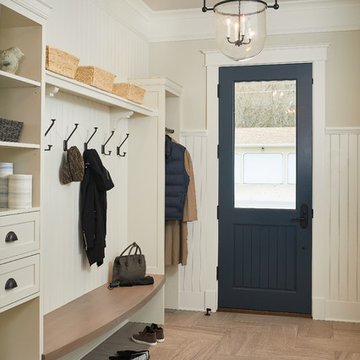
New mudroom to keep all things organized!
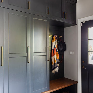
Inspiration pour une entrée traditionnelle avec un vestiaire, un mur gris, un sol en vinyl et un sol multicolore.
Inspiration pour une entrée traditionnelle avec un vestiaire, un mur gris, un sol en vinyl et un sol multicolore.
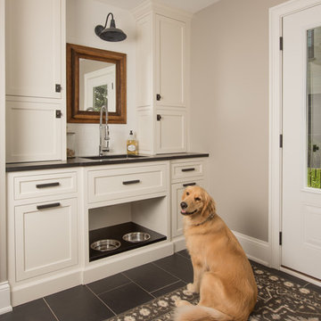
a good dog hanging out
Inspiration pour une entrée traditionnelle de taille moyenne avec un vestiaire, un sol en carrelage de céramique, un sol noir et un mur gris.
Inspiration pour une entrée traditionnelle de taille moyenne avec un vestiaire, un sol en carrelage de céramique, un sol noir et un mur gris.
Photographer : Ashley Avila Photography
Inspiration pour une entrée traditionnelle de taille moyenne avec un vestiaire, un mur beige, une porte simple, une porte bleue, un sol marron et un sol en carrelage de porcelaine.
Inspiration pour une entrée traditionnelle de taille moyenne avec un vestiaire, un mur beige, une porte simple, une porte bleue, un sol marron et un sol en carrelage de porcelaine.
Emma Lewis
Exemple d'une grande entrée chic avec un vestiaire, un mur vert, un sol en brique et un sol orange.
Exemple d'une grande entrée chic avec un vestiaire, un mur vert, un sol en brique et un sol orange.
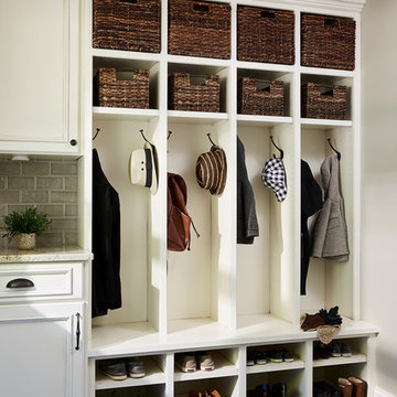
Aménagement d'une entrée classique avec un vestiaire, un mur blanc et un sol multicolore.
Idées déco d'entrées avec un vestiaire
1