Idées déco d'entrées avec un mur blanc
Trier par :
Budget
Trier par:Populaires du jour
1 - 20 sur 42 733 photos
1 sur 2
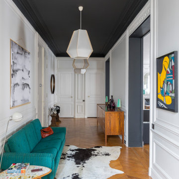
Cette image montre un grand hall d'entrée design avec un mur blanc, un sol en bois brun, une porte double, une porte blanche et un sol marron.
Idée de décoration pour une entrée design de taille moyenne avec un couloir, un mur blanc, une porte simple, une porte noire, un sol marron et un sol en carrelage de céramique.
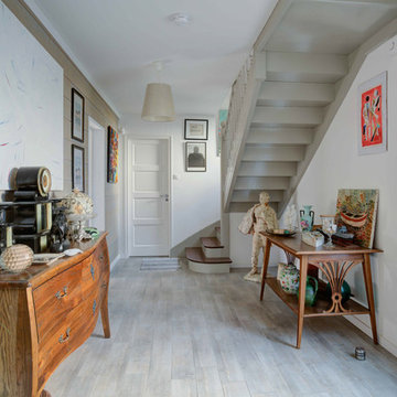
Exemple d'une entrée éclectique avec un mur blanc, un sol en bois brun, une porte simple, une porte noire et un sol marron.
Nathan Brami
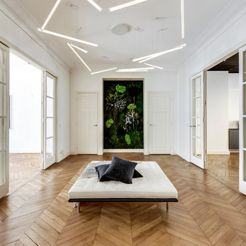
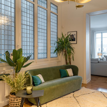
Idée de décoration pour un grand hall d'entrée design avec un mur blanc, parquet clair et un sol beige.
Idée de décoration pour un grand hall d'entrée design avec un mur blanc, parquet clair et un sol beige.
meero
Idées déco pour une entrée classique avec un mur blanc, un sol en bois brun et un sol marron.
Idées déco pour une entrée classique avec un mur blanc, un sol en bois brun et un sol marron.
Rénovation appartement Neuilly sur Seine
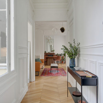
Idées déco pour un hall d'entrée classique de taille moyenne avec un mur blanc, parquet clair, une porte double, une porte bleue et un sol beige.
Idées déco pour un hall d'entrée classique de taille moyenne avec un mur blanc, parquet clair, une porte double, une porte bleue et un sol beige.
Réalisation d'une entrée tradition avec un mur blanc, parquet clair, une porte simple, une porte noire et un sol beige.
Entrée optimisée avec rangements chaussures sur-mesure
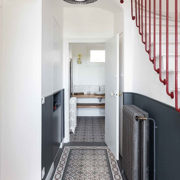
Réalisation d'une petite entrée design avec un couloir, un mur blanc, sol en béton ciré, une porte simple, une porte blanche et un sol gris.
Réalisation d'une petite entrée design avec un couloir, un mur blanc, sol en béton ciré, une porte simple, une porte blanche et un sol gris.
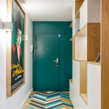
Cette image montre une entrée design avec un mur blanc, parquet peint, une porte simple, une porte verte et un sol multicolore.
Dans cet appartement haussmannien un peu sombre, les clients souhaitaient une décoration épurée, conviviale et lumineuse aux accents de maison de vacances. Nous avons donc choisi des matériaux bruts, naturels et des couleurs pastels pour créer un cocoon connecté à la Nature... Un îlot de sérénité au sein de la capitale!
Résolument Déco
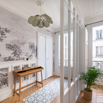
Exemple d'une entrée tendance de taille moyenne avec un mur blanc, parquet clair, un couloir, une porte simple, une porte blanche et un sol beige.
Exemple d'une entrée tendance de taille moyenne avec un mur blanc, parquet clair, un couloir, une porte simple, une porte blanche et un sol beige.
Audrey Cornu @MA Photographe 90000 Belfort
Cette photo montre une entrée moderne avec parquet foncé, un mur blanc et un sol marron.
Cette photo montre une entrée moderne avec parquet foncé, un mur blanc et un sol marron.
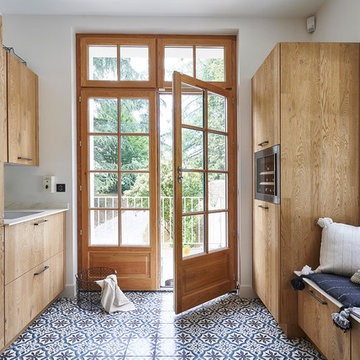
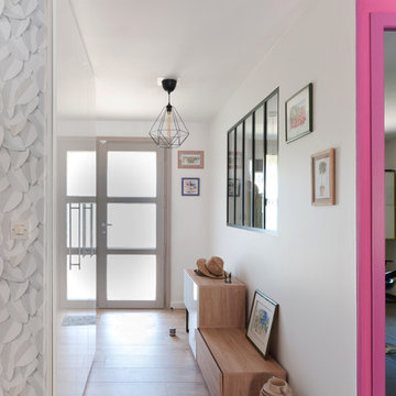
Cette image montre une entrée méditerranéenne avec un mur blanc, une porte double, une porte en verre et un sol multicolore.
Stéphane Vasco
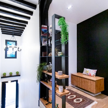
Réalisation d'une entrée design avec un couloir, un mur blanc et un sol multicolore.
Réalisation d'une entrée design avec un couloir, un mur blanc et un sol multicolore.
Aménagement d'une entrée bord de mer avec un couloir, un mur blanc, parquet clair, une porte simple, une porte blanche et un sol gris.
Barry Grossman Photography
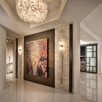
Réalisation d'un hall d'entrée design avec un mur blanc.
Réalisation d'un hall d'entrée design avec un mur blanc.
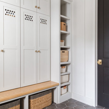
Photo: Rachel Loewen © 2019 Houzz
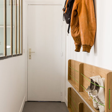
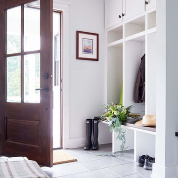
Cette photo montre une entrée scandinave avec un vestiaire, un mur blanc, un sol gris et du lambris.
Cette photo montre une entrée scandinave avec un vestiaire, un mur blanc, un sol gris et du lambris.
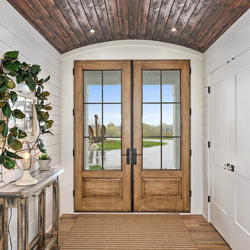
Modern Farmhouse designed for entertainment and gatherings. French doors leading into the main part of the home and trim details everywhere. Shiplap, board and batten, tray ceiling details, custom barrel tables are all part of this modern farmhouse design.
Half bath with a custom vanity. Clean modern windows. Living room has a fireplace with custom cabinets and custom barn beam mantel with ship lap above. The Master Bath has a beautiful tub for soaking and a spacious walk in shower. Front entry has a beautiful custom ceiling treatment.
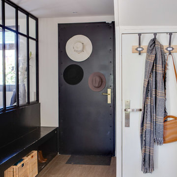
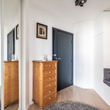
Idées déco pour une entrée campagne de taille moyenne avec un vestiaire, un mur blanc, une porte simple, une porte en bois foncé, un sol gris et un sol en carrelage de porcelaine.
Design & Build Team: Anchor Builders,
Photographer: Andrea Rugg Photography
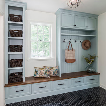
Inspiration pour une entrée traditionnelle de taille moyenne avec un vestiaire, un mur blanc, un sol en carrelage de porcelaine et un sol noir.
Inspiration pour une entrée traditionnelle de taille moyenne avec un vestiaire, un mur blanc, un sol en carrelage de porcelaine et un sol noir.
Idées déco d'entrées avec un mur blanc
1