Idées déco d'entrées modernes
Trier par :
Budget
Trier par:Populaires du jour
1 - 20 sur 55 909 photos
Audrey Cornu @MA Photographe 90000 Belfort
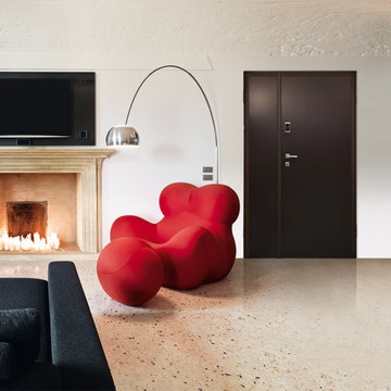
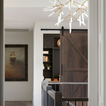
Cette photo montre une entrée moderne avec parquet foncé, un mur blanc et un sol marron.
Cette photo montre une entrée moderne avec parquet foncé, un mur blanc et un sol marron.
Marie-Caroline Lucat
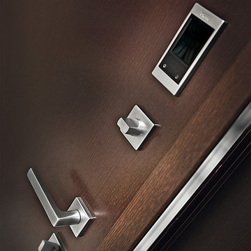
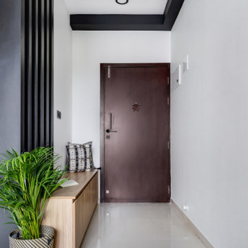
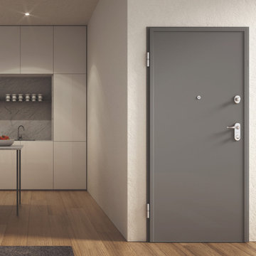
Cette photo montre une porte d'entrée moderne de taille moyenne avec un mur noir, un sol en carrelage de céramique, une porte simple, une porte noire et un sol blanc.
Cette photo montre une porte d'entrée moderne de taille moyenne avec un mur noir, un sol en carrelage de céramique, une porte simple, une porte noire et un sol blanc.
M. et Mme B. ont fait l’acquisition d’un appartement neuf (résidence secondaire) dans le centre-ville de Nantes. Ils ont fait appel à notre agence afin de rendre ce lieu plus accueillant et fonctionnel.
M. et Mme B. ont souhaité donner à leur nouveau lieu de vie une ambiance sobre, chic et intemporelle.
Le défi majeur pour notre équipe a été de s’adapter à la structure actuelle et par conséquent, redéfinir les espaces par de l’agencement sur-mesure et rendre l’ensemble chaleureux.
Notre proposition
En prenant en considération le cahier des charges de nos clients, nous avons dessiné un projet chaleureux et élégant marqué par l’ensemble de nos agencements sur-mesure.
- L’ambiance chic et sobre a été apportée par le bois et la couleur grise.
- Un meuble de rangement et des patères pouvant accueillir sacs, chaussures et manteaux ainsi qu’une assise permet de rendre l’entrée plus fonctionnelle.
- La mise en œuvre d’un claustra en chêne massif qui permet de délimiter la cuisine de la salle à manger tout en conservant la luminosité.
- L’espace TV est marqué par un bel et grand agencement sur-mesure alternant des placards et des niches, permettant de créer une belle harmonie entre le vide et le plein.
- La tête de lit ainsi que les tables de chevet ont été imaginés pour apporter de l’élégance et de la fonctionnalité dans un seul et même agencement.
Le Résultat
La confiance de M. et Mme B. nous a permis de mettre en œuvre un projet visant à améliorer leur intérieur et leur qualité de vie.
Plus fonctionnel par les divers rangements et plus chaleureux grâce aux couleurs et matériaux, ce nouvel appartement répond entièrement aux envies et au mode de vie de M. et Mme B.
Trouvez le bon professionnel près de chez vous
Idée de décoration pour une porte d'entrée minimaliste de taille moyenne avec une porte pivot et une porte en verre.
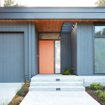
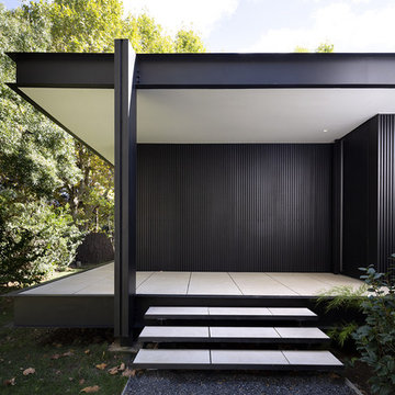
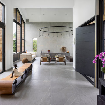
Klopf Architecture, Arterra Landscape Architects and Henry Calvert of Calvert Ventures Designed and built a new warm, modern, Eichler-inspired, open, indoor-outdoor home on a deeper-than-usual San Mateo Highlands property where an original Eichler house had burned to the ground.
The owners wanted multi-generational living and larger spaces than the original home offered, but all parties agreed that the house should respect the neighborhood and blend in stylistically with the other Eichlers. At first the Klopf team considered re-using what little was left of the original home and expanding on it. But after discussions with the owner and builder, all parties agreed that the last few remaining elements of the house were not practical to re-use, so Klopf Architecture designed a new home that pushes the Eichler approach in new directions.
One disadvantage of Eichler production homes is that the house designs were not optimized for each specific lot. A new custom home offered the team a chance to start over. In this case, a longer house that opens up sideways to the south fit the lot better than the original square-ish house that used to open to the rear (west). Accordingly, the Klopf team designed an L-shaped “bar” house with a large glass wall with large sliding glass doors that faces sideways instead of to the rear like a typical Eichler. This glass wall opens to a pool and landscaped yard designed by Arterra Landscape Architects.
Driving by the house, one might assume at first glance it is an Eichler because of the horizontality, the overhanging flat roof eaves, the dark gray vertical siding, and orange solid panel front door, but the house is designed for the 21st Century and is not meant to be a “Likeler.” You won't see any posts and beams in this home. Instead, the ceiling decking is a western red cedar that covers over all the beams. Like Eichlers, this cedar runs continuously from inside to out, enhancing the indoor / outdoor feeling of the house, but unlike Eichlers it conceals a cavity for lighting, wiring, and insulation. Ceilings are higher, rooms are larger and more open, the master bathroom is light-filled and more generous, with a separate tub and shower and a separate toilet compartment, and there is plenty of storage. The garage even easily fits two of today's vehicles with room to spare.
A massive 49-foot by 12-foot wall of glass and the continuity of materials from inside to outside enhance the inside-outside living concept, so the owners and their guests can flow freely from house to pool deck to BBQ to pool and back.
During construction in the rough framing stage, Klopf thought the front of the house appeared too tall even though the house had looked right in the design renderings (probably because the house is uphill from the street). So Klopf Architecture paid the framer to change the roofline from how we had designed it to be lower along the front, allowing the home to blend in better with the neighborhood. One project goal was for people driving up the street to pass the home without immediately noticing there is an "imposter" on this lot, and making that change was essential to achieve that goal.
This 2,606 square foot, 3 bedroom, 3 bathroom Eichler-inspired new house is located in San Mateo in the heart of the Silicon Valley.
Klopf Architecture Project Team: John Klopf, AIA, Klara Kevane
Landscape Architect: Arterra Landscape Architects
Contractor: Henry Calvert of Calvert Ventures
Photography ©2016 Mariko Reed
Location: San Mateo, CA
Year completed: 2016
Cette image montre une entrée minimaliste avec un vestiaire, un mur blanc, un sol en carrelage de porcelaine et un sol gris.
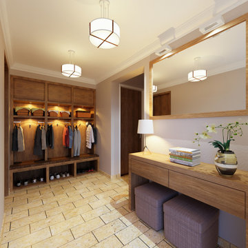
Réalisation d'une grande entrée minimaliste avec un vestiaire, un mur gris, un sol en carrelage de porcelaine et un sol beige.
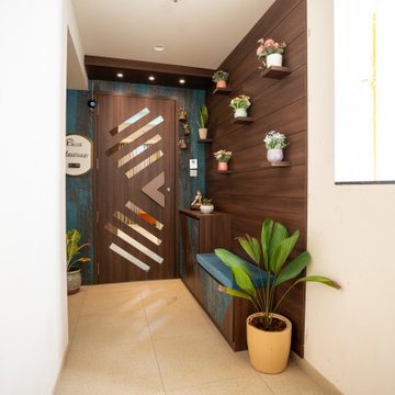
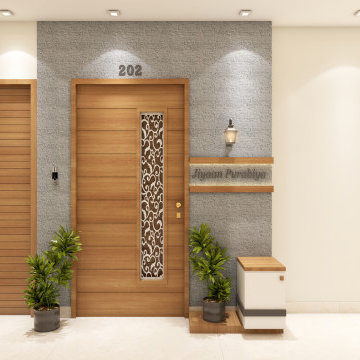
• Entrance-
• Main entrance - The main entrance exudes rustic charm with its combination of rustic finished laminate and wooden laminate. This blend of materials creates a warm and welcoming atmosphere, setting the tone for the rest of the home. The rustic finish adds character and texture, while the wooden laminate brings a touch of natural beauty. Together, they create a timeless and inviting entrance that leaves a lasting impression on visitors.
• Safety door - The safety door is not only functional but also adds a touch of style and sophistication to the entrance with its customized designer handle. Moreover, the door features a unique design that mirrors the pattern of the handles, providing both ventilation and aesthetic appeal. This thoughtful integration ensures that every aspect of the entrance contributes to the overall ambiance of the space, creating a welcoming and visually striking first impression for guests.
• Handle - As you enter through the passage, a personalized touch awaits with the nameplate situated elegantly on the left side of the main entrance. Crafted with metallic letters in a font style chosen to suit your preference, it adds a sense of identity and warmth to the space. This subtle yet distinctive feature welcomes guests with a personalized touch, making them feel right at home from the moment they arrive.
• Shoe rack - The entrance is thoughtfully designed with a convenient shoe rack and seating area situated separately outside, making it effortless to remove and store footwear when entering or exiting. Above the shoe rack, a complete wall paneling adorned with small ledges provides a perfect display space for decorative items, adding personality and charm to the area. The paneling's finished grooves add a touch of elegance and visual interest, enhancing the overall aesthetic appeal of the entrance space.
• False ceiling - The addition of a wooden false ceiling above the safety door, complete with cob lights, is a brilliant idea to ensure proper brightness and ambiance in the entrance area. This design choice not only enhances the aesthetic appeal but also provides practical illumination, creating a welcoming atmosphere for visitors. The warm glow from the cob lights complements the wooden finish, adding a cozy and inviting feel to the entrance space. It's a thoughtful detail that enhances both the functionality and visual appeal of the area.
The entrance sets the tone for the modern house. The foyer unit is an exquisite addition, designed to make a lasting impression. With its sleek lines and contemporary finishes, it seamlessly combines form and function. The subtle greens incorporated into the foyer's colour scheme bring a touch of nature indoors, creating a calming and refreshing ambience.
This Australian-inspired new construction was a successful collaboration between homeowner, architect, designer and builder. The home features a Henrybuilt kitchen, butler's pantry, private home office, guest suite, master suite, entry foyer with concealed entrances to the powder bathroom and coat closet, hidden play loft, and full front and back landscaping with swimming pool and pool house/ADU.

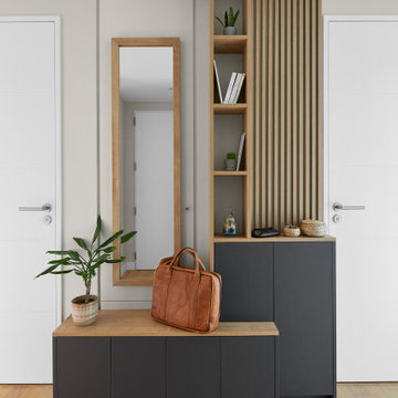
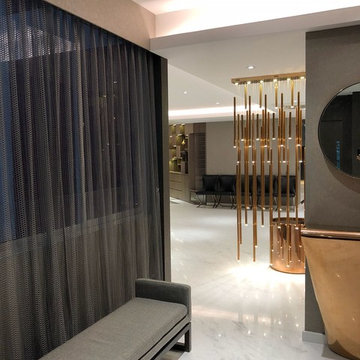
Réalisation d'un hall d'entrée minimaliste de taille moyenne avec un mur beige, un sol en carrelage de céramique, une porte simple, une porte en bois brun, un plafond à caissons et du lambris.
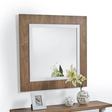
Espejo para pasillo, entrada, recibidor, comedor, salón,... se adapta a los distintos espacios de nuestro hogar.
Su diseño moderno hace que le de un toque muy actual al epacio
Acabados en chapa natural con detalle en laca.
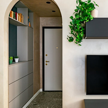
L’ingresso: sulla parte destra dell’ingresso la nicchia è stata ingrandita con l’inserimento di un mobile su misura che funge da svuota-tasche e scarpiera. Qui il soffitto si abbassa e crea una zona di “compressione” in modo da allargare lo spazio della zona Living una volta superato l’arco ed il gradino!
Idées déco d'entrées modernes
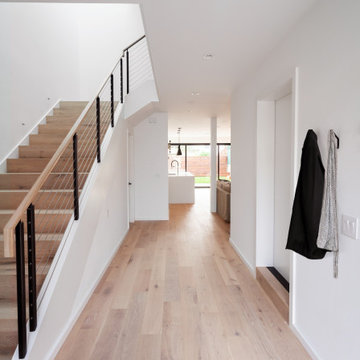
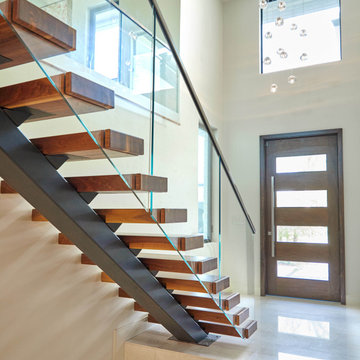
Entry way illuminated with natural light from skylight above stairwell. Open floor plan allows you to see through the living space to the back yard.
Photo credit: James Zhou
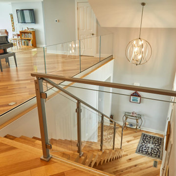
Glass railing is used to enhance this project’s indoor space. Clear glass panels highlight a beautiful Floating Staircase and a modern aesthetic. Surface mount posts anchor the railing without obstructing its clear lines, while steel clips hold the glass securely in place. The result is a minimal and sleek stairway.
1